Google finally unleashed its latest Android update Monday, and it’s a doozy. Not that most users will see Android 5.0 Lollipop right away.
Google’s mobile operating system updates usually hit the company’s own Nexus reference gadgets first, then make their way out to other devices. Depending on your device and carrier, that delay could be excruciatingly long. (Older devices may never see the 5.0 update at all.)
Assuming you do eventually get your Lollipop, you’ll be rewarded with a slew of changes designed to enhance the Android “experience” and make it more intuitive. Here’s a peek at some of the new features in store for you.
1. New Homescreen Look
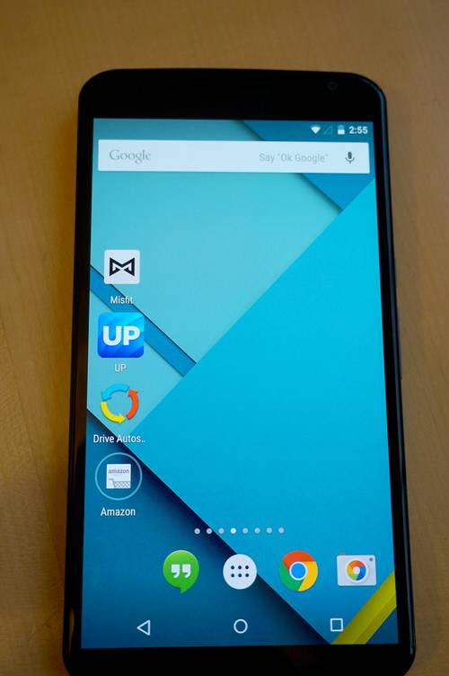
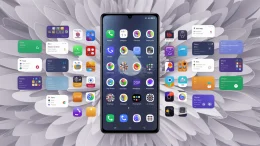
Google dubs its overhauled mobile interface “Material Design,” and the changes are apparent right away. Homescreen icons got flatter, and the navigational icons along the bottom are simple geometric shapes—triangle for back, circle for home and square for the new app switcher/notification function.
Critics may note that Apple delved into flatter design first, beginning with last year’s launch of iOS 7—a move that ditched its 3D-realistic (and somewhat cheesy) skeuomorphic design. But really, both of these tech giants trail number-three mobile platform Windows Phone. Oddly enough, it was Microsoft’s Modern (née Metro) interface that first made it hip to be flat.
Here, Android Lollipop manages to be colorful without going into carnival clown territory.
2. An App Drawer That’s Easy On The Eyes
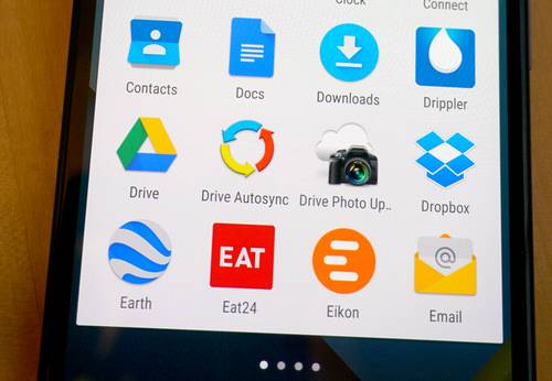
The apps aren’t just flatter. They’re actually easier on the eyes, as they look like they were printed on paper. This nuance is most obvious in the app drawer.
3. More Consistency Across Android Gizmos
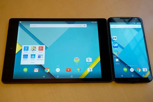
Google designed the new software to look and act more consistent across different Android devices, regardless of screen size—from smartphones and watches, to tablets and TVs.
4. Welcome, Google Fit
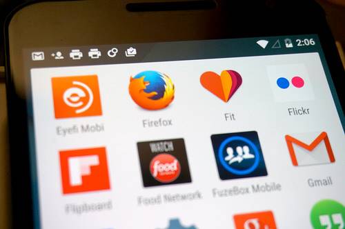
Google Fit—Android’s answer to Apple’s HealthKit—pulls in fitness data from different step-tracking and other health apps into one bucket. It also lets smartwatches running Android Wear software and Lollipop-powered gadgets work like interlocking pieces.
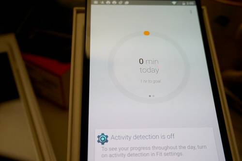
It’s a cyclical relationship: Android Wear watches take smartphone alerts and puts them on your wrist; Google Fit pulls the data from your watch—specifically, from its sensors—and puts it on your phone, along with fitness data from other apps.
5. Materially Designed Widgets
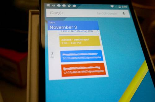
Like versions of Android before it, Lollipop also boasts widgets—those homescreen tiles that display emails, tweets, stock prices, or the song you’re currently playing, all without opening any apps. Widgets for Google’s own apps now feature the Material Design aesthetic, creating a uniform feel.
6. Transitions
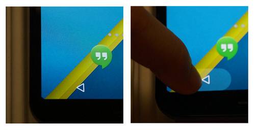
Never wonder again if the buttons at the bottom received your input. Google now offers a handy visual, which kicks in when you tap the “soft buttons,” letting you know that the device registered that touch.
It’s part of a broader push to make activities feel more fluid. Indeed, Lollipop offers several built-in activity transitions, so users don’t feel jarred going from one app or one state to another.
Google offers animated motions—some simple, some more elaborate—as shared visual elements that work across activities.
7. A Gmail Makeover
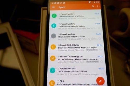
Gmail’s redesign under Lollipop brought in more colors, but somehow pulled it off without looking too gaudy or cluttered. It fits in with the universally “flat” design language extending across the whole phone.
8. Chrome Tabs Sit With Other Recent Apps
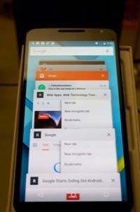
Lollipop’s approach to tabbed browsing puts running Chrome tabs in a vertical line along with other recent apps. Previously, users only saw one screen that represented Chrome (or other apps), and they’d have to choose it, then another button to pick a specific browser tab.
9. Prioritized Notifications
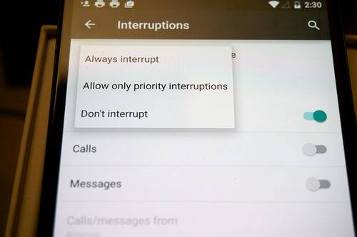
Want some notifications, but not others? Under Settings > Sound & notification > Interruptions, users can set priority interruptions for events and reminders, calls and messages. You can also prioritize alerts
With these tweaks, you can make sure that, say, calls from your phone’s contacts are considered more important than other calls.
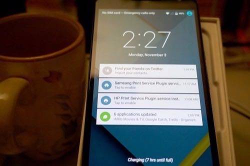
Notifications, of course, are still available by swiping down from the top of the screen.
10. New Keyboard
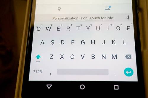
There’s something corny or clichéd about Android going beyond borders and boundaries … but in the case of the keyboard, it’s literally true. There are no lines to separate the keys now, which is another creative choice.
Other changes include handier Quick Settings, available in one long, fluid swipe down from the top of the screen alongside notifications, a redesigned phone dialer (which also loses its border between keys), and—in a change that parents should love—the ability to set up multiple user profiles for a single device.
We look forward to digging more into Lollipop after spending some more time with it. In the meantime, if any features stand out for you as the best or worst of the new update, let us know in the comments.
Photos by Adriana Lee for ReadWrite
