VisualComplexity.com is a site that intends to be a unified resource space for the visualization of complex networks. Their main goal is to better understand the different types of visualization methods used across several different disciplines, including social networks and the World Wide Web. Although this site is not new, with all the discussion around the idea of a “social graph,” it’s a good time to revisit what VisualComplexity has to offer. With the social graph, we’re attempting to map everyone to everyone and show how they are connected. This is no minor undertaking.
Why Visualizations?
The VisualComplexity web site was created by Manuel Lima, an interaction designer, based on research he began while attending the Parsons School of Design. Later on, when he was working as a Teaching Assistant as Parsons, he worked with Christopher Kirwan, to consolidate the research and launch the site.
By understanding the intricacy of networks and discerning patterns from the seeming chaos, we can achieve not only a structural understanding of the networks themselves, but we may also gain knowledge of how to implement major improvements in stability, robustness and security of these networks…knowledge that can help us move forward in not just a better understanding of the social graph, but of the very world around us and its inherent complexities.
The VisualComplexity Project
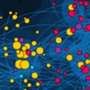
The VisualComplexity web site effectively functions as a catalog of visualizations of various types of networks, and currently hosts 557 different projects. Although it’s pointed out that not all the networks shown are genuinely complex, those that aren’t have been chosen for inclusion in the catalog because they demonstrate either an advancement in visual depiction techniques or they show conceptual uniqueness and originality of a subject.
For those interested in visualization techniques and maps, the site is a virtual treasure trove of beautifully created and engaging maps.
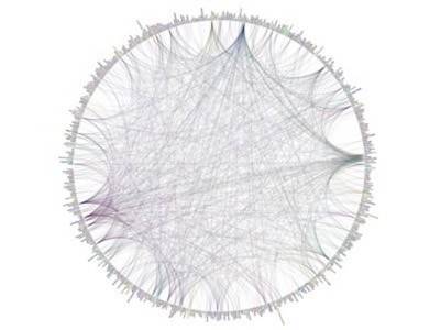
For example, there is the map the Processing.org flickr group, (a group interested in Processing – an open source programming language and environment for people who want to program images, animation, and interactions):
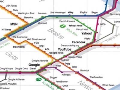
There is the Web Trend map, a visualization of all the major players on the web, ordered by category, proximity, popularity, and perspective:
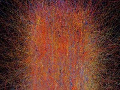
And, for a look at a truly complex visualization, check out the map entitled “A Working Brian Model“:
The types of networks on the site can be filtered by subject (Music, Internet, Art, etc.), Method (Arc Diagrams, Data Flow, Globes, Radial, etc.), Trend (Blogosphere, del,icio.us, Flickr, etc.), author, or year. You can also take a look at the site’s stats to see the number and percentage of projects by subject, most searched keywords, most viewed projects, and other interesting metadata about the project.
Visualization enthusiasts, prepare to lose yourself for hours in this inspiring and enlightening web site.