Akamai Technologies delivers 15-20% of all web traffic each day, which puts them in a unique position to monitor the status of the global web. This week, they released their previously customers-only web performance visualization tools to the public. The set of six flash-based visualizations let users identify how data is moving across the Internet in real-time.

The flagship app is the Real-time Web Monitor, which shows the countries (or Canadian provinces or American states) that are experiencing the most traffic load. As I write this, California and the United Kingdom are together accounting for 15.5% of global data requests. The app also lets you view the ten worst performing cities (Hong Kong and Tokyo are really hurting right now), and the area experiencing the most outside attacks on the network. (Venezuela is not a safe place to be a server this afternoon.)
The Visualizing Akamai tool shows the mind boggling number of visitors per minute make up just the 20% of the world’s Internet traffic that the company handles. The Network Performance Comparison appears to be just a marketing tool to show how much better Akamai’s network is (fun to play with, but not as useful as the others, in my opinion).
In addition to the three web performance visualizations, Akamai offers three performance indexes: News, Retail, and Music. They show traffic trends in different market sectors. For example, you can see the peak shopping times in different parts of the world. The retail graph also shows spikes around certain major shopping times of the year (there is a spike shortly before Mother’s Day on the current five-month graph — I’d expect a big spike later in the year right after Thanksgiving in the US: the official start to the Christmas shopping season here).

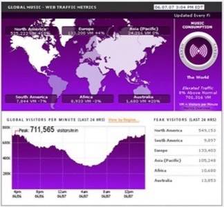
Above is a picture of the music index, but my favorite is the news usage visualization. The news index is neat because it has a list of the news events that caused the greatest spikes in traffic to news sites since Akamai started tracking in 2005. Interestingly, they’re mostly all sports related. Taking the top spot? Ghana eliminates the US in the World Cup last June. Second and third is the first day coverage of the US college basketball playoffs for the past two years. The first non-sports news is the death of Anna Nicole Smith last February, which checks in at number four, and just 6 of the top 15 news-related traffic spikes are non-sports items.
Akamai also offers desktop widgets for its three net usage indexes. The widgets use Yahoo! Widget Engine for Windows and OS X’s dashboard widgets for Mac.
Akamai’s data visualization tools are attractive and addictive and a fun way to keep tabs on what’s going on across the global net — trafficwise, anyway. (Other net traffic visualizations include the Internet Health Report and the Internet Traffic Report.)


