Sometimes a picture is the best way to see what a service offers.

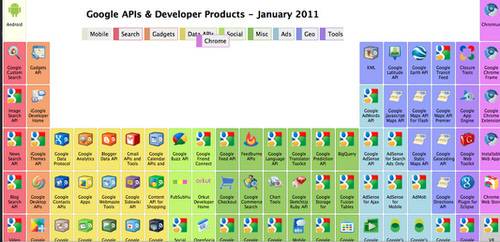
That’s certainly the case with an infographic that shows Google’s APIs as a periodic table.
The different APIs are organized by color category. Hover over the category and the table shadows the correlating APIs.
Each API in the table has a link to the page that details the API.

The periodic table is often used in this kind of context. It’s a classic information visual. Some find it cliche. Others take offense. Here’s what one commenter said about the Google periodic table on Hacker News:
Whenever I see “Periodic table of,” I remember of this blog post by Rob Pike: http://commandcenter.blogspot.com/2010/08/know-your-science….
“Another sort of abuse is comedy periodic tables: periodic tables of the vegetables, period table of the desserts, periodic table of the presidents, and on and on. There are zillions of them. I believe the vegetables one was the first widely distributed example.
What’s wrong with them? Again, they miss the point about the one true periodic table, Mendeleev’s periodic table of the elements. In fact, to put things with no structure into a periodic table not only misses the point of the periodic table, it misses the profound idea that some things have periods.
Pike goes on to say that the use of the periodic table as a cultural artifact cheapens science.
The periodic table is not some artistic layout of letters, it’s science at its very best, one of the great results of the 19th century and the birth of modern chemistry. It doesn’t honor science to take, say, typefaces and put them in a funny-looking grid. That just mocks the idea that science can predict the way the world works.
Science is not arbitrary. Making arbitrary cultural artifacts by abusing scientific ideas is not just wrong, it’s offensive. It cheapens science.
Do you agree? I am more of the opinion that this use of the periodic table actually helps make some sense of Google’s numerous API offerings.


