Gmail’s redesign may come with a bunch of spiffy new themes that look great in screenshots, but the actual usability of Gmail is in steep decline. For business users, Gmail is going downhill fast. It looks like Gmail is trying too hard to be a “social” application, and not hard enough to be an application for reading and responding to email quickly and effectively.

I’ve been using Gmail now almost since its release to the public. Its clean interface, keyboard shortcuts and relatively responsive Web interface have made Gmail my go-to mail client for years. While I’ve had some gripes with Gmail for years (not being able to sort by subject or sender in my inbox, for instance) the latest redesign has me considering going back to Thunderbird. Considering Thunderbird has improved very little in the last five years, that’s a sad reflection on the state of Gmail.
Cleaner, More Modern
Google’s “cleaner, more modern” look is neither of those things. First of all, Google? Piet Mondrian called and has two things to say: He’d like his designs back, and he’s thrilled to be alive again. (OK, maybe not.) If you happen to be an art buff or took a few art history classes in college, you might realize that the “new” Gmail/Google interface seems to be taking a strong cue from Mondrian’s paintings and the De Stijl movement.
OK, technically I guess you could call this “modern” if you’re referring to “modern art.” But modern art and modern are two very different things these days.
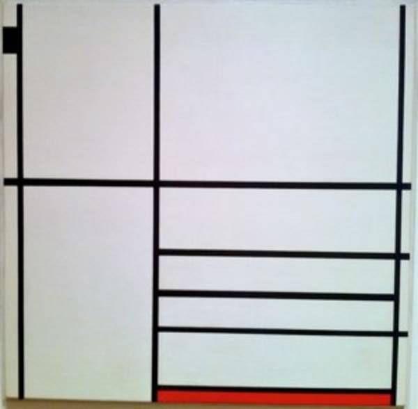
The boxy designs with thin black lines and assorted white, yellow, blue, and red boxes may work for you as art (or it may not). It’s certainly not working for me as a way to view my inbox, though. To be honest, I’ve never been a big fan of Mondrian or the De Stijl movement. I can’t say for sure whether Google’s UI team is full of closet Mondrian fanatics, but there’s a strong resemblance.
Wherever the UI team got its cue, the interface may look nice – but it isn’t actually that useful.
Generally Confusing
Some of the gripes I (and others) have with the new interface may well fall under the “people don’t like change” category. But a number of the changes just seem like clear steps backwards. Part of the problem with the new layout/interface is that it’s difficult to tell where the interface ends and the email itself begins.
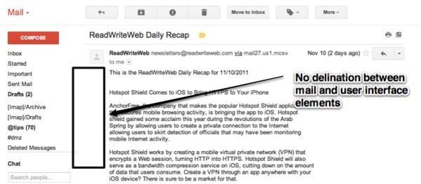
There’s no divider between the mail contents and the navigation on either side. Too much white space in many areas. If you use a Gmail edition that’s unpaid (read: has ads) the problem is even worse due to the visual clutter of the ads on the right-hand side.
A lot of the UI elements have been minimized or iconified, making them harder to see and less intuitive. The button to toggle mails as importan/unimportant has been moved from the toolbar to the top of the mail, next to the tags. The calendar and quicklinks have been shuffled off to a separate “tab” at the bottom that swaps with the chat list.
Icons Only
A major problem that I have with the new interface is that Gmail has gone from text-based buttons to an icon-only design. Lots of desktop applications offer the choice between text, icons or text and icons. Gmail, however, seems to have decided that we’re all better off with just icons. But we’re not.
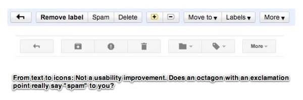
Not only does this make the interface less usable, but it also takes up more vertical space than the original design. The icons really don’t do the job anyway. Does an octagon with an exclamation point really say “spam” to you? Some folks may prefer icons to text, but Gmail doesn’t seem to provide an option to switch between the two. (Even the Gmail folks rely on text for the “More” button, which should be an indication that concepts are better conveyed with text than icons alone.)
Information Density
The good with the redesign is that Gmail has an option to choose between “compact” and “comfortable” views. There’s also a “cozy” which seems to be exactly the same as “comfortable” on my display.
The bad is that the compact is hard to read, and comfortable displays less information than the classic Gmail design.
As mentioned already, the whitespace issue is a problem. There’s also the sudden intrusion of user icons in my mail interface. Some folks may find this enticing, somehow, but I find a slew of user icons on the left-hand side of my mail to be distracting. It takes up unnecessary space, and it’s duplicating the contact information displayed on the right-hand side of Gmail.
I brought up the GMail topic on Google+ this morning and one of the folks who commented said the redesign seems to be for tablets and “makes the buttons easy to stab with a fat finger.” As an owner of fat fingers, I can appreciate this – in a tablet design. For a desktop design, not so much. I still use my mouse and not my fingers for most of my Gmail work.
More Work
Reasonable people can disagree on what makes for an improvement in a user interface, but adding more steps to typical user actions is rarely seen as an improvement.
But that’s exactly what the new theme for Gmail does. In the standard design, you have a list for Mail, Contacts and Tasks. In the new design, you have a Mail “menu” in the same place with a drop-down. This poses two problems. First, it’s non-obvious that it’s a menu. It looks like it’s just text sitting there. Secondly, it requires an additional click to get to contacts. Yes, that’s just one extra click, but that’s a lot of clicks over a long period.
Google has also removed the bottom toolbar from the interface. So if you’re at the bottom of your inbox, you have to move the mouse back up to the top of the screen to archive, spam, mark messages read, and so forth.
All these little tweaks add up to more work on the user’s part.
It’s Not All Bad
This isn’t to say that Google hasn’t gotten anything right. I do like the new conversation view. I like the idea of the “comfortable,” “cozy” and “compact” views users can toggle easily. Not crazy about the actual styles that exist now, but the ability to toggle between them is a good idea. The fact that you can resize the widgets on the left-hand side is nice as well.
The new HD themes are much more attractive, but I’m not sure they’re actually any more usable than the prior set of themes. The term “visual clutter” pops into mind. The themes suggest to me that the Gmail team are really thinking more about users who send a handful of emails a day, and not the business users that live in the inbox. But props to Gmail on the actual designs.
The “Mail from this month” information you get under “more information” on the right-hand side for a contact is useful.
But, overall, I think the new design is a step back. I’d like to see Gmail provide a theme for users who are processing large quantities of email, without the distractions. Until then, I think I’m going to be looking into standard desktop mailers again to try to find something more efficient. Any suggestions, or do you think that the Gmail redesign is the best ever?