Google+ launched to the public in September, and it rolled out its first major redesign this morning. Since Google began its march toward a unified product built around this social layer, over 170 million Google accounts have been “upgraded to Google+.” Today’s redesign reflects what Google has learned about those people so far: They need more options.
“Toward a Simpler, More Beautiful Google”
With PR from any big company, but especially on the Google Blog, everything is embedded in the wording. The title of today’s redesign announcement seeks a “more beautiful Google,” not just Google+. This reinforces the idea that Google+ is fundamentally Google, and that this redesign is meant to bring consistency across all Google services.
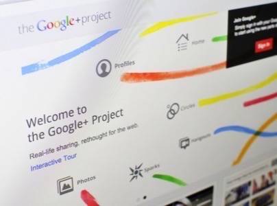
Google’s description of the new design is full of cues like “flexible,” “make [it] your own,” “a design that grows.” The major change in today’s redesign is a customizable navigation bar on the left side. In addition to the built-in Google+ services, apps installed by the user will appear here. In some cases, hovering over apps will pop up quick actions. Items can be rearranged by dragging and dropping, and unwanted items (Games, for example) can be hidden behind a “More” button.
The one that can’t be hidden is ‘Explore.’ It concentrates popular posts, trending topics and hashtags, and a slideshow of what Google+ can do. It also promotes Google+ games on the side. The ‘Explore’ page is built to convey the sense that there’s stuff going on on Google+, here’s what it is, and here’s how to participate.

Google also makes clear that this design is flexible in order to give it space for “The Next Big Feature, and The Feature After That.” The redesign is not just about letting Google+ users control their experience. It’s about getting them used to change.
The expandable nav bar also invites users to install more apps. Facebook’s booming app platform has succeeded in keeping hundreds of millions of users on the site for longer. Google+ needs to open up as a platform as well to compete for that attention. But it has to release more of its API before that can happen.
People on Google+
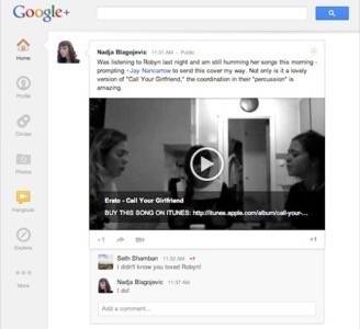
Profiles and conversations have also been redesigned. Posts are now “cards” that stand out from the background. Activity on a post has been shaded and slid underneath the original post as a “drawer.” This third dimension centers the attention around the original content, but it also gives the conversation its own separate space.
Photos have also been extended to the full width of the feed. Google wants a sharing experience that “takes your breath away,” and it conveys that with all this visual depth. Google+ was a flat surface before, and the new shades and dimensions are the most immediately noticeable change.
Hangouts are the most undeniably wonderful and personal part of Google+, and they got their own dedicated page in this update. The Hangouts page has its own slideshow of Hangouts features, and below that is a constantly updating list of live Hangouts to watch or join. The controls to start your own are on the side. It’s great to see the best feature of Google+ get this star treatment. Even the deepest Google+ skeptics can be won over by Hangouts. Trust me.
The Numbers Don’t Lie
Google’s design process is driven by user behavior. “One of the great things about working on products at Google is that we can try stuff out and launch it as an experiment and get tons of data,” Google Search lead designer Jon Wiley told ReadWriteWeb in February.
“As a designer, I feel very lucky because I have access to enough data and enough users that I can actually get statistically significant information on whether or not something should be this tall, or this tall, or this tall.”
When Google launches a redesign, it’s helpful to keep this in mind. It may drive you crazy to have to adjust, but Google makes these decisions by watching tens or hundreds of millions of people and optimizing for the way they use its sites.

The Scale of Google+
When Google announced its Q4 earnings in January, CEO Larry Page said that Google+ had 90 million users. That number has almost doubled in the past three months, and what it means is finally clear.
Early in the life of Google+, commentators disputed and argued about Google’s official usage statistics for the new social network. They couldn’t agree on what a “Google+ user” was. Was Google counting people who actually post on the site, or was it counting anyone who had connected to Google+, even if they never used it?
The numbers seemed too high to represent active users, so critics cried foul. But Google meant the same thing all along. Google+ is the new Google now, and any account that “upgrades” to the new way of doing things counts. They don’t have to go to plus.google.com and share to be counted. Google+ is Google’s name for people who use Google.
As more of the company’s hundreds of millions of users get pulled into the new, centralized, Google+-era Google, this flexible design will allow it to expand to suit more users’ tastes and preferences. The design still concentrates on expressing Google’s vision, but it draws more attention to what the community does there. If Google+ wants its 170 million users to come back and participate, this is the kind of user-centric design it needs.