Think twice about that huge font and those glassy icons: Look and feel is the first thing we see and notice about most web apps and is often critical to an app’s user experience, adoption, and ultimate success.
We chatted with a panel of expert aesthetes in the space, including Spymaster designer Eston Bond, veteran creative director Rich Barrett, designer/developer Warren Benedetto, Mike Rundle of 9rules and Beak fame, and the Paul du Coudray Lowdown, the winner of this year’s Rails Rumble appearance category. Here’s what they had to say about developers doing double duty as designers, trends they’d like to see disappear, and how aesthetics can help a startup sink or swim.
Is a web app’s look and feel critical to its overall success or failure?
“As a designer, I’d love to say it’s the most important element,” said Benedetto. “Unfortunately, my experience is that the look and feel is often inessential, to the point of being irrelevant. Some of the most successful things I have worked on, in terms of traffic and conversions, have been successful almost in spite of the design, rather than because of the design.
“If you have a great app that is easy and intuitive to use, it doesn’t really matter what it looks like (e.g., Craigslist, Del.icio.us, Google, 37signals’ products, the original Twitter design, even Amazon and eBay). By the same token, a great-looking app with poor usability will generally not fly very far. Quality trumps aesthetics every time.”
“Execution is everything… and presentation is most likely half of that,” said du Coudray. “I used to downplay the role of visual identity in the overall success of an application. It wasn’t until I started to design directly within applications that I could respect the balance between designer, architect, and builder, and be able to tell when something was essential (or not), or supportive of core objectives.”
For certain apps, said Bond, design is everything. “When I was working on the initial specifications for Spymaster, for example, aesthetics really mattered. In an escapist fantasy, one needs to have the world feel completely immersive, as close to the edge of reality as possible… In entertainment cases you have to pay attention to look and feel to a deeper degree than you do a corporate or heavily-functional application such as Google. One doesn’t really care what the Google box looks like as long as you get your search results back as soon as possible.” He went on to cite Craigslist as another “ugly” site that does well based on its content rather than its aesthetic.
Another perspective is Rundle’s contention. “A web application’s overall look and feel plays a very critical role mainly through two main factors: early adopters love beautifully-designed applications and that gets them talking. Secondly, ease of use and quality interface design go hand in hand to attract new customers and users. If the interface is not intuitive then they’ll be frustrated and give up (and tell all their friends.)”
A similar sentiment was Barrett’s opinion. “There are rare cases where an app’s mind-blowing functionality can override any other concerns but otherwise users tend to make a decision about an application’s usefulness to them within the first few moments of using it. Aesthetics play a major part in that decision.”
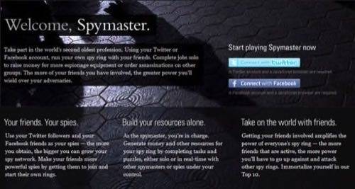
The landing page for Bond’s viral, social game, Spymaster.
What web design trends have surfaced and dominated in 2009?
“Huge typography seems to be popular this year,” said Benedetto. “Usually, that goes hand-in-hand with some ultra-casual copywriting. ‘Hi. We’re Vacuums.com. We make things that suck. Kind of like your life.’ Stuff like that. Google Chrome crashes, and the error screen says, ‘Aw, snap.’ There’s a very nudge-nudge-wink-wink sensibility. It can be friendly, fresh, and funny when done well, but often it just comes across as cliché.”
Barrett said he’s seen apps become smaller, simpler, and more streamlined – perhaps to be more mobile browser-friendly. “Simplicity is key so that the design can either work on both web and mobile devices or at least be consistent with the simple design of the mobile version.”
Rundle noted the benefits of designing for the newer class of Internet browsers. “Although a large portion of audiences still use Internet Explorer, especially in corporate environments, designers aren’t afraid to provide Safari, Firefox, and Opera users an enhanced design through the usage of CSS-based rounded corners, shadowed text, CSS gradients, box shadows, etc. I think giving savvy users a nicer design is a good idea and is also rewarding to web designers sick of dealing with all of IE’s hassles.”
Du Coudray had a few interesting words on the use of what he called “faux” elements. “With the risk of being quoted out-of-context saying, ‘Grunge is dead,’ I think that this particular trend has found its proper place. Intrinsic beauty in elements usually trumps any trends over time. That is to say, plastic will not try and be wood forever, but will eventually be used in ways which we find plastic beautiful. Maybe pixels will be the same – Who knows?”
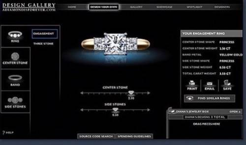
A ring-designing app Barrett created for DeBeers.
What elements of web app design should disappear forever?
“Anything that was good about most trends has been suffocated by the mind-numbing sameness of them all,” Benedetto summarized. That being said, he still sees value in the GetSatisfaction-style side tab, Digg-esque voting elements, and elegantly designed footers.
“The concept that enterprise software can’t be elegant and beautiful needs to disappear forever,” said Rundle. “Mailchimp and Ballpark are great examples of smaller SaaS companies with world-class interface design, and the folks designing enterprise software would be wise to learn from their examples.”
Barrett spoke to the tendency to flood users with options rather than making decisive design choices. “I think a lot of apps try to be everything to everyone so they overload their interface with features to try to be as useful as possible. I appreciate clean and simple applications, even if it means that you have to direct the user more and limit their choices.”
The all-Flash site is another annoyance among many web users and designers, Bond among them. “I’d love to see the 100% Flash site extinct as soon as possible,” he said. “In the majority of cases where I’ve seen sites that are super Flash heavy, it’s completely unnecessary. As mobile browsers begin to utilise more advanced rendering engines and mobile usage increases as a way to view the ‘real’ Internet (I’m looking at you, iPhone), Flash is becoming resource-intensive and restrictive.”
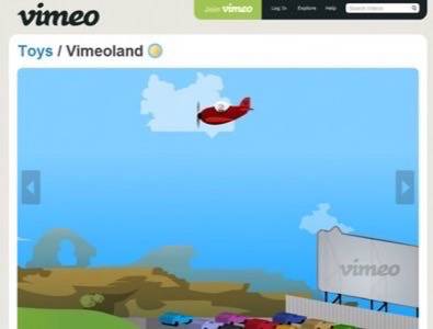
An animated section of Vimeo.com.
What design elements are simply overused, and are there still good reasons to employ them?
“The ‘Rails’ aesthetic,” said Bond, “that classic 37signals app look… I’ve worked on a lot
of Rails-based applications over the past year and I had one Flickr engineer tell me at a party, ‘Hey, good job on making it look like it’s not Rails, if you know what I mean.’ That shouldn’t happen. That’s definitely the sign of a hackneyed aesthetic.”
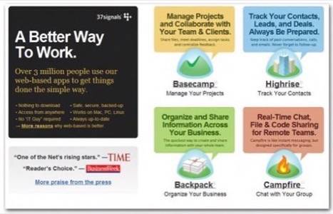
Benedetto echoes the same sentiment. While he claims to have mad respect for the 37signals folks, he also says he’s weary of what he calls “The Cult of Basecamp” design aesthetic. He also has noticed recent overuse of the grass-dirt-sky and retro-wood-paneling looks.
And seconding Benedetto’s comments on huge type, Rundle said, “People aren’t blind; you don’t need 72-pixel links in Helvetica Bold to attract attention.”
The much-copied 37signals look, as seen at 37signals.com.
Do certain design elements signal to users – and investors and media – the scope, uses, and meaning of an application?
“I think when Web 2.0 first exploded, that was definitely the case for the media,” said Benedetto. “‘Oh, it has a shiny, plastic logo? And a reflection? A badge? AND IT’S IN BETA?!? Eureka! We found the next Google!'”
These days, he said, some signals still apply. “I think that the prevalence of Basecamp clones in the world of small business apps communicates a certain ethic of simplicity and elegance to users. That may or may not actually be the case once you start using the app, but there’s definitely a signal in the design choices that says, ‘This is going to be easy to use.'”
Rundle also feels that design will always send signals about meaning. “Web design takes cues from all forms of graphic design, especially logo and branding work where colors are extremely important. Blue hues indicate stability (large companies love blue: IBM, Ford, IKEA, etc.), and green means responsible and eco-friendly.”
Sometimes, the most important design elements for usability are icons. “The character and tenor of the icons you use can immediately telegraph the nature of the application, who it is aimed at and how sophisticated it is meant to be,” said Barrett.
Still, ultimately, said Bond, “No one element is going to be the key of successfully translating your application idea into something an investor or userbase will understand; instead, it’s the PRODUCT design – the interplay of aesthetics and copy, interface complexity and perceived latency, core product concepts and functionality, everything intangible that defies any better description we file away under ‘user experience,’ that really can signal an application’s purpose.”
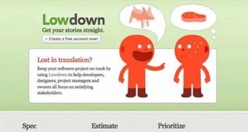
Lowdown’s landing page.
What’s good advice for the team developing and designing The Next Big Web App?
Noting that many developers are also doing graphic design for their applications, Barrett said, “One of the telling differences between an application design that is handled by a designer and one that is handled more by a development team is spacing. Developers don’t usually think much about how element should sit on a screen together, so you see a lot of items crammed together or unevenly distributed. This is the kind of thing an average user can’t put their finger on, but on a subconscious level, it bothers them and gives them a negative opinion of the application.”
Bond cautions teams to always develop and design with the end user in mind. “Especially in Silicon Valley, where it’s easy for entrepreneurs to isolate themselves in circles with like-minded techies and fellow entrepreneurs, I feel that a huge amount of startup CEOs and designers that I’ve talked to fall into the trap of tunnel vision: they have a grandiose idea of building a web application for the mainstream demographic but consistently make product decisions that appeal to their own interaction behaviour with such applications or what they think their friends will find cool. A lot of times this tunnel vision isn’t even evident to them because their local frame of reference supports it. Building for geeks makes for great customer immersion if you’re building something like (the wonderfully useful) GitHub, but that same process doesn’t work so hot if you’re building a site for middle-aged moms.”
Rundle echoed this sentiment, saying, “The concept of thinking like a user is extremely important. You just have to understand what they’re trying to accomplish and then match your design with those goals. Task-based design is especially important in web application design because people use your software to get things done, not to browse around and waste time. Simple things like having the most important function on a page be visually set off from everything else is a start. Grouping similar features together for enhanced comprehension. Being consistent with your interface design paradigms to breed familiarity.”
“Know why you are building something and never shift your attention from that purpose,” said du Coudray. “If there is not a central design problem to solve, the project will quickly dissolve into a series of individual problems with individual outcomes that are more related to the checking off of tasks then to a total solution.”
“If your expertise is development, not design, acknowledge that fact,” Benedetto cautioned. Most developers are smart enough to do html, css, and javascript … so they do. But just knowing how to do it doesn’t mean you’re good at it. Design is communication, not decoration. Hire someone who understands that. How it looks can be a big factor in how it works. Use design as a means of communicating to your users what to do, where to click, and how to use your app.”
The playfully illustrated landing page Silverback, usability-testing software for web designers and develoeprs.

Bonus round! What are your favorite colors and fonts for web design?
Barrett, who cites a theme of simplicity lately, loves strong, bold colors and Helvetica.
Benedetto swears by basic black (classy!), and as for fonts, he said, “Bliss, Swiss, and Fago are all nice clean fonts that aren’t Helvetica.”
Rundle cites his perennial fondness for steel blue, Lucida Grande, and Myriad.
Bond has been playing with desaturated palettes and a reddish pink, and says his favorite typefaces include House Industries’ Chalet and BP Foundry’s SangBleu.