The world’s most visited webpage, Yahoo.com, has just had a major re-design (available for now at yahoo.com/preview) and Read/WriteWeb has the inside story. As well as the first in-depth look at the new yahoo.com, I have for you an exclusive podcast interview with Yahoo! Chief
Product Officer Ash Patel and Vice President of Front Doors Tapan Bhat (yes that’s his
real title – more informally he’s known internally as VP of “Making Yahoo! the best place
to start”).
The Yahoo.com re-design is officially
flagged as a “preview” (aka beta) and it isn’t yet the default yahoo.com homepage. In the
podcast I was told there is no firm date for go-live – in the grand traditions of Web 2.0
it will be a beta until the company decides otherwise 🙂 Here is a look at the new
design:
New Homepage:

Old Homepage:

Overview of new features
The new yahoo.com marks a significant new look for the most trafficked website in the
world. There’s plenty of Ajax magic to make the Yahoo homepage more interactive – and
Yahoo has made a big effort to make the user the primary focus of the new homepage. It
has a larger search box, in recognition of the big role that the search interface
plays in today’s Web. There is also more emphasis on personalization, news content and
community – moving away from the 90’s ‘everything under the sun’ portal to a more
user-focused homepage for the user. Indeed upon visiting the preview page, you’re
greeted with a banner that shows just how important personalization is to this re-design:
“Welcome to the all-new Yahoo! It’s made for you.”
In the podcast we also discussed how the yahoo.com homepage has added more
multimedia links and content, in line with Yahoo’s status nowadays as a media
company. This trend for more video and audio content on the homepage will only increase
over time.
From a design point of view, the most noticeable feature is an increased use of
Ajax in the new layout. Also the page is wider, recognizing that the average PC
monitor size has increased over the past few years (nb: there is an option to switch to a
“narrow page”). The visual design employs the famous web 2.0 technique of faded colors –
and there is more use of tabs too. In the podcast, VP of Front Doors Tapan Bhat explained
some of the scaling challenges of implementing Ajax in a mass market website. He made it
clear that the move to a more Ajax-heavy user interface required a lot of testing and
optimization before it was ready for prime time. For an example of the Ajax touches,
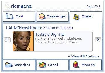
check out the “Personal Assistant” in the top-right corner. Here it is in a closed
state:
…and here it is in an open state, using Ajax to make the transition fluid:
List of new features
The new features of Yahoo.com (preview) are:
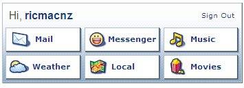
– Personal Assistant: A new “personal preview area” which displays recent
messages from Yahoo! Mail, an online friends list from Yahoo! Messenger, radio and
movies, weather, traffic and events from Yahoo! Local. See screenshots above.
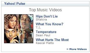
– Yahoo! Pulse: This is a new section in the home page and enables people to
discover “what’s hot on the Web” – including the most popular and interesting Yahoo!
searches; the latest trends; popular music, videos, photos, people and opinions. This is
in essence Yahoo! aggregating all of their user-generated content and filtering to get
the most popular items – e.g. Interesting Flickr Photos, or Most popular cars, or Top
Music Videos. Very 2.0!
– News Content: This is where Yahoo! will highlight feature stories,
entertainment news, sports and finance content, plus the latest national, world and video
news. These news items are hand-picked and updated by Yahoo!’s home page editors, so this
is really human-powered ‘professional’ content (as opposed to automated Google News-type
content). This section of content occupies a prime top-left spot in the new yahoo.com
webpage, which is an indication of how focused Yahoo is on media content these days –
because in the old design, news and entertainment headlines were to the right of the page
and/or below the fold.

– Enhanced Search Box: Yahoo! Search box has been re-designed (in particular
made bigger) and positioned more prominently on the homepage. Also you’ll note Yahoo!
Answers just beneath the Yahoo! Search box – which is their version of ‘collective
intelligence’ search.
– Re-designed Navigation: Yahoo has always had a lot of navigation elements on
their homepage, reflecting its history and reputation as the most popular portal on the
planet. But the new design is definitely an improvement to my mind, as the left
navigation makes Yahoo’s product options stand out more. The overall impression is of a
less cluttered interface, with content occupying the center of the page and so attracting
the user’s attention. In the old design, the navigation dominated the whole of the page.
Now that the product navigation has been given its own space in the left column, that
frees up room for the media content.
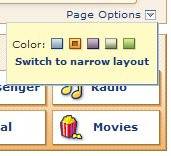
– Customization options: Users can customize colors and layout using the ‘Page
Options’ button.
MyYahoo and Personalized Start Pages
A final note on how the new yahoo.com design complements My Yahoo!, which is Yahoo’s “personalized start page”.
Yahoo.com is still very much a mainstream ‘portal’, but it now makes more use of web 2.0
functionality like the ‘collective intelligence’ evident in Y! Pulse. The new yahoo.com
also has personalization in it, with features like Personal Assistant. However MyYahoo!
is still the option for Yahoo users who want to fully personalize their web start page,
with RSS feed content subscriptions and the like. In the podcast, I asked a question
about whether MyYahoo! will get more widget/gadget functionality in the near future, as
Microsoft’s live.com and Google’s Personalized Homepage have done recently (as beta
products, it must be said). The reply was that because MyYahoo is an existing and stable
‘start page’ that pre-dated Microsoft’s and Google’s efforts by a long way, Yahoo has to
be more conservative about how it rolls out widget/gadget integration. But they are
looking into it.
Conclusion
All in all, I think the new Yahoo.com preview page is a big improvement on the old
design – in terms of both ‘look n’ feel’ and functionality. Considering that yahoo.com is
the most trafficked webpage in the world – and so any changes they make to it affect many
millions of users – I think the new design is a big step forward. It’s much more
contemporary-looking than the previous version and introduces a decent slab of ‘web 2.0’
functionality to the masses. What do you think?