Starting today, social bookmarking service StumbleUpon is allowing users to beta test a shiny, happy redesign of their site.

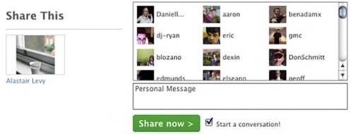
The new interface is streamlined and more social with an updated relationship system. A focus on consistency (e.g., limiting user control of visual elements) and removal of clutter (e.g., presenting tags in a drop-down menu rather than a cloud) characterize the design changes made. Also, a few tweaks to group sharing were made to help reduce share-spam.
The most significant UX changes have occured in the way friendships and subscriptions work on the site. Friends are now called Mutual Subscribers with mutual Direct-Sharecapabilities. According to the FAQ, “The Friends category… has a new shape in the new interface. Your friends… are now the equivalent of Stumblers that you are subscribed to and can mutually share sites with from your toolbar… Look for the ‘two-way’ icon under their avatars. If the icon is there, it means you can mutually share sites with each other.”
The “Favorites” tab has been renamed “All” and includes every site a user ever liked, including multimedia content. Similarly, the “What’s New” page, which displays sites a user’s friends and subscriptions reviewed, has been renamed “Recent Activity.”
In the new interface, shares are found in the main Discover tab and display the list of sites that were sent to a user by mutual subscribers with direct-share permission. Soon, the site will display sent as well as received shares.
The once-retired Similarity Meter, a diagram showing a users’ Favorites similarity with other users, is being resurrected. And by popular demand, group shares will no longer be available in bulk; users will have to select other users within groups to share items with them.
Design changes that limit user choice in favor of overall site consistency are threefold: List view rather than a grid view is the default for all profiles. In contrast to the 22 background colors once available, a mere seven of the most popular color themes are now being offered for profile customization. And the visual editor has been scrapped. “Rest assured,” the site reads, “we are still working on making sure all your past blog entries look good in the new interface. Some text customization will still be allowed.
“Our goal is not to limit your creativity, but to place emphasis on content and ensure a consistent user experience.” An admirable aim, indeed; we think StumbleUpon is working in a good direction with these changes.
We also admire the new drop-down menu for tags:

Users are able to toggle back and forth between the beta redesign and the old site design over the next month. “To switch back to the old look,” the site says, “simply click on the Beta link located on the main navbar (see image below) and on the following screen click the Leave Beta button. To return to the new interface, use the link Click here and try the new StumbleUpon! located at the top of all pages in the old view.”


