 |
 |
 |
 |
Anyone who has seen the built-in applications in Harmattan knows there is a nice variety of widget colours that help distinguish the different application types – purple for multimedia, orange for office, etc – with various shades for each colour theme for even more differentiation. Anyone who has used Qt Components in QML on Harmattan knows there is exactly one colour – blue – with one shade available. It seemed a shame to let all these other colours go to waste in QML, so I decided to do something about it.
Qt Components in QML have style elements associated with them that allow the user to change the appearance and tweak each component individually if required. It is nice to have this functionality easily accessible, and it can be as easy as:
Button { text: “Red Text!”; platformStyle: ButtonStyle { textColor: “red” } }
The problem with using this method to re-theme every component in your application is just that – you have to re-theme every component in your application. Changing 3-4 background images in the component to a different colour theme is a lot of work for an application developer with a complicated interface. Surely there must be a better way.
Fortunately, there is. Or, at least, I think there is. Why not have a method available to switch colour themes that requires only one line of code for application developers? We just need a method of letting all the styles know what colours we want to use and the styles should handle it themselves. This is, after all, how themes handle whether or not the application should display inverted (dark theme) or not.
In the grand tradition of Open Source software I decided instead of complaining about this I would do something about it. So over the weekend I wrote a patch to Qt Components that will allow users to use any of the 19 (yes, nineteen) built in colour themes as simple as:
Component.onCompleted: theme.color = 15
This simple addition to the application code will theme all components (dark or light) to a colour of the developers choice – in the above case orange. All values between 1 and 19 inclusive work as expected for all components that have coloured elements.
I also changed the QMLComponentGallery and QMLComponentExtrasGallery example applications to allow the user to select colour themes and see how they look with all the components. Seeing each of the components in all nineteen different colours with a tap on the screen makes for an easy way to browse through the available colour themes.
My code is available in my gitorious repository for anyone interested, but it isn’t possible to deploy it cleanly since it is built against the latest components. The version on the firmware on the N950 is 1.0 (compared to 1.1 in git) and installing a different version breaks package updating (system packages depend on the specific version instead of a minimum version).
I have created a merge request to hopefully get the changes back into the master repository and into official packages. Another avenue I could look into is having a separate package the user can install that makes these changes, but that would overwrite files from a system package so it might not be a good idea. Finally, I could look at making a package that extends the styles and adds colour support that way but I haven’t yet looked to see how feasible that is.
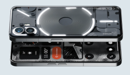
Any suggestions on methods I may have missed would be most welcome. All screen shots here are QML applications showing different colour themes.
EDIT: I changed my patch to accept theme number (for example, 16), colour name (darkOrange), or colour variant (orange3).
Source Fiferboy’s Developing

