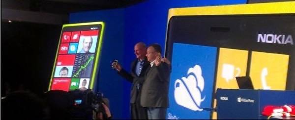
I sat in the front row of Nokia’s Windows Phone event in New York in September, watching Microsoft CEO Steve Ballmer and his Nokia counterpart Stephen Elop clasp arms and smile for the crowd and present the Lumia 920. At the time, I thought to myself, “you know, this may be the phone that gets Nokia back in the game.”
I reserve the right to change my mind.
At first blush, Nokia’s new flagship Windows Phone was everything I had been looking for from a high-end Windows Phone. It has impressive Near Field Communications (NFC) features with its ability to transfer music from the device to a set of speakers or headphones. It has a wireless charging feature that works with a “pillow” or that same set of speakers. It has Nokia’s well-reviewed PureView camera technology with Carl Zeiss optics that rival any other smartphone in the business, including Apple’s iPhone 5 and anything from Samsung. Slap on a quality battery (non-removable, industry-competitive 2000 mAh) and I thought, “Nokia might be on to something here.”
That was before I started playing with the Lumia 920.
I have never been a fan on “unboxing” videos where bloggers film themselves opening a box of a new device and showing off what is inside. Yet, I kind of wish I had done so with the Lumia 920. The amount of cursing expressed in my first five minutes with the device would have made good cinema.
- First thought: “Damn, this thing is heavy.”
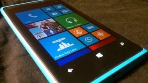
- Second thought: “Damn, this thing is freaking* blue.”
- Third thought: “Why the hell is it taking so long to start up?”
- Fourth, fifth, sixth thoughts: “I bloody hell hate how long and how many steps Microsoft puts your through to set up the device when you first turn it on.”
- Seventh thought: “Oh, Windows Phone, I want to like you and praise you for being different, but there is little actually simple, interesting or intuitive with Hubs and Tiles.”
- Eighth thought: “Wait? Where the hell is Spotify?”
(*Note: I may have used a word stronger than “freaking.” Also, I have no choice in the color of review devices I am sent from Nokia. I am not a fan of blue. The Lumia 920 comes in a variety of colors including white, black, red, yellow and blue. I would have preferred red or black. I have not been able to confirm this (though not for want of asking people from Microsoft, Nokia or HTC … nobody seems to know or they just will not tell me) but I think the color scheme for Windows Phone devices is the brainchild of Microsoft, not Nokia. HTC’s Windows Phones also come in a variety of colors.)
Let’s break down my list of curses.
Carry The Weight
When it comes to a smartphone, I am particularly sensitive to size, shape and weight. A smartphone is perhaps the most personal electronic device ever made. It travels everywhere you go, in your pocket or your bag, and if the size, shape or weight feel wrong, you won’t like it as much as you should. This is one reason why people have historically liked the iPhone and why Apple works so hard to make it slimmer and more streamlined. Apple fully understands the value of a device that “feels” good.
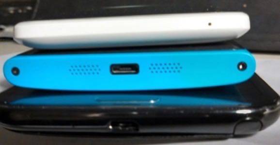
For instance, the Samsung Galaxy Note II is a fine device, I just find its enormity awkward when the purpose is to be used as a phone . At least the Note II is thin and light despite its gargantuan 5.55-inch screen. The Lumia 920 is neither thin nor light. If you are attempting to switch to the 920 from most Android devices or an iPhone, you are definitely going to notice the bulk.

At 185 grams, (about 6.5 ounces), the Lumia 920 is 73 grams heavier than the iPhone 5 (112 grams – about 3.9 ounces). Despite having a screen a little more than an inch smaller than the Note II (4.5 inches for against 5.55 inches), the Lumia 920 weighs five grams more. The Samsung Galaxy S 3 is considerably lighter, too, at about 133 grams (4.7 ounces).
Releasing a device that is noticeably bulkier than the iPhone 5 or the latest Galaxy flagships is not a very good way to compete with Apple and Samsung. Worse, Lumia line keeps getting bigger, not smaller. The original Lumia 800, announced in October 2011, was a joy to hold. It had a little heft to it but the body was sleek and pleasant. The Lumia 900, released in April 2012, was bigger but did not feel quite as cumbersome as the 920. The 920 is essentially the Lumia 900 on steroids.
It is hard to tell exactly why the Lumia 920 is so heavy other than to note all the hardware upgrades it includes. Wireless charging, bigger battery, advanced NFC capability, the PureView technology, et al. likely added up to a bigger, heavier body.
Windows Phone 8
Microsoft is spending a large fortune on its marketing for Windows 8, Windows Phone 8 and Windows RT. For Windows Phone 8, Microsoft touts its simplicity and easy-to-understand interface.
I call shenanigans.
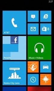
On the surface (no pun intended), Windows Phone 8 is simple. Everything you might like to use is pre-loaded on the home screen in the form of Live Tiles. Really, this is little different from any other modern smartphone, including the iPhone or any Android device – with the exception that Live Tiles can show you information on what’s going on in the app they represent even before you open them.
If you are switching from iOS or Android, though, Windows Phone is going take some time to figure out.
The first hurdle with Windows Phone (be it version 8 or anything that came before) is that you are going to have to go through a significant amount of steps before you even use the device. Things are only a little easier if you have an @live.com account from Microsoft. These set-up wizards are classic Microsoft – and a touch infuriating. No other mobile operating system makes you jump through so many hoops just to get going (Android is the simplest of the group, with all of your data imported to your device once you sign into your Google account).
When you finally reach the home screen, the now-familiar Hubs and Tiles are presented, replete with a selection of bloatware from both AT&T and Nokia. Many tiles are self explanatory, such as the phone icon, Internet Explorer and email. But not all the tiles have clear definitions. For instance, the “People” tile is essentially your contacts list turned into an app. It can import all your Facebook, Twitter and phone contacts and then update with pictures of those people.
Somehow, though, Microsoft has managed to complicate what should be simple. Microsoft has essentially created a unified contacts “app” (or Hub, as Microsoft prefers) with all of your disparate contacts in one place. Perhaps this is a conceptual problem for me, but I do not want my Facebook friends in my contact list by default. But if you want to use Facebook on your Windows Phone, those contacts are going to be in there. If find it cumbersome and annoying.
The Messages (not including email) tile is similarly complex – it incorporates SMS, Facebook Chat and instant messaging into a single space. There is value to a single messaging inbox, but the Windows Phone version is confusing. And you don’t get a choice whether you’d prefer a distinct SMS app instead of all of your messages in one spot regardless of where they come from? As for me, I’d be happier with a simple dedicated chat app, a dedicated SMS app and so on.
Users will have to explore the rest of the pre-installed tiles individually to see what they do – and many of them make you jump through hoops for sign-in and permissions that are often difficult to comprehend.
Paucity Of Apps & Design Decisions
Windows Phone 8 also continues Microsoft’s tradition of poor design for its native apps.
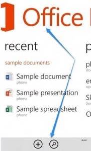
Smartphones, by their very nature, have limited screen space. Mobile app design experts know to optimize their apps’ most important aspects while marginalizing (hopefully in a stylish way) less vital features. Microsoft seems to miss the boat here.
For instance, look at the Microsoft Office app for Windows Phone 8. Note that the header of the app says “Office” in big red letters. The bottom has a gray bar with a search icon and a folder and the settings button. An app designer I know looked at that and said, “why the heck is Microsoft wasting all this space with the header and footer?” Issues like that crop up in many of Microsoft’s own apps.
Beyond the problems with Windows Phone 8’s built-in apps, the bigger issue is Windows Phone’s lack of third-party apps, and it’s even worse in WIndows Phone 8. Apps built for Windows Phone 7/7.5 have to be specifically updated to even function in the Windows Phone 8 operating system. This makes it much easier for developers to build apps that will work across Windows 8/RT/Phone but it causes problems Windows Phone 8 users right now.
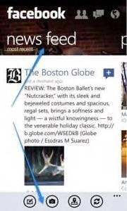
Take the Facebook app, which was built by Microsoft … not Facebook. No surprise that the Newsfeed is marginalized in the center panel while the header gets prominent display.
Worse, Windows Phone 8 is still missing some of my go-to apps. When I try a new device, the first thing I do is download the apps I use every day. So where is Spotify for Windows Phone 8? Where is Instagram? Path? Pandora? Flipboard? If I am forced to Microsoft’s and Nokia’s own set of services instead of the industry leading choicess, I am not going to be a happy camper.
Grade: Incomplete
There are plenty of quality aspects to the Lumia 920. The PureView camera, NFC capabilities, a quality and responsive screen that rivals the iPhone for clarity, Nokia Maps (yes, Nokia does maps well), the concept of Hubs and Live Tiles and so on.
The problem is a matter of execution. Good ideas, like the various hardware improvements to the Lumia series and the software improvements to Windows Phone, feel… incomplete. Microsoft and Nokia seem to have entered into a feature war with Android and Apple. They manage to win occassional skirmishes over particular features, but overall they are losing the fight.
