Guest author Mark Tobias is president of the online consulting firm Pantheon.
Most organizations are constantly adding material on their website—new sections, new toolbars, updated information and more. But how do you make sure that all the time and energy that goes into producing useful information doesn’t go to waste because it’s not arranged in ways that sync up with your visitors’ needs?
Many organizations in this situation end up with confusing, cluttered websites that turn away frustrated visitors instead of drawing them in. This is particularly true when they select web designs based on aesthetics instead of focusing on how well they meet the needs of the target audience.
The Ghost Of Melvil Dewey Haunts The Web
Unfortunately, far too many websites feature an information architecture and content strategy more akin to the Dewey Decimal System then to today’s users needs. Dewey’s classification of books into searchable sections of the library was an excellent service for researchers and library lovers, but it’s a poor match for the online organization of information.
The categorical approach inspired by the Dewey Decimal System forces website visitors to spend more time and effort trying to figure out how what they want to learn fits into pre-assigned categories. Let’s face it—patience isn’t much of a virtue online. Web users want what they want, when they want it. There is no tolerance for designs that force them to forage from section to section. If users can’t get their questions answered quickly, they leave.

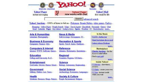
Yahoo learned this lesson the hard way. Consider this screenshot of the 1999 Yahoo homepage design, which is obviously dated, messy and vastly different from today’s Yahoo—which, by the way, still struggles for user attention long after abandoning the site’s original “catalog” design. The ideal way to feature your website’s offerings should be entirely dependent on the audience and how it seeks information, and Yahoo’s portal design only worked so long as there was no better alternative.
Soon enough, there was.

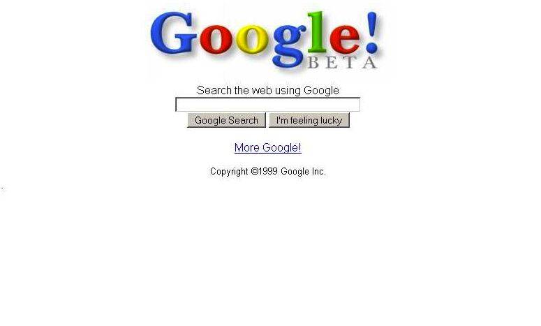
No one better understands how to serve up online information than Google. Its dependable homepage design has remained largely the same for roughly 14 years. While the algorithms that power Google’s search function are constantly tested and tweaked, the only significant design change in the past ten years is a larger sized search box, which each day answers more than a billion questions in 181 countries and 146 languages.
The Google experience is intuitive, highly personalized and user driven—no two searches are alike. Search results are a combination of the user’s logged search history and Google’s own automated daily crawl of 20 billion websites in search of data that can be turned into results. Thanks to Google’s immense “Knowledge Graph,” only 15 percent of searches are new to Google and haven’t been seen before.
What You Can Learn From Google
Google retains its prominence among competitors because it knows and responds to user experience. It’s a great model for nonprofit, association, and government websites that face enormous challenges keeping their target audiences informed and engaged. Here are four guiding principles to help guide your website content organization strategy:
- WWUD. Make “What Will Users Do” your organization’s watchwords when posting new material. Sure, you think it’s important, but will your target audience? How are they finding it? Where do they go after reading it? Think about your audiences’ interests, but also their level of experience. Is there a way to present things differently for first time visitors and experienced veterans?
- Question taxonomy. Website architecture persists from inertia and lack of awareness about how (and whether) users are finding and getting the information they need. Smart organizations challenge assumptions and “the way it’s always been” and are perpetually curious about their target audiences. Like Google and Amazon, the websites that know their users and tailor their presentations accordingly are able to draw users from page to page to learn and do more. They attract more visitors, impart more information, clinch more memberships, and drive more action and purchases. Not coincidentally, these websites tend to be cleaner and offer users more relevant material suited to their needs and experience levels.
- Answer questions. Like Google, websites should be organized and tailored to answer user questions. Users come to the Web to learn and get answers—often to questions they didn’t even know to ask. The notion that websites should be serving up modules of learning tailored to users is alien to most organizations. That kind of unwillingness to adapt to the audience is why Yahoo, Infoseek, Altavista and other search engines failed while Google lives on.
- Test and refine. Knowing how to answer user questions requires knowing your users and how they navigate your website. Website analytics tools can help you dig in to learn about where visitors are going, how long they’re staying and when they leave. Experiment with placement and wording of information. As we build each website, every step along the way is an opportunity to get feedback from the client’s target audience to shape the most effective architecture and navigation tools. Incremental and continuous testing keeps us honest and stops us from making both big and little mistakes that result from faulty assumptions.
If your website more closely resembles the rows and sections of a library than a user-friendly online learning expo, consider a new approach using these four principles to guide your strategy. You will be rewarded with an increase in quality Web traffic and a productive relationship with your target audience. In the high stakes world organizations, governments and companies live in, that’s well worth the effort.


