The press loves good data. However, if you are not careful in how you package your data while pitching to press, your efforts may be for nothing. Here are ten examples of how to use data to pitch press during COVID-19.
Crafting your pitch — a skill that you need to master.
You will want to pitch your data in a way that highlights fresh, unique, useful, and relevant data. Remember that crafting your pitch is a skill that you need to master.
There is no point in merely piggy-backing the COVID-19 pandemic just to try and get noticed. Not only will your pitch get sent straight to spam, but your image will also be tainted. So how do you pitch your data-driven content to press during this trying period?
Here are examples used by real businesses you can follow that are fabricated from pre-existing data and have gained attention from the press.
Example #1 – Curate Relevant and Helpful Information for the Public.
A friend of mine recently saw that www.flattenthecurve.com domain was for sale without any previous information on the website. So he decided to make something of this website after seeing all the information about the pandemic out there. He purchased the domain and worked with a group to set up an info hub for up to date COVID19 info by experts.
Now, he did not do this without prior research. Here are some of the steps to figure out what journalists want to hear about for their stories:
- Look for journalist’s requests on newsletters such as HARO, Profnet, JournoRequests, ResponseSource, and others to see what questions/asks/queries journalists have and any sources and experts they’re seeking for their stories.
- Dig deep into each request from a journalist to find an overarching theme for all the asks.
In my friend’s case, he saw the need/ask for this expert advice and opinions about everything going on with COVID. He also saw that nobody out there was providing this information so he started building his own content:
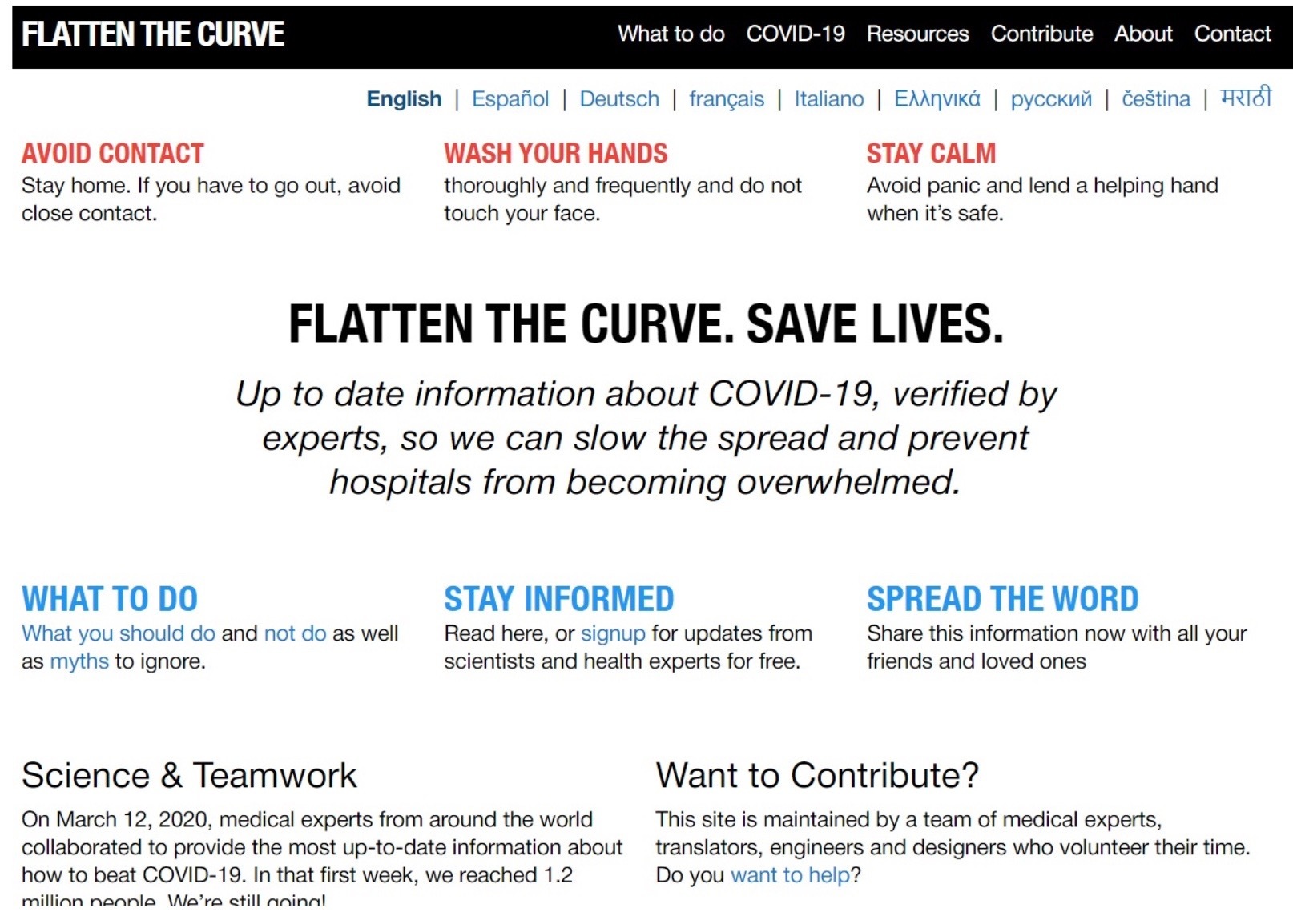
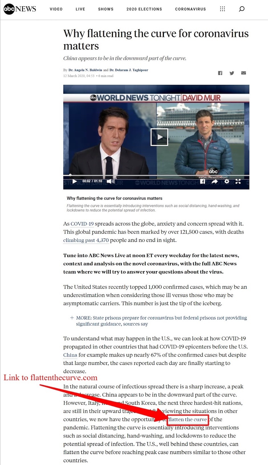
The very first version of content on this website was just a simple blog post. He slowly updated the content and worked on getting relevant data on the site. He then pitched media about his data and got amazing press on ABC News.
Now to pitch something like this, you do not need to create a fancy PR release. Merely use Google to find a journalist interested in this topic, and use Gmail to send them a quick pitch.
Here is the process to use to pitch the journalist:
- Find and identify journalists interested in your story.
- Create attention-grabbing newsworthy content.
- Find their email address. Here is a quick tutorial on how to find a journalist’s email, here.
- Reach out.
Since flattenthecurve.com consists of up-to-date information on COVID-19 from real experts and there is not much similar info out there similar to it — so it made the pitch unique.
Here’s another mention the site gained on a popular Medium blog:
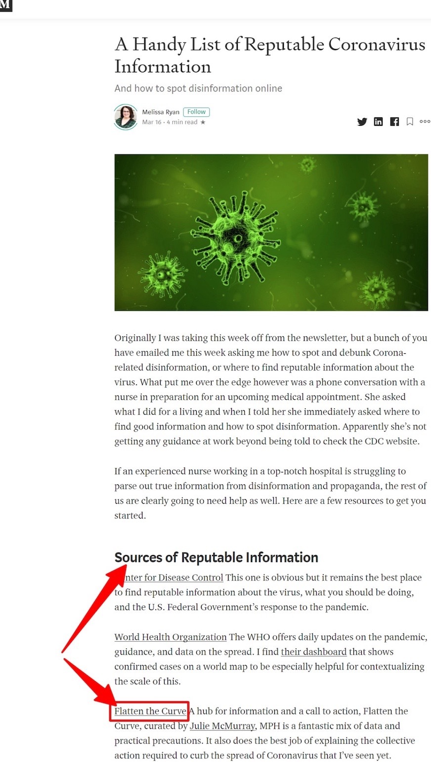
Flattenthecurve is cited as a source of reputable information since the owner has made sure to include only authentic information that has been verified by experts.
Takeaway: Curate information that will help people during this pandemic if you want to stay fresh in the news.
Example #2 – Use Graphs That Show Trends Over Time
Graphs help you to present your data in an easily understandable manner. People process visuals much faster than text. Journalists have limited time on their hands to go through the hundreds of pitches they receive every day. If you want your data to be understood quickly by the PR reporter, graphs are a great way to do this.
In regards to data about COVID-19, it is helpful to include graphs that show trends over time. Trends over time are pieces of data that help people realize the gravity of the situation.
Here’s an example from The Verge that features graphs and trends over time:

The graphs need not be your own, but you can use them to put forth a fresh perspective on the topic.
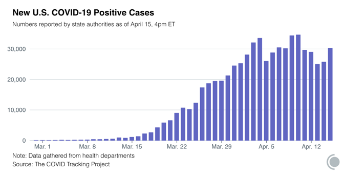
Takeaway: Use graphs that show people trends over a certain timeframe. This helps people track the progress of the pandemic so that they can get a sense of how well a particular region is doing in controlling the outbreak.
Example #3 – Use Images That Show Data Over Geographic Locations
Another type of COVID-19 data you can show is the trend across geographic areas. This could be the number of positive cases, the number of deaths due to the virus, or the number of people who have been cured of the virus.
Whatever data you present, when you show trends over geographic locations, it shows people how the virus is spreading. It also tells them which states are taking better precautionary measures to control the infection.
Example:
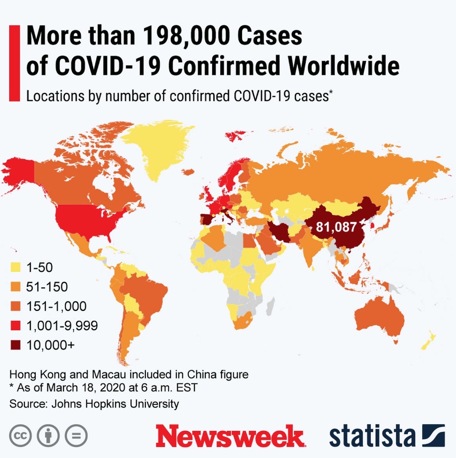
The graph above shows the distribution of confirmed COVID-19 cases clearly and is easy to understand.
Here is a featured images of the number of COVID-19 cases across the world from an article from the European Union.
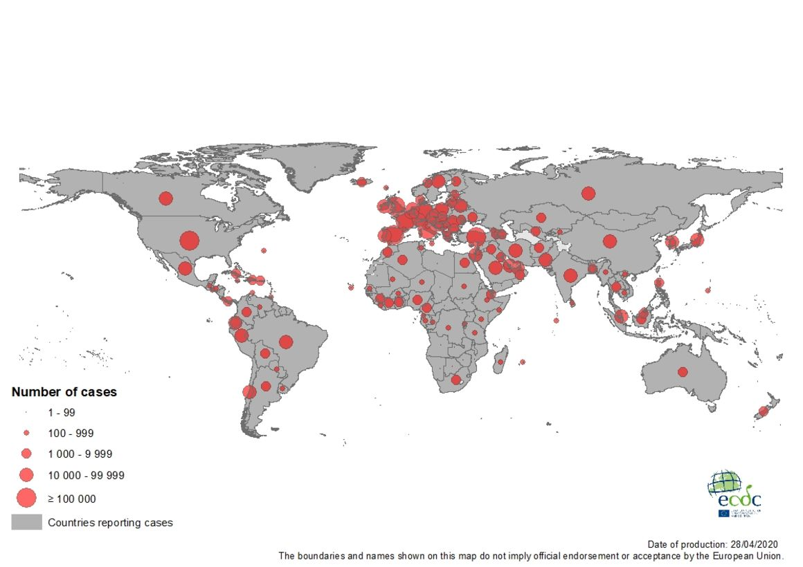
The site also claims to have up-to-date information that is carefully screened by experts.
Takeaway: Visuals convey much information in a short span of time. Readers are able to comprehend the situation of the pandemic globally in just a few images.
Use strong images that show the spread of the disease across nations to help people see clearly which nations are better controlling it.
You can also take an example here of how different sites present their information. Clear, concise — and easy to find. In business, you can use many examples across a variety of situational areas to improve your business reach.
Example #4 – Use Different Types of Data for Pitching
There are three different types of data companies use for pitching press: Owned data, created data, and researched data.
Owned Data
Owned data is data that your company has collected over time. The best part about owned data is that it is unique. Owned data may include customer profiles, industry trends, or other insights your company has gained from its customers.
If your company is in the healthcare or medical industry, it will be easy for you to obtain information about COVID-19 if you are already dealing with it.
You can choose to present this data in the form of whitepapers, blog content, video content, or infographics.
Created Data
If your company does not have access to information that can be used to gain exciting industry insights, you can always develop data for the purpose. This is called created data.
Created data could be obtained through experiments carried out to show a trend, or surveys conducted to gather invaluable insights about your target market. You can use created data as hard evidence supporting a theory you are trying to put forward.
For created data about COVID-19, you could reach out to medical professionals and gain their opinions on the pandemic.
Researched Data
The third type of data you can use is research data that is publicly available. In recent times, data about COVID-19 is all over the internet, so you may not have trouble finding relevant information.
Researched data is collected from businesses or other sources that may not be directly linked to your company or even your industry. However, if you are going to use data from external sources, you need to present your unique angle to the information — it is against the law to just copy others’ work.
Takeaway: Well-researched data is always sought after by the press. Even if other websites are citing the same resources of data, the way you present the data (using visuals and graphs) will help you stand out from the crowd.
Example #5 – Use Attention-grabbing Interactive Visuals
Use Google’s data PDFs and visualize them for your audience. Use information about the percentage change in people visiting retail/ recreational locations from Google’s COVID-19 Community Mobility Reports.
Use pieces that present attractive and well-presented visuals showing county-or state-level insights. Show helpful tables that show state-wise and county-wise percentages. Visuals and data can be obtained from many sites. But what is important here is how the information is put together and presented.
Takeaway: Use stunning interactive visuals to quickly layout information to readers.
Example #6 – Present Your Data Uniquely
You can show visualizations of changes driving behavior by country/region. Use a site like Apple’s Mobility Trends Report to get insights. Include dynamic visuals and include an element of interaction with the readers that captures their attention.
Takeaway: Find creative ways to present your data differently. Also, try to make your data interactive in some way so that it doesn’t appear ‘boring’ or static.
Example #7 – Use Data Visualization Techniques
Interactive map visuals are always a good way to go. You can list country names along with the median residential changes. Make your data visualizations crisp and clear and concisely provided data, making it easy for press sites to link to it.
Visualizing your data has many benefits and can help you pack more value in your content.
Takeaway: Present your data briefly and clearly so that people can process it at a glance.
Example #8 – Create Location-Based Interactive Content
A great campaign could be done by reporting the most Instagrammed places in the country. People could click any location on the map and see Instagram photos that were uploaded in that area.
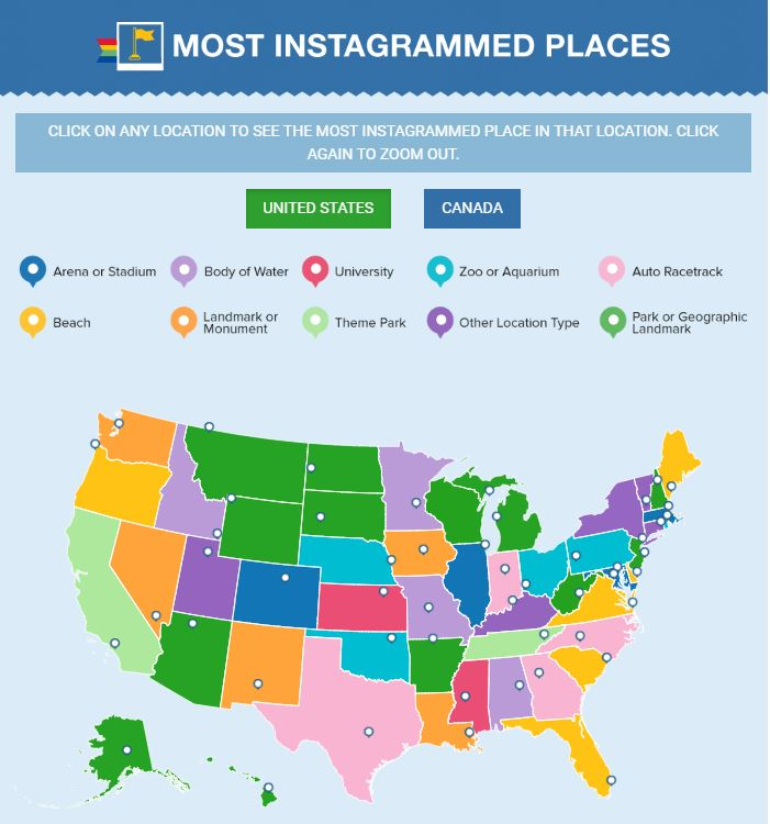
This campaign gained national coverage due to all the locations they covered, and it also got local coverage because people were interested in what was happening in their particular state.
Takeaway: Attract local press coverage by sharing location-based data in an appealing format. Interactive content gains a lot of traction due to its relevance to people.
Example #9 – Create Quizzes to Educate and Entertain
Quizzes are another type of interactive content that helps you gain more shares, especially on social media. Quizzes attract people due to the interactivity and give them a reason to stay on your site for longer.
Take this quiz from Orbitz, for example. The content is visual and fun, making the content shareable.
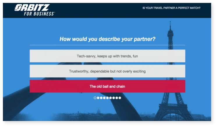
Takeaway: Interactive quizzes are a fun way to gain attention. Social media content has a tendency to go viral, so incorporate quizzes in your pitches. You can ask people personal questions while educating them about the latest COVID-19 news or trends.
Example #10 – Stop Self-Serving – Focus on Value Instead
Getting your company some media exposure is the goal of any public relations department. Although your main aim may be to gain some recognition and appear in top publications in your niche, you must be careful not to let that drive your pitch. Present data from reputable sources in real-time (if possible) and use information that is trusted by top news sites.
Takeaway: Focus on the value you are bringing your audience. Are you helping them cope with the COVID-19 lockdown and social distancing? Or are you creating opportunities for them to thrive during this pandemic?
People are looking for trust-worthy and helpful content, and the press understands that. Give them new data that is both practical and trustworthy, and they will be happy to publish it.
Tips For Successful PR Outreach and Link Building
- Make sure your data is authentic, relevant, and useful to a lot of people.
- Find which sites you want to pitch to, and focus on them. Do not waste your time and resources on every other publication out there.
- Make sure every pitch is less than 200 words
- Never coordinate interview times with journalists without a link to your Calendar app in your outreach email.
- Focus on providing value to your readers.
Conclusion
Data is everywhere and is always in demand. Press reporters are still after new and unique data to showcase to their readers. Curate relevant information that is helpful to the public. Relevant real-time data will help you stay authentic and reach out to a wider audience.
Create graphical representations to show trends over a time frame. Following a timeframe will help people understand how the disease is progressing.
Curate images that show trends over geographical locations. People are interested in how their areas are controlling the pandemic, and these will help them. You can also create images of your own showing these trends.
Create interactive content such as quizzes or location-based content. People enjoy personalized content that they can interact with.
Most importantly, do not seek to serve yourself at this time. It is more important to stay honest and help the public as much as you can at this time. The press values data that serves.