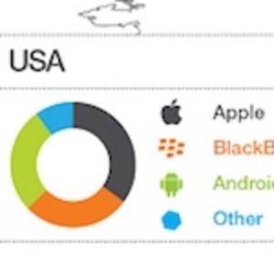
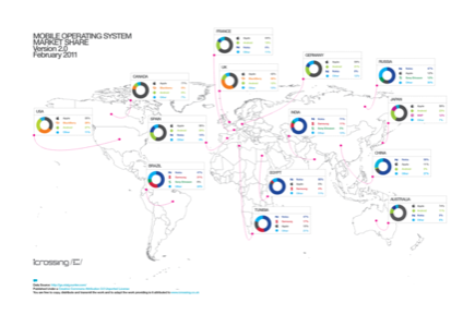
We just came across this great infographic which provides a visualization of the various mobile operating system market shares from around the world and how each platform’s share differs from region to region. The data is pulled from Statcounter, so it may not be the most accurate representation of mobile data there is, but it’s probably not too far off, at least in general terms.

The infographic was created by www.icrossing.co.uk and we spotted on the excellent Posterous site “Cool Infographics” maintained by Techmeme editor Mahendra Palsule.
Click on the image below for a larger version.


