The launch event for Rupert Murdoch’s new iPad-only newspaper The Daily was full of rhetoric about the future of journalism, heralding the app as a “this changes everything” sort of moment.

But having had a chance to download and read today’s inaugural issue, it doesn’t seem that the user experience matches the rhetoric. That may not be a surprise as plenty of people have long predicted The Daily would be a flop. But it still feels like a shame, considering the resources (some $30 million from Murdoch himself) that have been poured into the endeavor and considering the promise for a reinvented and reinvigorated journalism.
That’s just my opinion, of course, as are these first impressions of the new app:
The Content
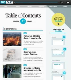
The Daily features six categories: News, Gossip, Opinion, Arts & Life, Apps & Games, and Sports. And as those probably indicate, this makes The Daily rather light on the sort of content I look for in a daily newspaper. Today’s news headlines, for example, involve Egypt, snowstorms, maximum security prisons, a doggie disco, Natalie Portman’s pregnancy, and Superbowl flashbacks.

At today’s launch event, The Daily boasted that it would update with breaking news, if necessary, more than just once a day. But as the content from Egypt indicates, this isn’t really a source for real-time updates. There are no reports, for example, of the violence that erupted in the streets of Cairo today.
While this broad and general content may be the epitome of “mass media,” it hardly seems like it will fulfill the intellectual curiosity of early adopters – early adopters of online newspapers or of iPads.
The Delivery
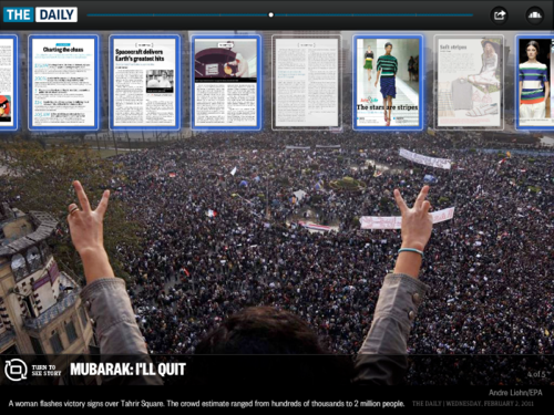
Content aside (a separation that really can’t be made), the form of The Daily is interesting as it does try to take advantage of the iPad’s multimedia experience. It incorporates not just text but full-color photographs, video, and audio. Switching your iPad from portrait to landscape takes you from the text of a story to accompanying photos – a nice touch, perhaps, if you aren’t one of those people who’ve cursed the loss of the functionality of the auto-lock button.
You can “flip” through the stories and images and can also use a slider at the top of each page – a visual browser – to find different stories and new pages. This morning, the app’s new “carousel” feature was touted as a new way to navigate and discover news. What I discovered instead: that feature seems to be the place where the newspaper’s ads are displayed.

You can share many (but not all) of the stories from the app to Facebook or Twitter or via email. Recipients will receive a link to that page, which they’ll be able to view even without a subscription. The articles also allow you to comment, with both the written and spoken word. The latter is an interesting if not odd feature. Perhaps the future of the letter to the editor involves angry voice recordings rather than typed missives.

There are a few irritating usability issues. When you log in to Twitter, for example, the iPad keyboard covers the “post” button. More annoying – other than the table of contents and the carousel, I found navigation through “the news” to be more difficult than serendipitous. There is no “back” button. There is no search. There are no archives.
The Recurring Subscription
It’s too early to tell how well The Daily will take off, of course, and it may be a little unfair to judge a newspaper’s content and form based on just the first issue. But barring any major improvements to both, I don’t think I’ll subscribe when my first two weeks are up (complimentary, thanks to an agreement with Verizon).
It’s not that I’m opposed to subscribing to an online newspaper. I’d pay for a good iPad newspaper. But right now, that’s not what The Daily offers.


