Google has been busy adding features to its BigQuery service in the six weeks since it became available. There are new visualization dashboards, the ability to process more concurrent queries and additional commands. Clearly, Google is trying to make this a go-to service for ad hoc data processing.
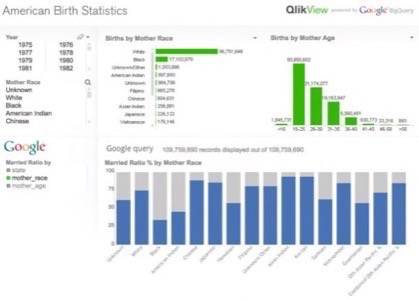
Let’s look at the more notable new features. First is the ability to bring in up to 20 different data sources and run queries on them concurrently, as long as you’re only crunching up to 200GB of data in that one pass. What this enables is a lot more analysis, and two vendors (QlikView and Bime) have already stepped up to provide more visualizations. Take a look at this infographic from QlikView first, which interactively examines American birth statistics from more than 100 million public records dating from 1969 onwards. You can click on the various query parameters, such as being able to view all California births or the ratio of married to unmarried women by their age, and in seconds, you’ll see the display. You could use this to find the answers to such questions as “What’s the average age of a mother in New York vs. in California?” (graphic)
Bime is the other vendor working with Google, and they’ve built a slick UI on top of the Google BigQuery platform that allows users to slice and dice 432 million rows of business data along with the birth dataset, too. There is no hard-coded SQL syntax, and it is also simple to explore the relationships involved in these huge data collections.
You don’t have to be a Big Company to use BigQuery, and Google makes it easy to get started with smaller datasets for free, as we mentioned in our May article. Like many other SaaS and PaaS-based tools, all you need is a Web browser. Check out Google’s discussion group for more of the latest enhancements to BigQuery.