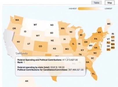
If you’re a lobbyist / advocate, conspiracy theorist or Freakonomics fan, then you’ll love DataMasher. The map-based mash up site just took the Sunlight Foundation’s $10,000 grand prize in the Apps for America 2: The Data.gov Challenge. DataMasher offers users with no programming experience a chance to compare government data sets on a state-by-state basis. The tool is just one of the 3rd party mash ups using Data.gov’s federal government information.

While the last Apps for America challenge focused on Congressional tracking, this new challenge encouraged participants to use Data.gov’s raw machine-readable data. Developers pulled stats from a slew of Federal agencies including the Bureau of Justice, the Bureau of Transportation and the Agency for Healthcare Research and Quality. Although this may seem like an easy feat, a number of government and semi-public agencies have been criticized for refusing to standardize public data. This recent Apps for America challenge is meant to encourage government transparency on all levels for the purpose of creating new citizen-driven solutions. Below are the winners of the challenge:
First Place: DataMasher: This site offers an easy-to-use interface that allows regular citizens to combine and mix data sets without any programming knowledge. From here, data is displayed on a State-by-State basis in map format. Compare cancer hot spots to CO2 emissions, SAT scores to crime rates and even political contributions to State spending.

Second Place: Gov Pulse: This application allows users to browse the Federal Register and create feeds on the most important proposals and information. Users can browse the latest government-related notices, respond to regulatory amendments and comment on everything from endangered species to homeland security.
Third Place: This We Know: This application gives you government-related info based on your zip code. It offers information on the number of factories within a 7 mile radius, the number of pounds of pollutants released, violent crime rates, cancer rates and related bills in Congress. This would actually be a great tool for environmental health advocates looking to make the connection between cancer hot spots and chemical pollutants.
Best Data Visualization: Quakespotter: This site creates a 3d visualization of earthquakes and matches it to data taken from those areas on Twitter.
For a complete list of entries visit the Sunlight Labs contest page.


