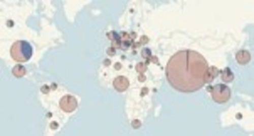
Facebook hit 500 million users this week, but where do they all live? If Facebook were a country, it would be the third most populous in the world – but it’s not a country. Those 500 million people (give or take a few fake profiles, right?) all live in actual countries, where Facebook is used to a greater or lesser degree.

Ross Perez is a Data Analyst at data visualization company Tableau. When the UK Guardian data blog posted numbers of Facebook user numbers country-by-country this week (including from longtime number tracker Nick Burcher) Perez thought those numbers would look good in a Tableau visualization. And indeed they do.
Perez, who is part of the marketing team at Tableau, said it took him about an hour to put this visualization together. Tableau aims to be to data visualization what Blogger was to blogging or YouTube to video publishing.
RSS readers can click here to see the interactive maps.
I think it’s fascinating to think about the relative sizes and market penetrations of various countries. In case you were wondering, the countries with the highest percentage of people using Facebook are Hong Kong, Canada, the UK and then the United States. Who’s most into Facebook in South America? Chileans, at 41%.
Not all countries are included. China, for example, doesn’t appear on the map. The giant social network hasn’t gained a whole lot of traction there, due to language, culture, marketing effort, local competition and probably most of all – government suppression of access to the site. (See this discussion on Quora for more perspective.)
For those countries where numbers are available, though. This is a pretty cool way to look at the data. Poke it a few times, it really is interactive.


