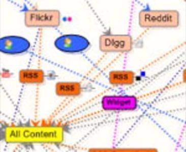
Our attention is stretched so thin these days that there are times when I have actually tried to register for what I thought was a new service only to realize later that I already had an account — it just got lost in the shuffle. With so many new web sites and services vying for our attention it is easy to feel the effects of social media fatigue. Andrew Shuttleworth, a social media junky living in Japan, thought it might be helpful to try to map his social media usage. The result is a staggering view of how information we put on the web flows.

Using Mind Manager flow charting software, Shuttleworth created a diagram detailing how information flows through the social networking and media sites that he uses. Shuttleworth told us that he created the map because he was struggling to figure out how to best manage and share his social media. “I surprised myself,” he said. “It is amazingly complex. Although your average user will only be using a small number of services, they will still face the same issues in terms of how services link together and which services are worthwhile to use and which are not.”
Below is a copy of the map Shuttleworth came up with (click on the image for a full sized version):

Shuttleworth’s diagram is probably not an uncommon view of information flow for many readers of this blog. And it’s still not done: the map has a large “to-do” section.
To begin creating the map, Shuttleworth broke his online information flow up into twelve categories, events, text content, videos, photos, microblog content, bookmarks, web sites viewed, software used, lifecasting, location, comments, and blogroll. He also has a similar tree for content that originates on a mobile phone. That’s a heck of a lot of things pulling at Shuttleworth’s attention, but I’m willing to bet that it’s a familiar situation for many of us.
The growing importance of attention is something we’ve often written about on this blog (see Alex Iskold’s excellent overview of the attention economy), and there are a number of different approaches to how to deal with it. In the social media space, one of the approaches that is currently gaining steam, especially in the area of social networking, is data portability.
Data portability will allow users to theoretically mashup and interact with all of their social media information from a single place. While that won’t cut down the number of sites and services tugging at our attention, it does promise to make managing that attention vastly easier. Shuttleworth points to services like Profilactic and Plaxo Pulse that are already attempting to bring our online social lives under a single umbrella.
“Overall, it was very helpful to see an overview of how my online information flows. I managed to get rid of some redundant channels along the way and am in a good position to consolidate and make sensible decisions about how to share information from now on,” writes Shuttleworth on his blog, saying that the map also demonstrated how complex our online lives are.
Shuttleworth released the map on his blog as a pdf, png (graphic), mmap, or xmmap xml file, for anyone wishing to explore it further or use it as a basis for creating their own online information flow chart.


