Guest author Gal Nachum is an entrepreuner, 5X founder and startup advisor.
If the holy grail of mobile and consumer online service could be summarized in one word, it would be “virality.”
The great thing about virality, as the measure of how fast or far a product or service gets shared, is that it’s essentially a by-product—the result of a user’s normal interaction with a product or service. The user simply uses the product as he or she normally would and virality happens as a consequence.
Virality can be the object of obsession for some startups. Many invest in initiatives designed to encourage viral growth, believing that once they reach positive virality, they have made it. At the least, some feel it’s an early-stage quantitative predictor of a service’s potential growth.
There’s something to this mindset. A weekly viral growth of 1.2 is equivalent to annual growth factor of over 65,000. Moreover, virality is usually fast, effective and, last but not least, cheap. With user acquisition costs on the rise, it is no wonder that app developers and other consumer services covet positive virality.
Really understanding virality involves some math, which could be one reason it’s usually not fully understood or harnessed. To demystify this facet of modern business, let’s take a real-life view of virality and go beyond the classical viral growth formula.
Viral vs. Non-Viral Growth
The simplest method to assess growth is to set a metric and use it as a comparison, such as the number of users, over subsequent periods of time. If we have an average growth of 10% week-over-week, we may be tempted to conclude that this is sustainable viral growth.
Unfortunately, it’s not so simple.
When trying to measure and quantify virality, it’s important to first differentiate between viral and non-viral growth. Various events—such as an incidental blogger review—can create a spike of growth. But that’s not viral, and the attention won’t grow along with the service. This is particularly important in the beginning, when overall numbers are low, since one-off events that temporarily cast attention can overshadow the entire viral activity.
It’s crucial to make sure you don’t confuse viral and non-viral growth, otherwise, your assessments will be off. This, unfortunately, is much easier said than done.
A common strategy is to focus on “traceable virality”—which is when a new user acquisition can be traced back to a specific person or activity that led to it. For instance, when Alice sends Bob a link to a cute YouTube video, and Bob clicks on that link, YouTube knows that Bob was acquired because of viral activity, not from a generic review about YouTube. With a few more steps, YouTube can link Bob back to Alice and credit Alice’s viral score with the acquisition.
Looking at traceable virality allows us to filter out incidental activity and measure only the genuinely viral (and sustainable) component of the service’s growth. But there are limitations.
It’s hard to distinguish between a user acquired via a product review and a user that heard about the service verbally from a friend. In such cases, instead of calculating virality from the bottom up using traceable virality, the best approach would be to filter out non-viral activity. There are plenty of web-based services that can help you closely monitor referral data. You can also establish quiet periods for marketing activity, so they don’t compromise your results.
There’s a down side, though: Both approaches aren’t so applicable to mobile services. Unfortunately, neither the Apple Appstore nor Google Play provide referral data or acquisition analytics.
The Classical Viral Model And Mathematical Formula
We can get more precise if we drill down into the details. Virality is a mathematical model, after all. The following digs further into the formula for assessment.
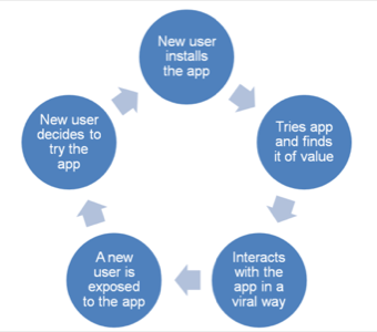
The model assumes something like the following: In each time period we have a certain number of new users that, shortly after joining the service and due to the viral nature of the service, generate additional users for the service, which then become the new users of the following period. This classical viral loop is depicted in Chart 1.
The average number of new users who joined the service in the next period (as a result of the activity of a single user in the current period) is the definition of the famous viral coefficient or K factor. A bit of math based on the above model will yield the following viral growth formula:

Where c is the number of cycles, time periods or generations; U(c) is the number of users at generation c and K is our viral coefficient. The chart below shows how this function behaves for different values of K.
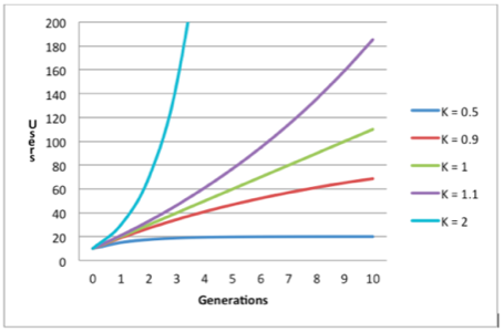
As shown above, values of K below 1 lead to stagnation. When K=1 we have linear growth and when K>1 we have exponential growth. Services with a K factor greater than one are said to have positive virality. A closer look at the chart reveals that the formula is very sensitive to small changes of K and each slight increase has a huge impact. This is the reason that K=1 is linear growth whereas going just to K=1.1 gives a yearly compound growth rate of 1,410. Going to K=1.2 gives a yearly growth rate factor of over 65,000 which means that if you started out with 1,000 users you’ll have over 65 million users in just a year.
A weekly viral growth with K=2 would translate into an unfathomable yearly growth by a factor of 4,503,599,627,370,490 (over 4.5 quadrillion). This is the reason startups make a huge effort to optimize the viral coefficient of their service. Every small increase counts big time.
This formula alone, however, is not very useful as, since we’re usually not interested in the number of users we’ll have N cycles from now. What we want to know is the number of users we’ll have N days or weeks from now. To fix this, we simply replace the number of cycles by the time – t, divided by the cycle time – Ct. This gives us the viral growth formula in its most commonly known form:

This classical viral growth formula is driven by two parameters, the viral coefficient – K and the cycle time – Ct. We have just discussed the importance of the value of the viral coefficient. The importance of the cycle time, however, is many times overlooked. The chart below describes growth based on the above formula for various combinations of K and Ct. We are starting with K=2 and Ct=12 and then increase each parameter by 50% and 100%. This gets us to K=3 and K=4 when increasing the viral coefficient and to Ct=8 and Ct=6 when making the cycle time shorter.
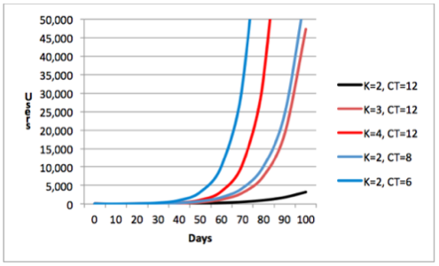
As you can see, the impact of the cycle time is even stronger than that of the viral coefficient. That means that, theoretically, if your team can either increase the viral coefficient by a factor of 2 or reduce the cycle time by a factor of 2—with the exact same effort—then reducing the cycle time is the way to go.
Beyond the Classical Model
Cycle time is the most important parameter of the viral growth formula, but it’s also the least understood. How do we measure the cycle time of a given service, and what exactly does it mean? To understand it, we need to go back to our model.
If grouping users into “generations” may have seemed artificial to you, you’re absolutely correct. It is an artificial construct we needed to make our model work. The framework assumes that the entire viral activity takes place in a short span of time following the moment the user joins the service. The length of that virality period is our cycle time. Real-life virality, however, does not behave this way.
Different services have different virality patterns. One of the most common patterns is that of a decay function. This means that there’s a strong viral activity shortly after users joins the service, and there’s less viral activity as time passes. Other patterns may be influenced by periodic and seasonal fluctuations—such as weekends, holidays, vacation time—external events like major sports games or world events, and many other factors that are hard to foresee.
To predict growth accurately, we would like to understand how the viral coefficient evolves over time. Using traceable virality we can count how many users in average each user generates at the first, second … and Nth day after joining the service. Such a chart might look as follows:
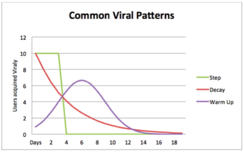
The Step line is the viral pattern on which our original model is built. This is usually not the case. The Decay line is the pattern of a decaying viral activity. A decaying viral pattern can be approximated using the classical model pretty effectively and the cycle time is derived by the time period in which most of the viral effect has been attained. The Warm Up line shows another common scenario where users need a “warming up” period before they start being viral.
Following the warming up period, users behave in a manner very similar to the decay pattern, which results in a pattern resembling a bell curve. If the bell is steep, then it too can be approximated by a step function, and the classical model can be used. The cycle time in this case will roughly be the time it took to reach the peak of the curve. When the viral pattern cannot be approximated by a step function, a dedicated growth model and formula need to be developed.
Understanding the viral pattern will help us understand whether we can or cannot use the classical viral formula and if so which cycle time to use.
The Bottom Line
Virality is a great early stage indicator to the potential growth of a service. It can be measured at the very early stages of a service, and when used correctly, it can predict how fast the service will scale.
When measuring virality early on, it’s important to focus on traceable virality. Analyzing the viral pattern is critical in order to understand whether the classical viral growth formula is applicable, and to determine its parameters. For many services, the classical viral growth formula is not applicable and a dedicated formula needs to be developed in order to predict growth rates.
Lead photo courtesy of Shutterstock; all others courtesy of Gal Nachum


