Twitter has just launched its first official iPad application, and the reviews so far have been glowing. The new app offers a few notable features, such as panes for interacting with content within a stream, media which displays inline without slowing you down and gesture support for common Twitter actions.

What stands out the most about this new application is not a summary of its features, however. It’s how the app fits into this growing trend that positions the iPad as the go-to device for consuming streams. With its touchscreen interface, the Apple tablet is ideal for both viewing and interacting with flows of information – not just tweets, but also Facebook status updates, news, RSS feeds, photos and more.
Twitter for iPad: The Good
With the official Twitter for iPad application, the process for interacting with Twitter’s fast-updating stream of content has been addressed through the use of panes. You tap on tweets to open a pane on the right where you can see the posted video or photo, or, as is often the case on Twitter, the Web page being linked to via someone’s status update. There, within this new pane, the content loads.
But the pane can also be pushed off slightly to the side with a swiping motion so that you can continue to browse through the stream of tweets on the left. By the time the content loads on the right (Twitter’s blog post puts it well: “let’s be honest, video is great but sometimes it can take some time to load”), you’re ready to skim the news, watch the video, etc. and then you can move on to the tweet you’ve already queued up to take its place.
Initially, you’ll have to figure out how this particular interaction works, but after a minute or two, it will be swipe, swipe, swipe, swipe and you’ll quickly become addicted to the flow.

Twitter for iPad: The Bad
The other interactions, unfortunately – like the pinch to view author details or using two fingers to pull down on a tweet and see the entire conversation thread – are slightly less intuitive. Maybe more than slightly, to be honest. There’s a learning curve.
For example, you first have to learn how to “properly” tap a tweet. Tap on the tweet itself and you see the right-side pane and its associated content (like the photo, video, news item or even a stream of the hashtag mentioned). Tap accidentally on an @mention within the tweet, however, and you’ll end up seeing that person’s profile information instead, displayed below the tweet in the right-side pane, and not the associated content. This can get a bit confusing for the new user, and it can easily slow you down too, because you have to focus on where to tap.
The two-finger pull-down has to be done slowly or it flips up like a window shade whose cord you just yanked and let go. The pinch a tweet – well, let’s be honest here – someone is going to have to release a YouTube instruction video for that gesture. (Oh, thank you.)
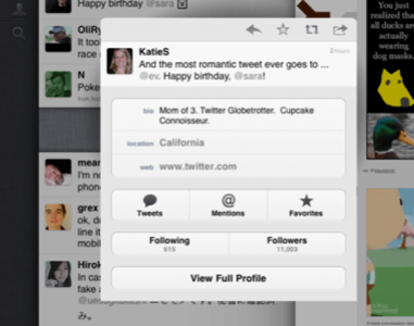
In other words, Twitter for iPad is not perfect. (And no, it didn’t just “kill” all the other Twitter applications, the Twitter website, or anything else). It’s a good enough app, but it may not be for you.
Beyond the Twitter App: Stream Consumption is the New iPad Trend
But these days, there are plenty of other applications to choose from. We’ve previously been fans of Twitterific for iPad, but it wasn’t exactly ground-breaking in its design. However, other startups, including Pulse, Flipboard, Entertainment Weekly’s Must List, ABC News, Reeder and even some interactive iPad magazines like Wired, certainly are. Wired and EW’s Must List each present new visions for magazine content on the iPad, both in long form and short. Pulse and Reeder are gorgeous, interactive news readers, and while ABC News may be a bit hokey for you, with its Google Earth-esque spinning globe interface, it’s definitely doing something different. Whether its interface ends up winning or losing in the long run is almost besides the point – the point is that new interfaces are possible now, thanks to the iPad.
At the top of the heap today, though, is Flipboard, a social news reading application we recently called “one of the best iPad apps available.” In reality, that’s selling it a bit short. It’s one of the best apps available, period, iPad or not. In comparison with Twitter for iPad, the app clearly excels. There’s no learning curve – the entire process is 100% intuitive. And any app that isn’t needs to go back to the drawing board and re-evaluate whether its special “tweaks” really work.
Twitter for iPad, despite its many innovations, involves several minutes of practice to get it right. You couldn’t hand it over to Grandma without a how-to class either. And that’s not Grandma’s fault – she readily mastered using iPad’s built-in photo gallery application despite never owning or using a computer. We would argue that good design makes new interactions simple and intuitive – you don’t think, don’t don’t have to practice and you certainly don’t have to watch a video to figure out how you “pinch a tweet.” You just swipe, tap, pinch, swipe, and all somewhat mindlessly. Twitter for iPad is a good start and is sure to be a hit among early adopters, and there’s no arguing it showcases some innovative ideas, but it’s not a home run just yet.


