Today at the #letsfly conference, Twitter announced big changes to its user interface. In the new design, Twitter completely changes the homescreen layout. Now @ messaging is called “connect,” hashtags # are “discover,” and the profile feature is just called Me. Direct messages are nowhere to be found on the homescreen; they are now located in the “Me” profile. The update is available now on iPhone and Android, and the update for Twitter.com will rollout over the next few weeks. Twitter for iPad has not changed. Our resident developer, Jared Smith, tests out the updated Twitter iPhone app. Take a look after the jump.

Jared says that the new Twitter is “vastly different,” and notes that it brings the activity stream right into the app itself, and now separates @ message communication into “interactions” and “mentions.” Now “mentions” does not include new followers, people who favorite your tweets. It is only about people who directly @ mention you. Everything else gets dumped into the “interactions” feature. For those who don’t want to sift through the two to pick out actual conversation-worthy @ mentions and passerby-type mentions, this could be helpful. On the flip side, it might just make for unnecessary back-and-forth between the two spaces, which ultimately could slow down the user experience instead of speeding it up. Twitter has also de-emphasized the direct messages feature by pushing it into the “Me” tab.

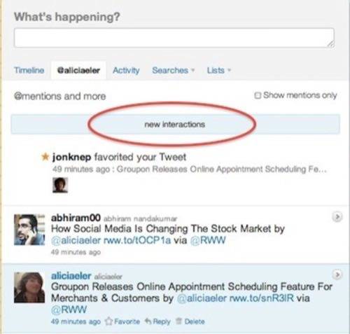
Twitter users may have already noticed the subtle “interactions” notice under the @ mentions tab on Twitter.com. Anytime a user has new @ messages, Twitter says it they have “new interactions” waiting.

In addition to the usual “share a link” tweet button and the “follow on Twitter” button, Twitter has added new buttons for hashtags and mentions.
This announcement comes on the heels of Facebook’s Subscribe plugin for websites, which went live today. This plugin makes Facebook more Twitter-like, save for the fact that a Facebook user’s public post will still go to the user’s Facebook friends, making it less useful for public figures, journalists, artists and politicians who want to create a Twitter-like feed of niche interest-related posts that their Facebook friends might not care about.
Twitter made its tweets embeddable, too, which is a huge step up – previously users had to either just do a screengrab of the tweet, or try a Twitter curation tool like Storify. For directions on embedding a tweet, go here.
Twitter wants to position hashtags as more than just symbols for trending topics. It has changed the language to try and make it feel more like a discovery tool. The menu bar now says #Discover. Of course it does – what social space doesn’t want to be the source for discovering new, awe-inspiring, shocking or just plain cool information?
Where Will You Go To Discover New Information?
StumbleUpon bills itself as a discovery engine. With its new visually oriented, topic-focused redesign, StumbleUpon’s user profiles now show all posts the user has liked, commented on and shared in the user profile. Still, the aim is to discover more relevant content through the StumbleBar.
Google added social SEO to its juice by dropping the +1 buttons next to every link in Google search. This makes it easier to share links right to the Google+ profile. Facebook’s news feed aims to offer users more relevant content, ultimately hoping to show them new stuff they would have otherwise missed.


