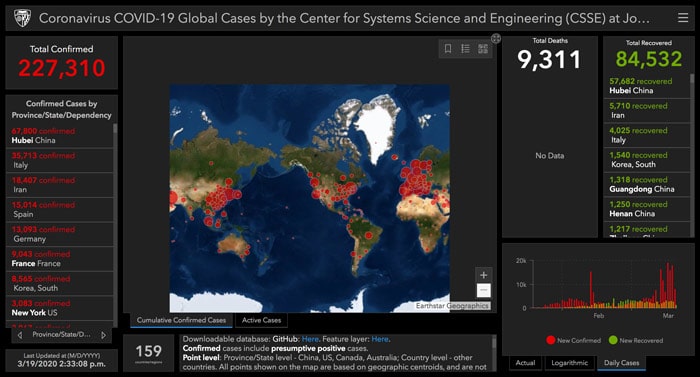
Many people around the world want to keep an eye on the COVID-19 pandemic. How many deaths? How many cases? Recoveries? Deaths? Which cities? Well now they can do that with ease as the Center for Systems Science and Engineering has built a coronavirus tracker dashboard for you to use. This tracks cases from around the world using data from WHO (World Health Organisation).
If you don’t want to have this on your laptop all the time, you don’t have to worry. There is a mobile version for your smartphone.
This coronavirus tracker dashboard shows the amount of confirmed cases, recoveries and deaths. Something you may want to note is that the amount of confirmed cases includes the presumptive positive cases as well.
How it’s displayed

The tool displays a map to show you where the cases have been confirmed. This is shown through dots being placed on the certain area where there are cases. The size of these dots depends on the amount of cases that area has. For example, an area with more than 50,000 – 100,000 cases will have the largest dot but an area with more than 17,000 – 50,000 will have a smaller dot.
Any customisation?
Additionally, you can change the basemap. Currently, there are 16 to choose from which seems like a pretty good range. These basemaps include GB Cartographic, GB Topographic, GB Light Grey, GB Background, GB Dark Grey, Imagery, Imagery Hybrid, Streets, Topographic, Navigation, Streets (Night), Terrain with Labels, Light Gray Canvas, Dark Gray Canvas, Oceans, and OpenStreetMap.
Also on the coronavirus tracker dashboard is a graph of cases. There are three in total for you to look at: Actual, Logarithmic and Daily Cases. The ‘Actual’ and the ‘Logarithmic’ graphs shows the amount of cases in Mainland China, cases in other locations and the total amount of people recovered over February and this month. The ‘Daily Cases’ graph shows the newly confirmed and newly recovered cases – pretty self-explanatory.
Click this link to get to the coronavirus tracker.


