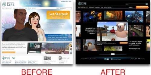
Sometimes, no matter how compelling your service, it all comes down to the basics. When the buzz begins to die down, you have to resort to compelling content to sell your site and services. This goes for every site. Even Second Life, who recently discovered that their existing home page design wasn’t doing the site justice. Now, after testing a new design for their landing page, they’re going live with a new design and the Lindens are hoping that it will continue to motivate more residents to join the Second Life community.

This year was a rocky one for virtual worlds. They continued to move out of the spotlight as media darlings and found, instead, more taciturn media and struggling communities. Second Life dealt with stagnant numbers and Google decided to pull the plug on Lively.
Now, the shot in the arm for Second Life seems to be as simple as a redesign that emphasizes the benefits of the community to would-be users and encourages them to register to try the service for themselves. Plus, they’ve thrown some Cooliris-like panning interactivity in there for good measure.

After testing the new design for one week, Linden Lab is convinced the new design is doing a better job than its current home page:
“Over the past week we’ve been comparing the core metrics (traffic, registrations, logins, economic and inworld activity) of the new page with our existing new user home page. The data is encouraging: the new design performed better in almost all aspects, so we are moving full steam ahead with launching the redesigned page.”
And so it seems that finding new life – or a Second Life – could be as simple as communicating more effectively. It will be interesting to see if this return to basics makes 2009 a better year for Linden Lab and the residents of its community.


