Last month, we wrote about a well-designed but overbuilt and slightly confusing microblogging site that had elements of Twitter, Facebook and Google Reader.

Miio had some nifty features and an inviting design, but we thought it was trying too hard to be everything. Apparently users agreed, and today Miio revealed a slimmed-down redesign that’s easier to digest.
So what is Miio?
Yesterday I was reminiscing with one of my roommates about earlier days of the Web, remembering the good old days of Napster and AOL chat rooms. At the time, I thought making random friends and having conversations with strangers all over the world was one of the primary functions of the Internet.
Now, meeting strangers over the Web is largely the domain of dating sites (with the exception of Couchsurfing.com). There are lots of parts of Facebook where users interact with strangers – groups, fan pages, Facebook Questions, and on the profile pages of their common friends.
But people don’t use Facebook to meet strangers. You already have hundreds of people to interact with just through your real-world social contacts. What ever happened to Internet friends?
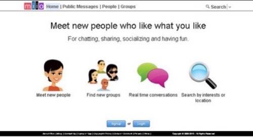
This is Miio’s value proposition. “Meet new people who like what you like” the site says, and then: “Meet new people,” “find new groups,” “real time conversations” and “search by interests or location.”
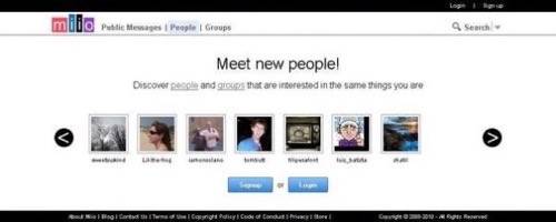
The Miio homepage before and after the redesign.


The changes
The ability to publish RSS feeds to Miio, which a user could see in her timeline (the stream of updates and notifications) was one of the things Miio tossed. The company simply asked users what they thought of the feature, and a majority said they didn’t use it.
Miio hasn’t gotten rid of robots entirely – you can still set up keyword alerts, which is cool. These alerts can be filtered by content type and delivered to the timeline, email or SMS. The example used is a keyword alert for “Lakers” set to display only photos and videos in the user’s timeline.
It looks like the other big change is the homepage. Also the Miio team slightly tweaked the way the groups, public messages and search pages are laid out basically by putting buttons in more intuitive places.
The rub
We liked Miio the first time around, and we still like it. The group conversations are fun and it’s tough to beat as a microblogging service with easily embeddable photo and video and up to 2,000 characters of text.
Miio is still broadcasting some confusing signals – we’re still trying to understand why separate tabs are needed for “messages to me,” “replies to mine” as well as “message sent” and “replies sent.”
But the site has two real flaws. First, the network effect – needing to have enough users adding content to give it value – is in place. No problem, this is the case with all young social networks.
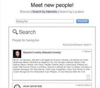
The other hurdle is bigger. Miio wants you to find new people to interact with, but expects you to use some pretty flimsy connections to discover friends. You set your relationship status when registering and fill out your profile with a list of keywords that are supposed to be your interests.

This limited picture is the major way for users to find people who “like what you like.” Perhaps an expanded profile with sections for music, movies and books could drive more connections between people.
Then again, such broad interests are kind of analogous to those AOL chat rooms. There is already a group for fans of naps.
What do you think of the new Miio?


