On Tuesday, Microsoft continued its drive to remake its entire product line leveraging the Windows 8-style user experience, formerly known as “Metro.” The lastest product to get theMetro makeover: SkyDrive.
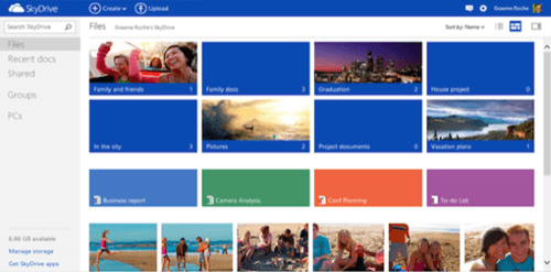
The redesign of Microsoft’s cloud storage system replaces a somewhat stodgy list of files with the Windows 8-style interface using improved typograhphy and colorful interactive “live tiles.” (Due to a trademark dispute, Microsoft has quietly dropped the use of the word “Metro,” but has yet to replace it with an official moniker. “Modern UI” seems to be a leading candidate.)
Ever since Microsoft adopted the extension of the Swiss typographic style within the Zune user interface, the company has slowly extended the concept into other businesses. Wikipedia may credit MSN’s redesign as Metro-influenced, but the design approach’s real coming-out party was the introduction of Windows 8. David Chen, a UX designer at AJA Creative Design, has characterized 2005’s Apple OS X interface as a UI to interact with. Metro, Chen believes, is a UI “to keep in touch”.
“Metro will drive the new magic across all of our user experiences,” Microsoft chief executive Steve Ballmer said in his January speech at the Consumer Electronics Show (CES) in Las Vegas. He described it as “fast, fluid, dynamic, across all the Microsoft experiences,” and noted that Metro-style elements have been included to the Xbox, Windows Phone, and Windows 8.
“So in 2012, what’s next? Metro, Metro, Metro,” Ballmer said, slapping host Ryan Seacrest on the leg.
At the end of July, Microsoft applied the Metro design scheme to its new Outlook.com email service. Also on Tuesday, Microsoft said that Outlook.com had attracted a total of ten million users.
Microsoft appears to be almost finished updating its online services with the new look and feel. At the top of each page of Microsoft’s services, Microsoft includes a menu, allowing users to navigate to SkyDrive, Hotmail, Outlook.com, Hotmail Calendar, Messenger and the People contact page. Of those, Microsoft has applied the “Metro” interface to Outlook.com, as well as the related People tab. But the Calendar tab still defaults to a Hotmail view, meaning that that’s probably next on the list. But Microsoft declined to confirm its plans: “We don’t have anything to share on the timing of Calendar, but it’s something the team is looking at as part of an upcoming release,” a Microsoft spokeswoman said in an email.
SkyDrive Upgrade
Although the UI is the most obvious change to SkyDrive page, the services also got a functional update.

Microsoft added an instant-search feature to SkyDrive – letting users search for files anywhere within the SkyDrive interface – as well as Office documents written with Excel, PowerPoint or Word. Frequently-used options are now at the top of the page, including the ability to Create documents in Office Web Apps. (Users can opt in to the new Office Web Apps or use the traditional version.) Naturally, users can share, embed and upload files and folders, as before.
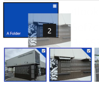
Some minor conveniences have also been added: drag and drop, as well as a new default behavior of sorting photos from newest to oldest using HTML5. And, last but not least – Microsoft removed the beta tag, giving SkyDrive full commercial product status.

App Improvements
Microsoft also promised a SkyDrive app for Android. When it becomes available in a weeks, it will help make SkyDrive and other Microsoft services a little less exclusive to Windows Phone.
Performance improvements are also on tap for both Apple OS X and the main Windows desktop. Microsoft offers new SkyDrive users 7GB of free storage, accessible via the Web interface or a dedicated app that runs on iOS or the Windows desktop.
SkyDrive automatically sync the contents of folders, looking for incremental changes. The problem, Microsoft said, had been that those changes would often suck up the PC’s resources. To fix that, Microsoft cut the amount of time needed to look for the updated files as how long SkyDrive takes to upload photos
But Microsoft still hasn’t quite been able to allow SkyDrive users to specify where files are saved – that’s coming in a future update, Microsoft promises.
Finally, Microsoft said SkyDrive is no longer restricts which types of files apps can upload, and Microsoft added a file picker to open and save files.
“Metro” in SkyDrive
Designer and creative consulatant Stephane Massey has written a nice overview of the design principles governing “Metro”, including the language and principles governing its design:
“Information is the star of the show. If it makes sense to express information with typography do it – otherwise don’t force it.”
“Typography can be beautiful when incorporated with design skills,” Massey added. “This is exactly the thing that makes typography stand out from other media – it’s not typography for the sake of typography but typography as a particularly efficient and flexible tool to convey structured information.”
Within the SkyDrive page, files are color-coded by type – green for Excel spreadsheets, blue for Word files, orange for PowerPoint presentations. When photos are displayed, the photo itself replaces the file icon, as you might expect.
So is there any Microsoft property that won’t receive a “Metro” update? It doesn’t look like it. The company is clearly trying to give its software and services a consistent look and feel for branding purposes as well as to give users a consistent interface.


