Yvo Schaap is a 23 year old student in the Netherlands who spends at least some of his time developing ways to visualize information. More specifically, he has been working with the open Twitter API and generating some amazing informatics visuals from the resulting output. Plus, the tools and methods he uses to get the visuals is almost a lesson in new media artistry.

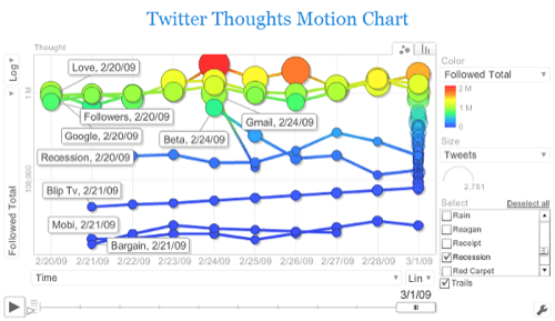
Let’s look at TwitterThoughts first. Here, Yvo takes a live Twitter API stream, parses it through a Yahoo! Pipes process, dumps the result in a giant MySQL database, then he uses the Google Visualization API to render the output as an interactive Flash chart. A lot of the heavy lifting here is done in the cloud, in freely available utilities. And the result? Let’s say Edward Tufte would feel comfortable putting it in his book, Envisioning Information.

Keep in mind that this is just a screenshot of a live Flash application. You have a number of variables to toy with on each axis, plus full control over the timeline slider. Also, you have two separate views. Overall, we spent a lot of time just clicking on data points, adjusting sliders, and watching progressions. It’s endlessly fascinating.
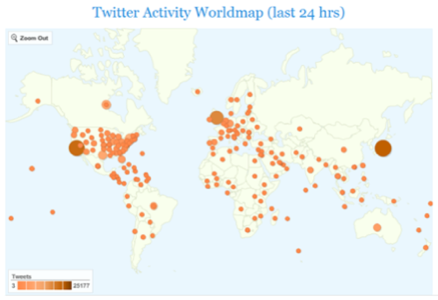
Yvo also generates some other visuals from the data he extracts from the Twitter API, such as the World Twitter Map. In this mashup, different areas have different sized bubbles to indicate their level of activity on Twitter. We couldn’t help but notice that the map has a ‘zoom out’ button but no visible way of zooming in.

Overall, we believe Yvo is doing some groundbreaking work here and fully leveraging the potential of public information management tools such as Pipes and the Google Visualization API. Bravo Yvo! We can’t wait to see what you have in store for us next.


