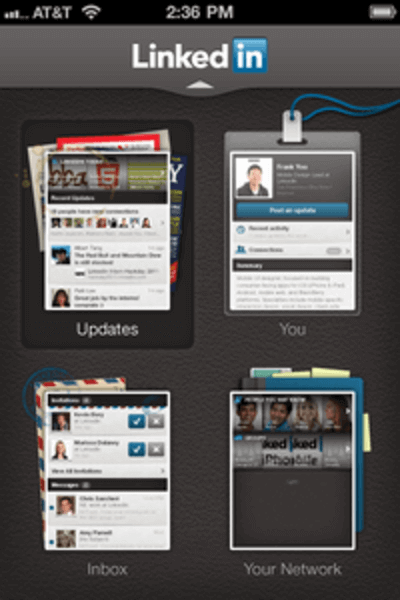
LinkedIn has launched a major overhaul of its mobile apps for iPhone and Android, as well as a brand new HTML5 mobile Web app. It’s a complete redesign, forgoing the larger grid of menu options in favor of four key sections: Updates, You, Inbox, and Your Network. The previous menu had too many choices, and some of the titles weren’t intuitive. What’s the difference between “News” and “Buzz?” Why are “Connections,” “Reconnect” and “Invitations” all separate buttons? The new screen simplifies the navigation options.

The update also adds new features. This release addresses what LinkedIn reports is “the #1 most requested feature” from its members, allowing users to access LinkedIn Groups from the native apps (though not from the Web app). The app has also been rearranged to open by displaying the Updates stream, which LinkedIn says is “one of the most frequently used areas of the current mobile app.”
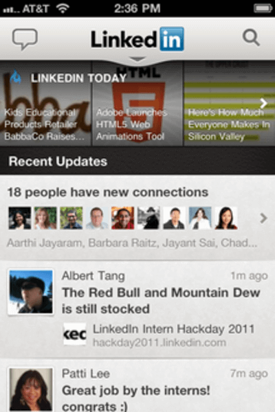
The new navigation options make sense, although people used to a dedicated feed of news articles separate from member updates will now find them all on one screen. On the native apps, the Updates screen displays news from LinkedIn Today horizontally across the top, with updates from connections in a vertical feed underneath. The HTML5 version lacks the LinkedIn Today stories. Invitations make sense rolled into the inbox screen, and existing connections make sense as part of the “You” screen. Groups and People You May Know don’t seem like an ideal fit for one screen, but there’s some logic to it, as Groups are a way of making new connections. Groups are a new and highly requested feature in the native apps, but the Web app doesn’t have them.
Design Choices
The new app has some major aesthetic changes. Whereas the previous mobile apps had basic, unobtrusive design, allowing users to choose color themes (some of which were garish), this new app has some serious textures. The background texture, reminiscent of the ubiquitous linen visible all over Apple’s iOS and Lion operating systems, is a rich, dark leather, which frankly looks sort of goofy under the chrome on the rest of the interface. The menus also rely on a lot of white text on top of darkened, non-uniform graphical backgrounds. It’s not the easiest interface to read, compared to the relatively blank one the app had before.
The four main menu options have some heavy graphics underneath. The Updates tab is a pile of papers and magazines, the You tab is encased within a lanyard ID badge, the Inbox has a stamped letter underneath, and the Your Network tab has what looks like a notebook full of sticky notes. These graphics certainly make the selections stand out from one another, whereas the spartan icons of the previous version were hard to distinguish, but each section of this app has a distinct design, which feels overwhelming in a different way than the previous six- or nine-option menu did (Android and iPhone, respectively).
The Big Picture
The update does contain some undeniable improvements besides the slimmed-down main menu. The LinkedIn mobile team promises speed increases of between two and ten times across all features. The HTML5 mobile Web version is also a step toward universal accessibility across platforms. We’ve called HTML5 one of the top trends of 2011, and LinkedIn has joined the party by building this Web app in addition to its native Android and iOS apps. Today’s update places greater emphasis on LinkedIn’s most mobile features than did the previous versions, and that’s a welcome change. As far as the aesthetic differences, well, those always take time to settle in.
What do you think of LinkedIn’s new mobile redesign?


