On the day that Windows 7 was generally released in October 2009, Microsoft announced that it was “simplifying” the PC. It was a long awaited, much appreciated response to nearly three years of wrestling with the sea of sloth that was Windows Vista.

My review of Windows 7 was both notorious and, even in hindsight, correct. I called it “Vista without the crap.” For that review, I ran a scientific test which produced this real-world calculation: Windows 7 expedited the Web browsing process for folks who use Web apps and browsers for their full-time work (like myself) by three-and-one-half minutes per hour. That’s 385 hours of productivity regained per year, which is enough time for my company Ingenus to produce one book and rake in a nice heap of cash. I suggested to Microsoft that it use the following slogan: “Use Windows 7, Get Six Weeks of Your Life Back.”
I look at the Consumer Preview of Windows 8 and I fear I may lose those six weeks again.
All through the Windows 7 promotional tour, Microsoft demonstrated the many ways that the new operating system simplified the PC. Product managers and executives gave the following explanation: They watched the way people work in the real world. They realized these people want to take fewer steps to accomplish the things they do most often. Users don’t like to be told what to do, or led into one way of doing things that the designer of the software may prefer. People feel better about their computers when they’re not thinking about them as computers – when they can concentrate either on their work or whatever they may be having fun with. The operating system should say hello, welcome, and then get out of the way.
If these things were all true as recently as 2009, what manner of cataclysm upset the balance of the universe so horrifically as to have made black white, and to replaced Windows 7’s design philosophy with that of the Windows 8 Consumer Preview? As I run through these examples with you, as an exercise, imagine explaining them to your mother.
The Search for Start
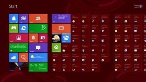
Dividing a smartphone’s small screen into eight or nine tiled blocks, makes sense and makes the phone easier to control. Using the same logic to divide a larger PC screen into dozens of mosaic blocks, does not do either. Does any Web site you’ve ever used, work like this? Or to be more specific, any Web site since 1998?
What makes the Windows 7 Start Menu work well (which I said at the time of its release) was its simple, two-column division: things you typically use on the left, things you typically do on the right. I typically open a Network window to see which computers in my office are functional. I open up documents I’ve been working on recently. And to search for stuff, what could be simpler than simply typing what it is you’re searching for?
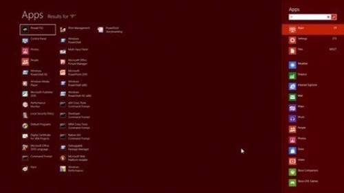
One aspect of Windows 8 design – which was literally explained to me in a positive light using these words – is that you’ll learn how to do something once you’ve discovered it for yourself. It is not obvious from the Windows 8 Start screen that you can still just type something and Windows will search for it. There’s no search control that says that. However, this is still how Start works – you type a character, and search begins.
But in everyday work, you shouldn’t have to go searching through the entire file system for stuff you did just yesterday. Not everything in life requires search, contrary to whatever Google design philosophy Microsoft has commandeered.
Zones Instead of Buttons
When the Start Button premiered in Windows 95 (to the Rolling Stones singing backup, you may recall), it was with the idea of giving the user one obvious place at all times for beginning any task. The most sensible place to put something that will most always be on the screen, at that time, was the lower left corner of the Desktop.
As you may already know by now, in Windows 8, the Desktop is one of two staging grounds for applications, the other one being the “Metro-style” world where the easier, device-like apps will run. So there is no longer any one single place on the screen that will always, or most always, be visible. How does one get to “Start” if she can’t always see it? Microsoft suggests that you might try looking at the keyboard – and indeed, on most PCs made in the last decade, there’s a Windows logo button. (Of course, the Windows logo has changed with Windows 8, but that’s not too confusing – just uninspired.)
With the Consumer Preview, Microsoft addressed this for the first time by adding a zone in the lower left corner that brings up a kind of Start button when you hover the mouse pointer toward that corner (assuming you’re one of those old-fashioned folks who still use a mouse).
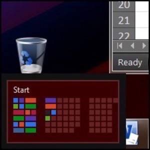
In the Developer Preview, it was difficult to control the Metro-style apps, the new class that uses the WinRT library. When I asked why Metro apps couldn’t share the Taskbar with the other Desktop apps, the response I got was that the Taskbar would not always be on-screen. Why wouldn’t it be on-screen all the time? Because sometimes you’d be running a Metro-style app.
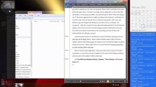
Well, so much for that explanation. If you hover the mouse over the Start zone button, or if you hover it in the upper left corner of the Desktop, you’ll get what amounts to the taskbar for Metro-style apps. Yes, friends, you are now looking (above) at a Desktop with two Taskbars (which calls to mind the lyrical phrase, “And now for something completely different”). Typically, bringing up a Metro app replaces the entire Desktop with the app, in which case, the Desktop gets miniaturized and changes places with the app you just clicked on.
Why is any of this important? Imagine the following situation: You want to play a song. Sounds simple enough, right? Assume you’ve made it through to the Desktop, you’ve opened an Explorer window, and you have a list of your MP3s in front of you. When you double-click on any of these, your Desktop goes away.
Within 20 seconds, the Desktop is replaced by this thing (right). It’s not a list of the music you own – it’s a piece of wallpaper containing some random album covers from music published in the last century. Granted, you’ll be listening to your song now, but you’ll want to return to your work. This is something the former designers at Microsoft (whom I guess were all sacked) used to know: Sometimes you do other things while you work, and sometimes you do more than one thing at a time.

Getting back to your work is a matter of rearranging the screen. First, you click on this wallpaper in order to get the music player controls back. (Ask yourself, on what class of device whose screen is larger than a postage stamp is it absolutely necessary for the music player to consume all the real estate?)
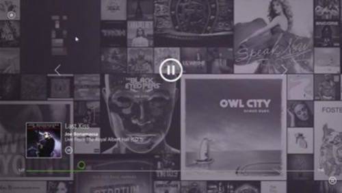
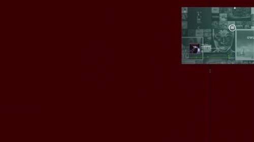
Then you grab the top of the wallpaper as though you were about to rip it off of your screen (above), and drag it to one side or the other of your screen. You’d think the Desktop would come back now, but no. Although you’ve zoned your music player, you now have about 84% completely blank screen. How many of your co-workers do you know who would be freaked out by even a partially blank screen – doesn’t that mean something’s gone wrong? The next step is for you to fill the remainder of the space with the Desktop.
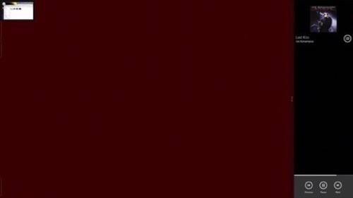
So you point to the upper left corner to bring up the Desktop miniature (above), and click on that. This restores the Desktop to the scary blank space, and now you can continue about your work (below). Now, this is not Windows Media Player we’re looking at – although it’s offered in the Windows 8 Consumer Preview, it’s as a kind of fallback alternative. This Music app, which replaces Media Player as the default, takes up either the rightmost or leftmost 16% (roughly) of the screen. Although the border between the Metro and the Desktop world looks like it includes a handle, in practice, you can only change the app’s relative size to 84%, 100%, or zero.
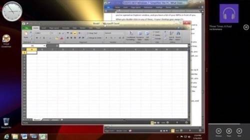
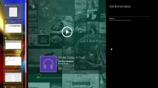
When you size a Metro app to 84%, it reduces the Desktop space to 16%. For the moment, there is no functional reason to do this. Like in the screenshot above, the Desktop doesn’t shrink or partition itself; it just makes itself a big taskbar. In Windows 8, there are quite a few surprisingly detailed procedures for doing things that accomplish nothing whatsoever, this being one of them.
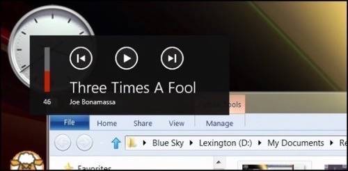
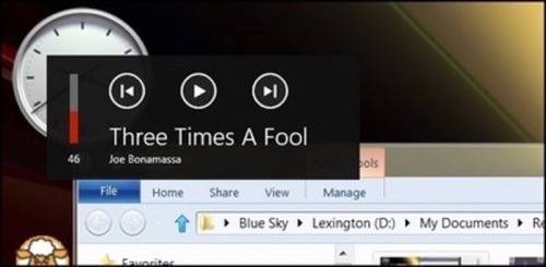
(This just in: If you happen to own a mouse with one of these programmable page up/page down buttons, pressing it when you’re listening to a song in the Music app will bring up this little box in the left corner for about five seconds, whether or not you have the app showing along either side. You won’t know this fact unless and until a) you discover it accidentally for yourself, therefore “learning;” or, b) I tell you about it.)
Share What with Whom?
One of the earliest design philosophies in graphical computing is not to offer someone a choice to do something that can’t be done. Either take it off the screen, or “grey” it to demonstrate that you can’t do this thing right now.
One of the design points Microsoft touts for Windows 8 are the “Charms,” which are the five Android-like icons that appear along the right border of the screen when you point to the upper right or lower right corner. Hiding a menu until it needs to be seen, is not a bad thing at all. In principle, I actually like this approach. It was explained to me that Charms would respond with information that was in context with the function the user is performing or the app that she’s currently using.
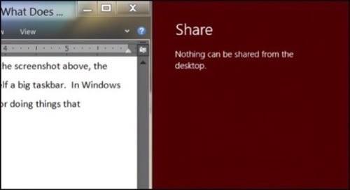
“Share” is among these five charms, and you might think its purpose is to make the document you’re working on or the item highlighted in your Metro app become sharable through some Internet conduit with one of your contacts. Maybe. The only way to determine when and where Share has no purpose whatsoever is to choose it, and be punished for doing so. (Charming.) With respect to the entire Desktop, although Share remains a selectable charm, it appears intentionally designed to serve no purpose in this context whatsoever.
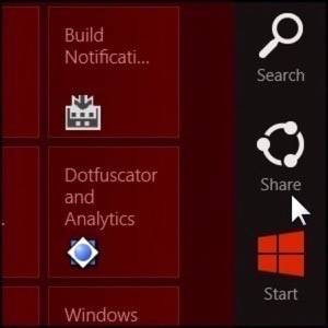
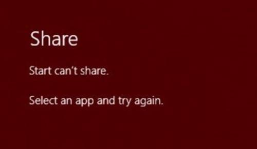
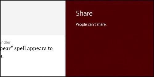
So let’s move to the Metro world of the Start screen. Share is available here too, but when you choose it, you’re greeted with this message: “Start can’t share.” You must launch an app first. Now, the app that most folks would consider a candidate for sharing something with someone, would be an app named People. When you launch People, and then you select Share, you’re given the prophecy shown below: perhaps the single most fitting tribute to the ethos of Windows 8: “People can’t share.”
The Difference Between Settings, “Settings,” “More PC Settings,” and Control Panel
The whack-a-mole game continues as you try to locate the one place where the operating system settings are stored. Since using Windows 8 truly does feel like using two operating systems – perhaps one from Venus and the other from Mars – a reasonable person may guess that there are two places to locate system settings.

Almost right. “Share’s” charming cousin “Settings” is also always available. It’s where one will eventually locate Shut Down, which confirms “off” as one of Windows 8’s various settings. When you pull up the Settings menu from Start, the first menu choice is “Settings.” You read this correctly.
With this much redundancy, you’d think you’d be on the right track. Not really, unless you’re looking for settings pertaining to the Start Menu specifically, of which there are two. To get to where you think you want to go, you have to take a kind of backdoor exit from this menu. It’s at the bottom, it’s not as charming as the Settings charm itself, and it’s marked “More PC Settings.”
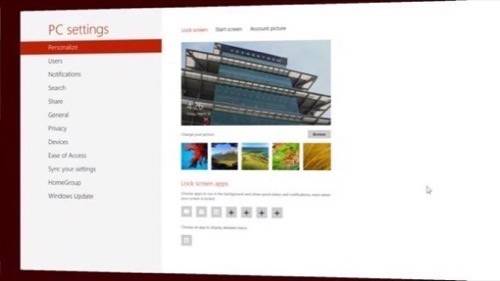
Here, common sense tells you this screen will give you the Metro-style settings, and the Desktop-style settings will appear elsewhere. For the most part, that’s right. But how would you then divide, in your mind, the settings that pertain to your PC as a whole, whether it’s in one world or the other? As it turns out, you’ll find some of them here (above) and some of them in the Control Panel that’s familiar to users since Windows 95.
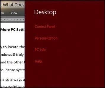
Amazingly, you can locate the Control Panel from the Settings menu for the Desktop, but you do have to go to the Desktop to get there. (In the Technical Preview last September, a tile for Control Panel did appear on the Start screen; in the later Consumer Preview, it does not.) Some settings appear in both the Metro screen and the Control Panel – for example, the option to join a homegroup network. But other very important settings – for example, setting the date and time – appear only in the Control Panel.
There are two franchises about which most folks who have known me for any duration of time will conclude I am a loyal fan, despite all the headaches and the miserable episodes. But between Windows 8 and the 2009 Star Trek movie, it is the latter which displays the greatest continuity with its predecessors. And that is saying something.
There is a new, vast, and potentially loyal group of users who are just now being introduced to a higher plane of technology by way of tablets and multitouch PCs. If Microsoft seriously intends to meet these new users with a schizophrenic, disjointed, loose assembly of dead ends that is anywhere near the state of the current Windows 8 Consumer Preview, then it will lose those users and it will never get them back. This is where the future of Windows either finally comes together or completely falls apart.
Scott M. Fulton, III is the sole author of this document, and is solely responsible for his content.


