If you haven’t changed your brand’s Facebook page over to Timeline yet, Facebook will do it automatically on March 30. And if you have, chance are you could be doing more to make it look better.
One of the initial complaints when Timeline for brands was announced last week was that it would make it harder for individual companies to stand out. We spoke with design experts and Facebook power users to compile a list of simple steps you should take to make your brand’s Facebook timeline look its best. Implement some or implement all of the following suggestions to make Timeline work for your firm.
Cover Images

This is the biggest change, and the one that has design pros most excited. The images are massive – 851 by 315 pixels – and Facebook bars firms from including price or purchase information, contact information and calls to action (i.e. “Like our page!” or “Tell your friends!”).
Many firms are using the cover images to showcase their teams, while others are getting artistic and laying the cover images out as you would on a printed page. This is the only part of your company’s timeline that Facebook requires you to keep public, and it is the image that is either going to draw people into your page or send them clicking.
Companies need a “compelling cover photograph that speaks to the audience on their own terms,” said David Howard, a social media consultant who works with tech companies. “Marketers tend to think first about showcasing their own products in glamor shots, but they should turn this on it’s head and think about what their customers see on a day-to-day basis and figure out how to feature that in a cover photo.”
Socialfresh has some other examples of great Timeline cover photos.
Apps
Brands can add up to 21 apps to their Timeline, and can showcase four of them right under the cover photo. This, in part, solves some of the complaints about the elimination of tabs from the old Facebook brand pages.

The key is to make the tabs visual and keep them consistent with the branding on the rest of your page. Spiderworking has great suggestions on how to easily make your tabs visually engaging.
“I’m even considering making these featured apps fall into one of three buckets: Contact, Buy and Sign Up,” said Jon Loomer, a digital marketing consultant. “In the end, those are going to be most important for the typical brand.”
Avatar/Logos
Nearly everyone we spoke with noted that the new profile photos are now smaller for brands. We didn’t find a single design expert who told us to do anything but include your company’s logo in the 120 by 120 pixel space.
“Its placement is important. It overlaps the cover photo at the bottom left, making it essential to a well-balanced design,” said Lindsay Alford of Noble Studios, a design firm that works on Facebook branding for companies. Alford has more suggestions for visually stunning Facebook brands pages on a blog post she wrote last week.
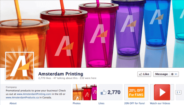
If possible, try to find ways to incorporate the logo in the avatar into the cover photo, as Amsterdam Printing was able to do on their Facebook Timeline:

Pinning Posts
Companies were initially worried that Timeline, which, by default, presents everything chronologically, would prevent them from highlighting certain content. Facebook is letting brand pages get around that by allowing them to “pin” a post to the top of their Timeline, where it will stay for seven days or until it is manually removed.
Highlighting Posts
Margaret Allee, who works for Sport Clips Haircuts’ social media team, points out that brands can also highlight content within the Timeline. Highlighting lets your stretch an image across both columns in Timeline, making it more visually appealing to viewers.
“We will be using these new features during an upcoming enter-to-win sweepstakes to emphasize important/fun promotional information,” she said.
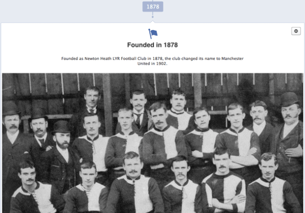
The football team Manchester United, for example, used this feature to highlight a big milestone in the team’s history:


