Color design can be an effective marketing tool if used correctly. Acting directly on the subconscious of the site visitor, the color in web design can form a positive attitude to the product, trust, and positive emotions that cause a person to make a purchase and believe your brand.
When a person first enters the site, he intuitively perceives the picture as a whole. Within the next 1-2 seconds, the client decides to stay and explore the resource or to close the tab and go back to the search results. If the color design of the online business is chosen and implemented correctly, the user will more likely remain on the page.
Let’s see how to choose the right shades and predetermine the process of your client choice.
What You Need to Know About the Combination of Colors
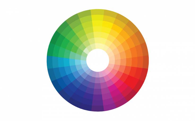
The principles of color combinations originate from Newton’s color ring. Of the three primary colors, intermediary ones are produced by mixing, which is located in the adjacent ring segments. To choose colors, use one of the following seven schemes:
- Monochromatic – for design creation, one primary color is chosen, and additional colors are formed from its hues (saturation and brightness are adjusted).
- Complementary – in this case, the color selection for the web site begins with the choice of two contrasting tones, which are complemented by several more derived shades.
- Split – this scheme is similar to the complementary one, but one of the contrasting colors is replaced by two similar ones from the adjacent segments.
- Analog – according to this scheme, 3 colors are chosen from the neighboring segments: one is used as the main one, and the other two play the role of additional accents.
- Triad – the designer takes three colors that are equally distant from each other, and on the basis of them forms a color palette.
- Rectangle – here, four colors are used, and each pair is chosen according to the principle of contrast.
- Quadrate – the scheme resembles the previous one, but all colors are equally distant from each other.
Which color to choose for the site?
In developing the color scheme of the site you should not be guided solely by your own preferences. After all, the site is created, first of all, for the user. How to choose the right color for a site is a question of understanding the psychological aspect of the influence of colors and using this knowledge in accordance to your goals. There are three methods for choosing the color of the site which we will discuss in detail below.
Corporate style.
If your product has a corporate identity or a logo that has already entrenched in people’s memory and become recognizable, or you plan to do it this way, it makes sense to design the site in the appropriate colors.
But you need to pay attention to how the selected colors are combined with each other and how they will look in the design of the site. In some cases, colors from the logo can be replaced with similar shades, adjusting the intensity, brightness, and other color options.
Theme.
Colors for website design should correspond to its theme or product/services to which it is dedicated. For example, purple is the traditionally chosen shade for perfume sites, a site about auto lease deals is difficult to imagine without the use of dark blue or gray colors in the design.
The target audience.
Who are your customers, for whom the site is created? If it is men, it is better to prefer dark or neutral shades. For women, it is better to choose pastel colors. For children, traditionally colored in rich and bright colors is the way to go.
How Many Colors Should Be Chosen for Design?
The site, designed with a large variety of colors, is hard and even repulsive: getting to it, the user wants to quickly close this tab. If there are few colors, the site may look monotonous, and the user’s attention will be dispersed. The optimal working palette for the designer is 3-4 colors:
- Main. The basic color in the design, which highlights the main content on the pages.
- Additional. Color to highlight background information, which is advantageously combined with the main color, complementing it.
- Background. Calm shade on which the main and additional colors are not lost.
- Accentuating. Contrast primary color that attracts the visitor’s attention to key elements of the site.
Colors and Psychological Characteristics of Their Perception
Color perception is not constant. How a person responds to the same color depends on many factors. But still, before choosing a color for a site, you need to examine the typical associations for each color that are specific for most people.
Red
Associated with aggression, power, passion, and love. It focuses the attention, causes anxiety, and feeling of danger. This color is ideal for highlighting triggers, calls to action, functional elements of the site. But you need to be careful, as such a saturated and expressive color can play against you.
Orange
This color is associated with youth, friendliness, positive and bright positive emotions, and energy. It awakens creativity, adding dynamics to the site. It is often used for youth style design. Orange looks favorably in the design of accents.
Yellow
The color of joy, childhood, happiness, and vitality. Sometimes associated with solidity, status, and credibility. The nuances of perception depend more on the chosen hue. You can confidently use yellow colors for a business site, and for the store of children’s goods as well. This universal color fits different themes, reinforcing each specific message.
Green
Associated with health, nature, development, environmental friendliness, safety, and finances. This color opens up many possibilities of color combinations: it can be mixed with warm and cool hues, depending on the subject of the site. Saturated and dark shades of green best convey the emotions of money and financial stability.
Dark Blue
Such a choice of color for website design will be justified if you need to gain the user’s confidence, instill calm and confidence in them, create a sense of reliability and convince them of your professionalism. In addition, deep blue looks luxurious and aesthetically pleasing in the design of the site.
Purple
A color of luxury and refinement. Associated with romance, mysticism, and mystery. Suitable for mystical sites and in the store selling exclusive products. Violet can also work in cases where the target audience is women.
White
Clean, spaciousness, and express freedom. This color is often used for the background. This solution is optimal for online stores because it allows you to better focus on the products. With a large amount of content, white background allows you to visually structure information and get rid of the feeling of clutter. Used to create a trendy minimal design.
Black
Refinement, tension, domination, and minimalism. Be careful with this color. It can delight the user with a combination of minimalism and luxury or can cause a negative reaction and irritation.
