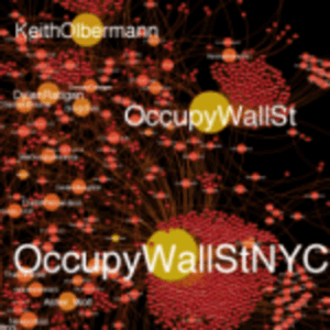
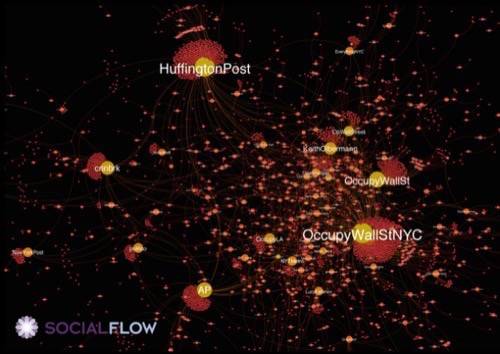
Whether you think the protestors camping out in various city parks around the world is justified or not, it is interesting to see this analysis published in Technology Review today. They used a tool from SocialFlow that examined a pile of Twitter data. Did you know the first use of their hashtag was in a July 13 Adbusters blog post?

(Click to enlarge the screen. There is a “before” picture posted on TechReview’s site too.)

Of course, by October things were a bit different in the Twitterverse, as on the streets of New York and elsewhere. The above screen shot shows centers of influence from Huffington Post and Keith Olbermann, with smaller nodes from the New York Post, CNN and the Associated Press. Where is the coverage by the Grey Lady? Too small to see with my eyes. That in itself shows you how the message was spread and who was relevant and who wasn’t. Fascinating.


