The latest changes to Google+ might not have a huge impact – but that doesn’t mean they aren’t huge.
Wednesday, Google revamped its Google+ profile pages, making the social network more image-heavy and sprucing up a few Google+ areas that were collecting virtual cobwebs. The announcement appeared as a blog post by Googler Sara McKinely and was then shared widely by Google+ guru Vic Gundotra.
Cleaning Up The About Page
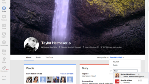
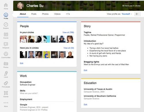
The update cleans up users’ About pages, where personal, educational and professional info live. Previously the About page was an odd tangle of editable boxes, and it wasn’t always clear what information was private or public. Now Google+ has added in a “View profile as” button (à la Facebook), making for handy, quick way to check who can see what on your profile. The page is also much more attractive, with color-coded boxes displaying personal information in cards, as you can see in the image below:
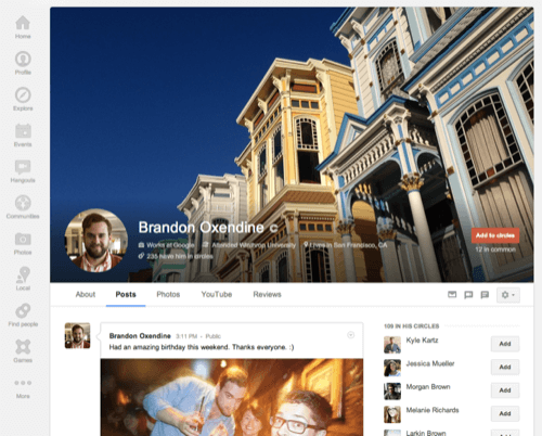
The biggest change, or the most unavoidably eye-catching anyway, is that atop the new Google+ profile pages, users can select one
massive
image to display at up to 2120 x 1192 pixels. The cover photo completely dominates everything else about the profile page – literally nothing else appears above the fold.
Sweating The Small Stuff
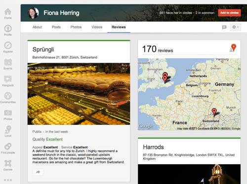
Beyond the literally big stuff, Google has added a shortcut to its Local hub, where reviews of restaurants and venues show up, all linked to a reviewer’s respective Google+ account, of course.
Google+’s thriving photo community will no doubt be excited about today’s interface changes. Personally, I’m dreading what happens when graphically challenged Google+ users start uploading their newest baby photos at insufficient resolution. Ick.
The changes to the look of Google+ come a day before Facebook’s March 7 press event, where it’s speculated that the big blue social network could infuse News Feed with larger images while doing a bit of UI spring cleaning itself.
Images via Google+.
