With the relative freedom provided by laptops, mobile devices, and more affordable transportation, people have become more migratory and, yet, better at remaining connected – or at the very least, accessible. Nowhere is this more evident than in the tech sector, where individuals are jetting back and forth to attend events or meet up with coworkers halfway across the world.

And when it comes to keeping track of the techie crowd and their travels, Dopplr is one of the best resources around. Now, they’re giving users a view into some of those travel patterns with Dopplr city pages.
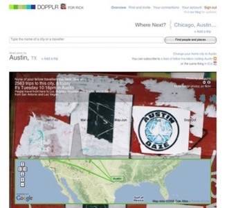
Dopplr has been testing the pages internally for some time. Now, they’re exposing them to the Dopplr users. As the name implies, these new pages provide a visualization of annual visitor activity for practically any city on Dopplr. There are metrics, as well, including information on fellow travelers in town, the number of trips to the city overall, the number of trips for the given day, local time, and interesting facts – like from which cities people are generally visiting.

Looking at even a few pages reveals some interesting trends. Austin, Texas, USA, for example, gets a heavy influx of Dopplr users in March. Why? The annual pilgrimage to the SXSW interactive festival. Portland, OR, USA, by contrast, shows a definite uptick during the summer months. London, Paris, and Tokyo have steady traffic throughout the year. (Obviously, I could spend hours just thumbing through these cities.)
But there’s something else interesting happening here – which Marshall Kirkpatrick mentioned recently. To make the reports a little more aesthetically appealing, the city pages pull in images of the respective cities from Creative Commons licensed content held on Flickr. Not only does it provide more context for the city, it offers yet another venue for Flickr users to showcase their work. All thanks to Creative Commons.
Unfortunately, while the image concept is laudable – and often beautiful – many of the randomly selected photos tend to obscure the graphs of the travel data. So, if you’re looking for beautiful images, you’re in luck. But if you want to read the data, sometimes you’re going to have to strain to see it.
Nonetheless, Dopplr city pages are well worth a visit. It’s great to see Dopplr exposing some of the interesting data points that the company has been accumulating about its user base. And I’m a firm believer that any time this sort of data is made accessible, it’s always wise to take a cursory look, for my own edification.
To see city pages in action, register or log in to Dopplr and search for the cities that interest you – or try clicking through some of the cities from your trips.


