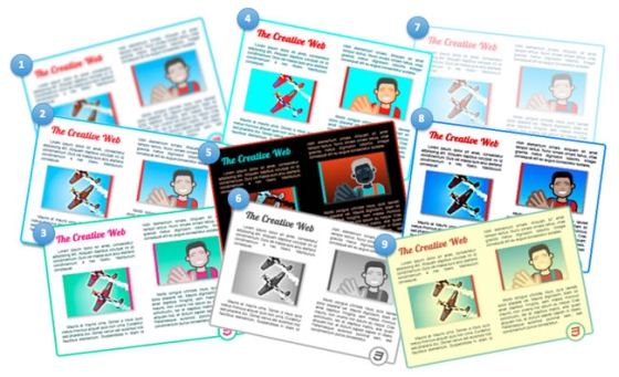
Advances in HTML5 and CSS (for example transitions, animations, transforms, text shadows, box-shadows, gradients, SVG) have improved the graphical and interactive richness of HTML. SVG filter effects are now moving to Filter Effects 1.0 to become available in CSS and HTML, in addition to SVG, and will bring effects such as grayscale, sepia tone, or hue-rotate to all web content. More sophisticated effects, such as the chiseled effect shown in Figure 1, will also be possible.
The following videos show examples of CSS shaders in action on HTML content.
A few caveats: This is a work in progress. As we continue the discussion with the broader community, we will be making some changes. The syntax used in this article reflects the CSS shader’s proposed syntax, but it will likely evolve as the discussions in the W3C FX Task Force and with the broader community continue. Note also that, in accordance with common practice, all the new proposed properties are prefixed with
-webkit- in our WebKit prototype. For the sake of simplicity, I have omitted this prefix in the rest of the article.http://www.adobe.com/devnet/html5/articles/css-shaders.html#1
Grayscale filter effects demo (0:06)
<html> <head> ... <style> #shaded { filter: grayscale(1); transition: filter ease-in 0.3s; } #shaded:hover { filter: grayscale(0); } </style> </head> <body> <div id="shaded"> <div id="multi-col"> <h2>The Creative Web</h2> <p>Lorem ipsum dolor ... </p> <img id="png-img" src="planes.jpg"/> <p>Mauris at ... </p> <img id="svg-img" src="picture.svg" /> <p>Morbi congue ....</p> <img id="css3-img" src="html5_css3_styling.svg" /> </div> </div> </body> </html> filter property defines the filter (or chain of filters) that should be applied. As you can see, it is also very easy to integrate it with CSS transitions. The filter property is animatable.In the example, the
grayscale() filter function is animated to gradually fade out because the amount parameter in the filter function is animated from 1 (full grayscale) to 0 (no grayscale) when the user hovers on the shaded element.The W3C Filter Effects 1.0 draft specification defines two things:
- A general syntax for defining a filter by assembling filter primitives in a graph.
- A CSS
filterproperty that can reference a filter definition or use one or more filter functions.
The filter property can use a number of predefined filter functions: blur, drop-shadow, gamma, grayscale, hue-rotate, invert, opacity, saturate, sepia, and sharpen. Figure 2 illustrates the effect of each:
- blur(5, 5)
- drop-shadow(10, 5, 5)
- hue-rotate(328deg)
- saturate(5)
- invert(1)
- grayscale(1)
- opacity(0.5)
- gamma(1.1, 3.6, 0)
- sepia(0.5)
However, some things are more difficult. For example, what if you want to have only a portion of the element turn to gray scale? Or what if you want the transition to happen differently, for example, as a swipe effect over the element? Or what if you want a filter effect that is not amongst the predefined set of filter functions or the default set of filter primitives? This is where CSS shaders come in.
The CSS shaders proposal offers to add a
custom() filter function to Filter Effects that integrates with predefined filters and CSS animations and transitions. CSS shaders provide the flexibility and expressivity needed to create arbitrary effects—from the simplest ones to the most complex.
http://www.adobe.com/devnet/html5/articles/css-shaders.html#1
Simple CSS shaders in action demo (0:10)
custom() filter function which also carries parameters for the shaders, as well as some configuration options. Here is the code:
<html> <head> ... <style> #shaded { filter: custom(url('wobble.vs') /* wobble effect */ url('color-swipe.fs'), /* swipe effect */ 40 40, /* mesh lines/cols */ amplitude 60, /* wobble strength */ amount 0.0); /* effect amount */ transition: filter ease-in-out 2s; ...; } #shaded:hover { filter: custom(url('wobble.vs') url('color-swipe.fs'), 40 40, amplitude 60, amount 1.0); } </style> </head> <body> <div id="shaded"> <div id="multi-col"> <h2>The Creative Web</h2> <!-- Same as previous example --> </div> </div> </body> </html> filter property to define the effect. The difference is that instead of using one of the predefined filter functions, we use the custom() function and reference the two shaders. The specifics of shaders are discussed in more detail later on. For the time being, the important thing to understand is that each shader provides a specific effect and exposes parameters that can be set and animated from CSS.In this example, the custom filter uses a
wobble.vs vertex shader (for the distortion) and the color-swipe.fs fragment shader (for the grayscale to color swipe effect).
What are shaders?
For example, a vertex shader can create a waving flag effect on a surface, or a wobble effect, as in the previous example. A fragment shader (also called pixel shader) can make arbitrary computations to determine a pixel’s color. CSS shaders harness the power of hardware-accelerated shader programs.
How do CSS shaders work?
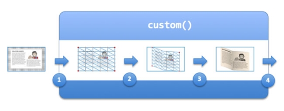
In the example, the element with the
shaded id has its filter property set to:
custom(url('wobble.vs') /* wobble effect */ url('color-swipe.fs'), /* swipe effect */ 40 40, /* mesh lines/cols */ amplitude 60, /* wobble strength */ amount 0.0); /* effect amount */ wobble.vs and color-swipe.fs shaders have been coded such that when the amount parameter is set to 0, there is no wobble and the pixel shader applies a uniform grayscale to the element.When the user hovers on the
shaded element, its filter property is set to:
custom(url('wobble.vs') url('color-swipe.fs'), 40 40, amplitude 60, amount 1) As with the grayscale filter effect earlier, the integration with CSS transition makes it very easy to set the effect in motion and is done the same way, using the
transition property.
Writing shaders
Writing shaders, while taking some practice is not that difficult. Also, and this is a little known secret, they are a lot of fun to author.
Shaders are written in the OpenLG ES shading language, the same language used for WebGL shaders. Here is the vertex shader example that creates the wobble effect from the previous example.
For those not familiar with shaders, the following terminology definitions should help read the examples:
- Vertex: A coordinate on the geometry processed by the shaders.
- Texture: A raster image (offscreen image). CSS shaders turn an element’s rendering into a texture that is used and processed by the vertex and fragment shaders.
- Attributes: Per-vertex parameters, passed to the vertex shader
- Uniform: Global parameters that have the same value for all vertices and pixels. They are passed from the
custom()function to the shaders. - Projection Matrix: A matrix converting coordinates from the normalized vertex coordinate range ([-0.5, +0.5] along each axis) back to the actual viewport coordinate system. Typically used in the vertex shader.
precision mediump float; /* required */ // ================= Per-vertex attributes =================== // attribute vec3 a_position; /* The vertex's coordinates */ attribute vec2 a_texCoord; /* The vertext's texture coordinate */ // Uniform parameters are available to shaders and have the // same value for all vertex or pixel. uniform mat4 u_projectionMatrix; /* The projection matrix */ // ================ Shader parameters ======================== // uniform float amplitude; uniform float amount; // ============== End shader parameters ====================== // const float rotate = 20.0; /* could be made a uniform */ /* to allow control form CSS */ const float PI = 3.14...; varying vec2 v_texCoord; mat4 rotateX(float f) {...} mat4 rotateY(float f) {...} mat4 rotateZ(float f) {...} void main() { v_texCoord = a_texCoord.xy; vec4 pos = vec4(a_position, 1.0); float r = 1.0 - abs((amount - 0.5) / 0.5); float a = r * rotate * PI / 180.0; mat4 rotX = rotateX(a); mat4 rotY = rotateY(a / 4.0); mat4 rotZ = rotateZ(a / 8.0); float dx = 0.01 * cos(3.0 * PI * (pos.x + amount)) * r; float dy = 0.01 * cos(3.0 * PI * (pos.y + amount)) * r; float dz = 0.1 * cos(3.0 * PI * (pos.x + pos.y + amount)) * r; pos.x += dx; pos.y += dy; pos.z += dz; gl_Position = u_projectionMatrix * rotZ * rotY * rotX * pos; } precision mediump float; /* required */ // The 'original' content rendering in a texture. uniform sampler2D s_texture; // ================ Shader parameters ======================== // uniform float amplitude; /* unused in this fragment shader */ uniform float amount; // ============== End shader parameters ====================== // varying vec2 v_texCoord; // The desired 'color swipe' color. const vec4 swipeColor = vec4(1.0, 1.0, 1.0, 1.0); vec4 grayscale(vec4 color) { ...; return gray; } void main() { vec4 color = texture2D(s_texture, v_texCoord); vec4 gray = grayscale(color); vec2 pos = v_texCoord; float p = 1.0 - pos.y; /* progress from bottom to top */ vec4 sc = swipeColor * color.a; float threshold = amount * 1.2; if (p < threshold) { float a = min(abs(threshold - p) / 0.2, 1.0); gl_FragColor = mix(sc, color, a); } else { float a = min(abs(threshold - p) / 0.005, 1.0); gl_FragColor = mix(sc, gray, a); } } Shading languages, such as the OpenGL ES shading language, are designed to make programming visual effects easy. CSS shaders offer a way to tie this expressivity into the CSS syntax and make it easy to use and animate these effects.
Comparison with WebGL
By contrast, CSS shaders provide a way to apply arbitrary shaders to arbitrary Web content.
Where to go from here
In the meantime, you may want to refer to the following resources to learn more about CSS animations and effects:
Source Adobe Developer Connection
