Bill Gross is the man who made the technology behind the first keyword advertising systems online and has long been rumored to be aiming to challenge Twitter.

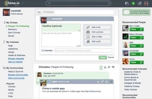
Today Gross launched a big, ambitious new social network called Chime.in. The service aims to offer the best of all the other social networks, plus a better experience for users and an advertising revenue split based on user interests. Unfortunately, the site is not good so far. UX is particularly important if Chime.In is going to create a thriving network with a revenue split. We talked to three different User Experience professionals who took a look at Chime.in and said it needs a drastic overhaul if it’s going to be a contender. I think it’s occasion to remember just how important and non-trivial the interface work on successful social networks has been.
Above: Click for full size.

The gist of Chime.in is that it allows users to follow and discuss streams of content about particular topics. Sometimes that content comes from topic feeds, sometimes from individuals who tag updates with certain topics. Like I’ve tagged a bunch of mine “existential dilemmas” – and you can just follow that topic from me.
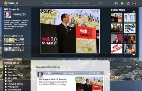
There are big previews of links, lots of images, different types of media sharing, profile pages, organization pages, communities. There’s a lot. Maybe too much.
“The interface is really disruptive for easy scanning or reading,” said Thomas Vander Wal, the man who coined the word Folksonomy (popular classification through tagging). “The UI needs a drastic rethink.”
Vander Wal’s perspective is one that many other UX professionals articulated to us independently. Upon sharing the feedback below with CEO Bill Gross, the site founder’s response was as follows:
“Thanks very much for the feedback. We did do a lot of testing, but this input is very valuable, and we plan to adapt and shape the product greatly based on what we learn in the coming days, months and years. Thank you for sharing this, and we can’t wait to see what people think of the product as we iterate through beta.”
Unfortunately, the feedback was pretty brutal. Other tech news sites have focused on the gimmick of revenue share for ads next to content on the Chime.In pages, but that’s unlikely to appeal to users (brands, sure) and the service is aiming to do much, much more than that.
“It suffers from a malady that many sites suffer from – trying to do too much,” says Olivia Hayes, Senior Creative & UX Designer at Ignite Social Media.
“The most usable sites and platforms are the ones that have only a few goals for you to accomplish, and they lay them out in a very clear, hierarchal way to indicate which is the most important goal.
“In this case, there’s no visual hierarchy to help the user innately understand what the goals of this site are. You shouldn’t have to read the ‘About’ section to find out what a site does. You should be able to land on the homepage and undersand in a few moments what the site does and what action you should take first. This site has a lot going on with no clear visual hierarchy…I’m still not even sure what it does.”
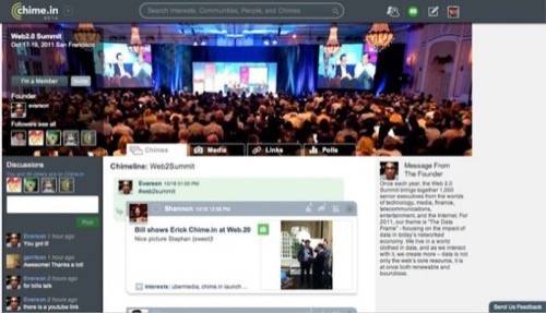
Below: A topic page for the Web 2.0 Summit, where Chime.in is launching. The Chime.in community manager didn’t bother to change the description of the page from the description of the conference he copied and pasted in. That seems kind of lazy and inauthentic. Did I mention there’s a revenue split on ads though? It’s like you can be paid a few bucks for Tweeting! Isn’t it about time you derived some value from this otherwise worthless medium?

Jim England, Director of User Experience at Infochimps, feels much like the others.
“Chime.in’s user experience is best described as distracting and clunky.
“Individual posts are difficult to read. Unnecessarily loud visual elements such as box shadows and bold colors distract the user from the content. Actions such as reply or favorite are shown for every post – compare that to Twitter’s interface which only shows actions on hover. My eyes never got a chance to ‘rest’ on the content; they felt overly-stimulated.
“There is also no visual consistency. For example, the ‘share what interests you’ box has a larger margin on the left than the right and doesn’t line up with the rest of the page. Certain elements feel out of place – the ‘invite your friends’ box sticks out like a sore thumb. There is a notable absence of polish in the interface.
“I really like the idea of Chime.in (reminds me a bit of Friendfeed!) but unfortunately the user experience leaves much to be desired.”


