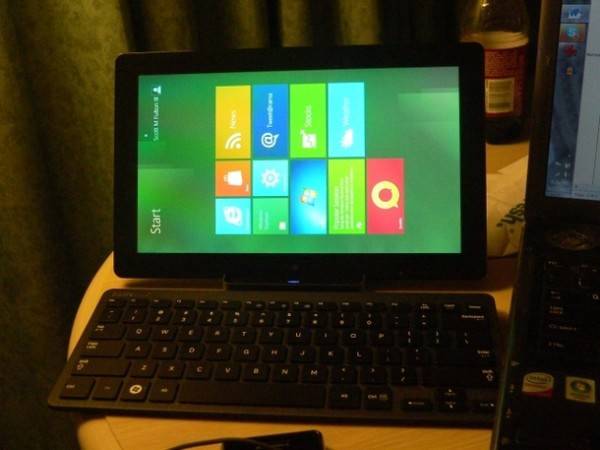
It’s called “Developer Preview” for a reason: Microsoft wants professional developers to be the first to see its design motif for Windows 8, and the first to start giving feedback before the rest of the world jumps in. Perhaps fortunately, perhaps unfortunately for Microsoft, I also attended the Build 2011 conference here this week
I was a beta tester during an era when companies paid for the service. My testing philosophy is for me to jump in without full knowledge of what I’m doing, which some say for me comes naturally. This week, Microsoft loaned me and other members of the press the developer preview tablet that paid attendees have received to take home. Some say a picture is worth a thousand words; with me, it’s worth 20,000. I’ve made some pictures of my experiences, and I think you’ll agree with both me and CEO Steve Ballmer that there’s a lot of work to be done.
To be fair to Microsoft, there’s always a zillion bugs in a developers’ preview – you’re not going to have clean code when a project has just hatched. I’m not looking for bugs here, and I’ll forgive them when I see them. What I’m trying to determine is whether this new design philosophy works. I’ve told my readers before that a company can’t mesh two design motifs together in the same computer and expect even users who like one way or the other, to make sense of them both simultaneously. The first time I made that point in print was in reference to the Apple IIgs.
This point can’t be made any clearer than when you discover (at least for now) there are two Web browsers in Windows 8.
Really professional video courtesy of Shaky Left Hand, a division of You Gave That Guy a Camera? Industries LLC, which is solely responsible for his content.
You may have, and even use, more than one Web browser on your PC. Maybe it’s Internet Explorer and something else – perhaps Firefox, perhaps Chrome. Would you need two Internet Explorer 10s? (“Internets Explorer 10?”) If Windows 8 ends up looking a lot like the developer previews we’re seeing this week, there will be two IE10 browsers, both of which may be running simultaneously – one for Metro, one for the Desktop.
Why? There’s an architectural reason (for now) why Windows 8 needs an IE10 renderer for Metro – the environment for Web apps and the new Start Screen – that’s separate from the Desktop. Metro apps designed to use the new WinRT system library are rendered using Trident, the IE10 rendering engine. We’re told the security scheme for installing and running Metro apps has different requirements than the one used for Desktop apps. Different interfacing requirements require separate apps.
That’ll be interesting. Securing the Web browser and imposing protocols for applications to adhere to that security, has been a thankless effort for Microsoft for years. It’ll be hard to imagine malicious users bored with the whole cross-domain scripting saga, ignoring the opportunity to try a cross-browser scripting exploit.
A common user from Earth will want her favorite Web sites in both browsers. When she pins them to one, she’ll expect those pins to appear in the other, unless there’s some distinction between the browsers that will be meaningful to the user. And there’s not.
But even the security issue is not the most important point. What I’ve heard from Microsoft this week in defense of the two-Web-browser scenario is that this gives users a choice. They can run in this fun, new, gadget-less world, or in the familiar world they’ve already come to love. (We’ve heard the word “love” a lot from Microsoft in marketing this preview.)
The problem is, the choice is meaningless. If this were a smartphone instead of a PC or a tablet (which, let’s face it, is a PC), users would not be afflicted with a similar choice. Too many options for mobile users become obstacles. If this tablet PC is supposed to be mobile, then you don’t need for the kinds of options you give desktop or laptop PC users to obstruct mobile users.
One possible solution which was probably considered was to create two “modes” for Windows 8, one more “PC-ish” and one more “mobile-ish,” and maybe have OEMs implement some kind of physical switch between the two. The argument against modes, which I heard this week directly from Windows President Steven Sinofsky, was that you don’t want to give users options that, for them, will be meaningless. I couldn’t have said it better myself.
Where’s the exit on this thing?
Not every design element of Android is a “feature.” When Google’s designers decided there shouldn’t be an obvious exit point from apps, it was probably a late night, the D&D game ran long, and they shouldn’t have been using the 12-sided die to be making decisions. Thus, Microsoft shouldn’t have been borrowing from their playbook.
Switching between the two worlds and erecting a fence between them, for what good that’ll do.
The definition of the word “seamless” is “having no seam.” One of my wishes this week was for Microsoft to utter the word “experience” far less often, and I did get my wish (thank you, Microsoft). In place of “experience” was the word “seamless,” which is used in reference to the very obvious seam you see in this video and some of those that follow.
The seam is actually a kind of fence that separates the Metro apps world from the Desktop applications world, and it serves to emphasize the sadly obvious fact that little or no effort was expended to integrate the Metro concept with the Desktop concept in the same environment. Mobile app users do not want two environments. It’s enough for them to integrate their mobile phones with reality, without having to shove some other motif in there as well. What’s more, PC applications users do not want two environments. Work is about being centered, maintaining focus, feeling in control. Only in a poorly planned PowerPoint presentation can it even be imagined that a worker can be focused on a plurality of bullet points.
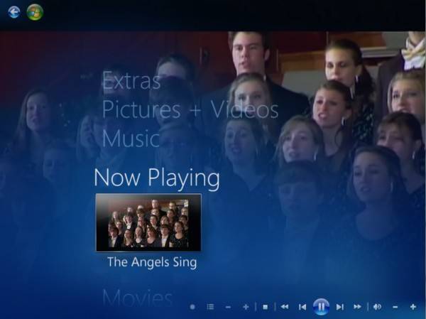
I wanted an example of the concept of “seamless,” so I took this screenshot of Windows Media Center in Windows 7. This is the application that truly launched the whole “Metro” look – the idea that things you do can be explained in big, bold options rather than stupid caveman symbols, and that you can touch and move these options to see what you can do and make choices. I have said this again and again: Media Center is Microsoft’s best-designed Windows application in history. It perfectly exemplifies what control feels like, without taking the viewer’s eyes away from what he’s controlling.
Do you see “seamless” here? (That’s the Indianapolis Children’s Choir, by the way.) That video is playing in the background while this big, bold menu is in the foreground. There’s no fence, nothing that has to be slid one way or the other to be seen or hidden or minimized. The only thing I’m doing with Media Center is controlling the media, not fiddling with the controls so that the media can be controlled.
Keep all this in mind now, and explain to yourself, or to me, or to the lamppost how the following makes any design sense:
Menus should not exist for the sake of having menus. There’s a Control Panel, then there’s the Desktop Control Panel, and then there’s “Devices.”
Many developers will find they have problems with the new Control Panel concept. There’s a big and important reason: The Control Panel was supposed to be a place where device manufacturers could dock the panels that let users set options for their devices. Over time, that got branched out into “Devices and Printers,” but Control Panel apps are special classes of apps that have existed since Windows 95, and that Windows 7 presently makes room for.
Here is where the whole HTML5 thing works against Windows 8: The Metro version of the Control Panel app doesn’t have access to the OEM apps that bring up settings for attached devices. The result is that there are not two, but three possible simultaneous locations for whatever kind of dock or bay the Windows 8 user must pull up to access a device. Once you find whatever the proper menu or device-controlling device is, you’d like to exit the other two. And that becomes another huge problem.
Task Manager should not be an exiting tool. In fact, there should not be such a thing as an exiting tool.
Now, since this last video was made, I came to realize (read: a more observant person showed me) that there’s a Task Manager tile right there on the Start Screen. The fact that I didn’t find this big, bold square on this bright, shiny menu can mean either of two things: 1) These glasses of mine aren’t making it; 2) If the location of an option on a screen has no discernible meaning – if it can be almost anywhere and mean the same thing – then you can make it the size of a presidential campaign promise and it can still get overlooked.
I made a similar comment when the Ribbon tool was introduced for Office 2007. On the current Home menu, for instance, I can’t seem to remember or recall whether Find and Replace are on the left or the right side. And I have a photographic memory (not a joke, except all the photos in my memory seem to belong to other people nowadays). Then I realized that there are programs that utilize these same tools differently, and put Find on the left and Cut/Copy/Paste on the right.
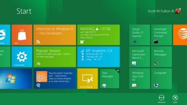
The Task Manager tile on the Start Screen is, well, there. You see it, don’t you? And “there” could actually be anyplace; I can unpin it from here and scoot it at any particular point I care to place it. Trouble is, I’ll probably forget where. The reason is because location, in this menu, is completely irrelevant. It’s a choice that makes no difference.
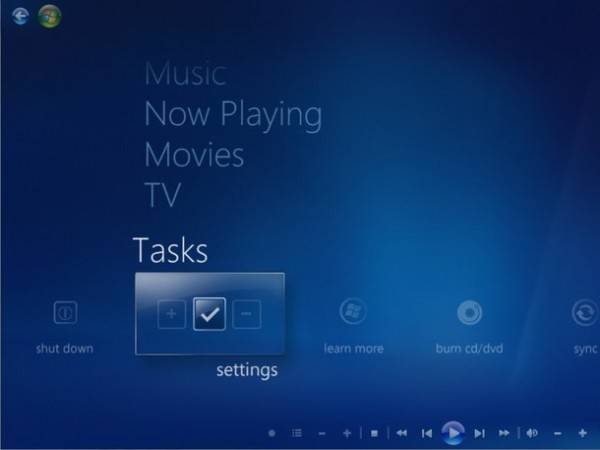
And that brings me back to Media Center (WMC) for Windows 7. One of the most brilliant design revelations of this program is that both location and direction can imply meaning. Menus categories are vertical, menu options are horizontal. The stuff you’ll do most often will be toward the top of the vertical menu, settings and other stuff toward the bottom. And the options you’ll use most often fall just to the left or just to the right (there’s two ways to go, making it easier to go either way).
Why this revelation was completely lost in the Windows 8 preview is lost on me. It does not matter in the least where the Control Panel or the Task Manager is in Windows 8. And that’s a problem because location should not be made a choice; the very act of doing so renders it valueless. There may be fun stuff I want to position or reposition in the list of things I may want to run or check on, but finding the appropriate location for Task Manager amid the Weather, Stocks update, and Treehouse Stampede is a waste of time. Users should never be forced to make the design decisions that architects ran out of time to make for themselves.
I sincerely thank Microsoft for the opportunity to test one of its developers’ machines. But I think the company knew what it was in for when it handed me this thing. What’s more, if professional developers aren’t capable of rendering the same type or level of feedback as I’ve just done, then giving them these machines to take home was a waste of money. There needs to be a lot of feedback between now and the first public beta of Windows 8, and if we wait too long, the beta process will have begun and there will be millions more users to ignore.
When the feedback becomes an uproar, each voice will be so loud and boisterous that you could lose it in the mix. Sort of like a tile on the Start Screen.


