How confident are you in your website’s user experience (UX)? If you don’t have measurable results that prove your UX is working, it may be time for a website redesign. Your website should create a seamless, enjoyable, and rewarding experience for your target users. Brands can teach you about UX.
Some companies have a firm grip on what makes excellent UX, while others are still learning. Find UX inspiration from some of the top brands that are doing it right.

Amazon
A “best of UX” list would be remiss not to include Amazon, the e-commerce giant. Virtually all of its features comply with UX best practices, from the simple navigation menu to clever customer recommendations.
Amazon has raised the bar in terms of UX for e-commerce sites from the beginning. It prioritizes customer convenience (and makes conversions easy) with tools such as 1-Click Checkout. This simple tool lets users jump straight to their shopping carts. This maximizes efficiency and makes the checkout process as smooth as possible.
Other wins Amazon.com boasts in terms of UX include vibrant imagery, personalized shopping suggestions, and buttons that make shopping easy, such as “Buy it again” on recent orders. Amazon makes it clear on every page that user experience is its top priority. A review of 60 different websites’ UX strategies ranked Amazon at number five overall, based on an analysis of more than 550 website elements. Amazon ranked first in its industry as a Mass Merchant.
Lesson: Make shopping convenient at every available opportunity.
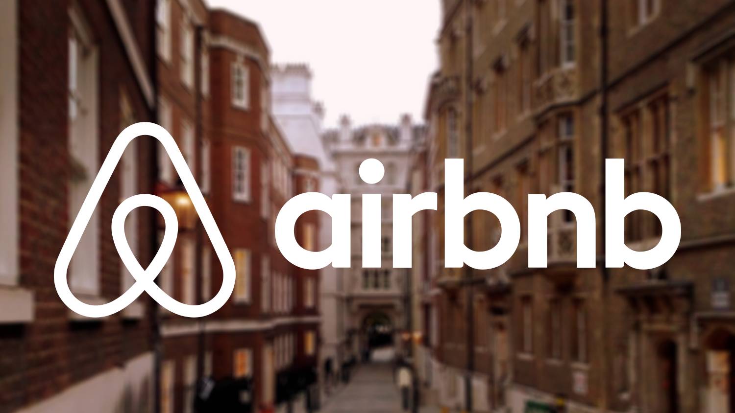
Airbnb
We’ve highlighted Airbnb in the past for its inspirational startup story. Now, we’re giving the company another round of applause for its consistently excellent UX. One look at Airbnb’s homepage and users are hooked. The company does everything right for a simple and enjoyable user experience, including:
- Ample white space
- Easy search tool at the top of the page
- Inviting high-quality imagery
- Personalized recommendations
- Relevant content
Airbnb manages to deliver information quickly without overwhelming or boring the user. It masters website design elements such as depth and contrast, along with simple color combinations to create a distinct online presence. Airbnb invites users in and makes them want to stay awhile.
Lesson: Don’t overthink it. Make your website enjoyable to browse.
Apple
It perhaps comes as no surprise that a company centered on design conquers the user experience. Apple.com is a prime example of optimal UX. From innovative parallax scrolling to amusing product animations, Apple has left no stone unturned in its attempt to create an immersive and enjoyable user experience.
Apple.com pulls the user in and makes it difficult to leave – hiding any exit points until you’re virtually immersed in the world of Apple. Then, it uses exciting elements such as 3D touch to encourage users to interact, engage, and explore.
With all of its bells and whistles, however, Apple still has not neglected its content. The company uses the smart strategy of listing all the ways a product will improve the customer’s life, rather than merely listing product features.
This makes it easy for the user to imagine owning the device, as well as to understand its value in real-world applications. Apple also uses a clean layout and simple navigation to create the sophisticated, modern, and minimal look the brand is known for, in keeping with its tone. All around, Apple has shown it, masters, UX.
Lesson: Match your website design elements with the tone and purpose of your company.
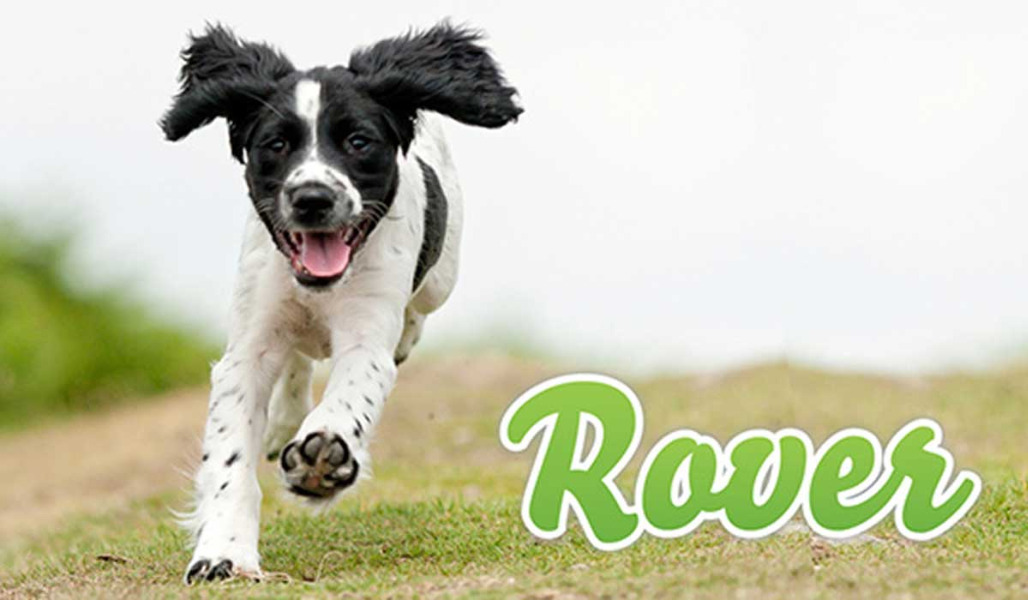
Rover
Rover made the list because it goes above and beyond to establish a feeling of trust. Dogs are family for most pet owners, especially millennials. People who use Rover want to feel 100% confident in the person they hire to watch or care for their dogs. Rover shows an excellent understanding of its target audience by providing elements that inspire trust. These elements include:
- Keywords such as “trusted” and “local.”
- Photographs of people hugging pets
- Information on what makes Rover safe right on the homepage
- The “Rover Guarantee” of 24/7 support, photo updates, and reservation protection
- Testimonials from happy pet owners
- No pop-up ads or other untrustworthy elements
On Rover.com, users can immediately access the information they need to decide whether or not to trust the website with finding a pet sitter. This makes users more likely to use the website to reserve a sitter. Rover has created a UX centered on trust and authenticity to prove to users it is the right choice when searching for a pet sitter.
Lesson: Establish your brand as a trustworthy authority in your industry using an optimized website.
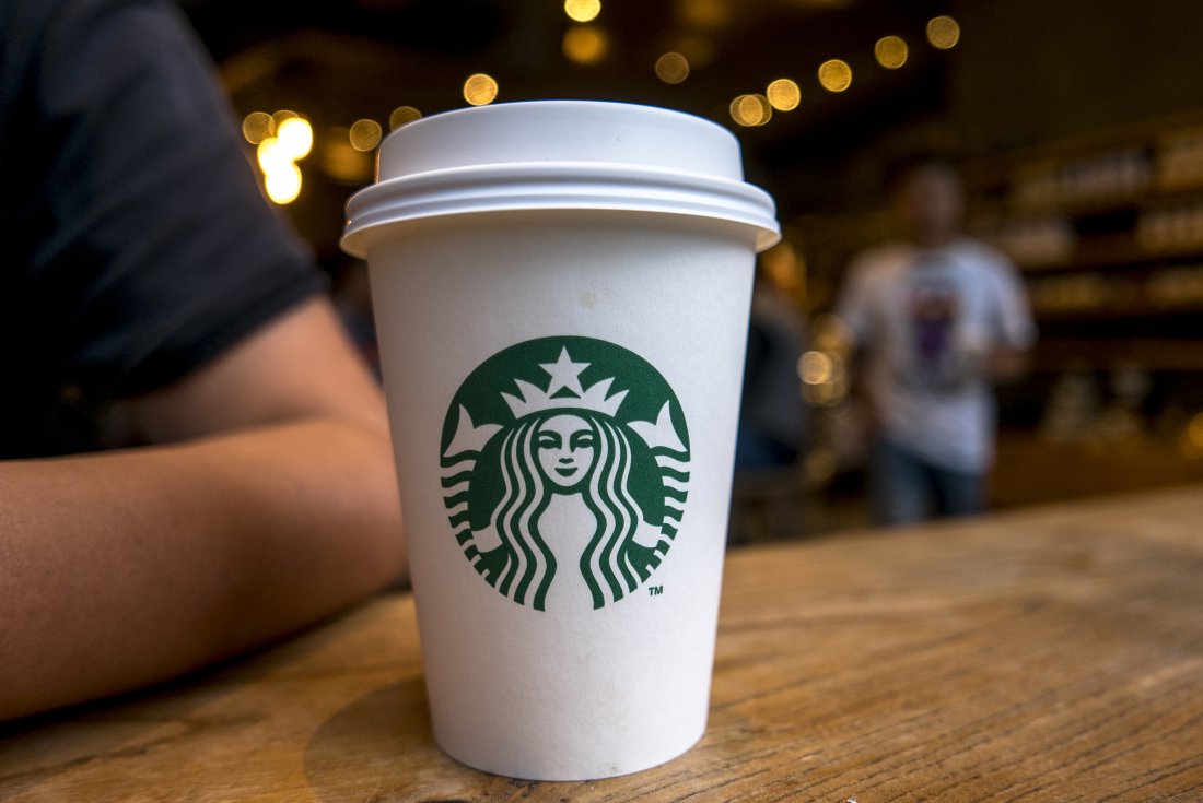
Starbucks
The coffee mogul has thrived by putting its customers first. The website is no exception. Starbucks conquers UX with its brand’s signature green color scheme, bright photos of its drinks.
A warm thank you to military veterans and spouses for Military Appreciation Month (displaying both topical content and a customer-first business approach). Furthermore, it offers all the best in UX design elements: simple navigation, non-crowded layout, and responsive design.
Starbucks also shows off its UX prowess in its app, which is one of the most-used loyalty apps in the world. The app’s design and features have made it a must-have for coffee lovers, mainly through exceptional user engagement.
The app offers all kinds of convenient features for users, from paying for your beverage ahead of time to customizing a Spotify playlist. Plus, easy integration with other platforms gives users everything they need to continue using the app seamlessly.
Lesson: Put your users first in every design element – they’ll notice and thank you for it.
![]()
Paypal
Paypal has decided to let simplicity rule in its website design – a choice that has contributed to the trustworthiness and usability of the site. Paypal keeps design ultra-simple, with bright white backgrounds and easily navigable menu options.
It never tries to trick or confuse users, which is essential for an app that deals with personal finances. It’s simple, clean, and predictable website design is why thousands of users continue to trust and use Paypal, despite competitors such as Venmo and Zelle.
Paypal.com wasn’t always a showcase for great UX. Before its redesign in 2014, the website was busy and overly cluttered. This led to user confusion, dissatisfaction, poor UX, and overall less user engagement.
Since then, however, Paypal has focused on keeping things simple. It reduced its content, reorganized website elements, made items more meaningful, and prioritized website efficiency. Today, it is much easier to give or send money as an individual or small business through a simple, seamless platform.
Lesson: It might be time for website redesign, especially if your website has telltale signs of failure.
MailChimp
How did Mailchimp become a leading name in email campaign technology? In part, due to its branding. MailChimp gave its brand a distinct, recognizable mascot: a chimpanzee named Frederick von Chimpenheimer IV. Adding this branding gave the brand an edge of humor, personality, and friendliness. It helped build an emotional bridge between MailChimp and its consumers – something that was important for the email automation company. Without Freddie, the brand might have risked appearing too dehumanized thanks to its automation technology.
MailChimp understands that organizing email campaigns is not the most exciting endeavor. To appeal to its audience, the brand made it more fun. Its website is creative, interactive, and engaging – even for people who don’t know the first thing about email campaign automation. Animated graphics and original cartoons add personality to the brand that customers can connect with. They are then more likely to use Mailchimp and remain loyal to the platform. It also helps that the website contains many other UX best practices, including ample white space and value-driven content.
Lesson: Don’t be afraid to show your brand’s personality. Creating a memorable UX means thinking outside the box.