Icons are deceptively complex. The best ones have clean, basic graphics. But even simple outlines can pack a lot of meaning and nuance—particularly when those images depict people.
People are tricky. And representing a whole group of them with a single icon can get complicated.
For Facebook designer Caitlin Winner, that wasn’t an excuse—that was a challenge she accepted.
Thanks to Winner, Facebook recently updated its people icons. Its leaders never issued an official directive to reverse its original hare-brained design choices—like giving the woman a divot (read: chip) on her shoulder or positioning her behind a man in the group graphic.
What Facebook did get right was creating an open environment that encouraged Winner to follow her instincts. Without prompting, she revamped those tired icons to fit a more modern sensibility, and soon discovered that her work spread throughout the company and into its newest update.
The Facebook Woman Steps Out From Behind The Man

On the surface, the Facebook icon changes may not seem very important. But consider that, with 1.4 billion users, the network often makes choices that wind up becoming our cultural reference points. Its introduction of “likes” a few years into the social network’s existence has become a way of online life, and its “thumbs-up” symbol is like a touchstone for a whole generation. In that light, how the social giant chooses to illustrate men and women matters.
That wasn’t necessarily why Winner started changing the icons. Chronicling her experience on Medium, she described the effort more as a side hobby than work project.
The designer started by ditching the woman’s chipped shoulder and the plasticky “helmet hair” for both genders.
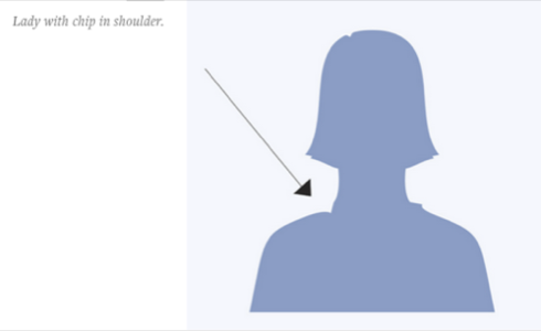
Using those new assets, she cobbled together a group icon, with some intentional changes to way they were ordered.
“It was an obvious refresh to use three unique silhouettes instead and, here again, I placed the lady first,” Winner wrote, about her decision to pull the woman out of the background, behind the man, and put her front and center.


Soon, she found that colleagues started adopting the graphics without question. Now they’re part of her company’s update. As Winner notes, they follow Facebook colleague Julyanne Liang’s work on map icons last year “to give the non-American half of the globe an accurate world view from the notification icon.”
As far as design goes, the changes aren’t drastic. But in some ways, they’re profound. Not that everyone is thrilled with Winner’s tweaks. Some online commenters believe putting the woman in front is just as sexist as leaving her behind the man. But either way, when it comes to the imagery used to depict people, companies or other subjects, icons can be powder kegs for discussion.
They can define what they intend to symbolize, and even reveal latent attitudes. When done well, they can become excellent catalysts for conversations that force us to reexamine what we think we know about the nature of identity and worth. When done poorly, they can become distractions.
A Picture Can Be Worth A Thousand Gripes
When Airbnb decided to debut its new “Bélo” company logo last year, the effort quickly became the butt—or some other body part—of jokes. The company tried to stay on script and talk about why it changed its branding, along with updates to the service and site, but those pesky “vagina dialogues” overshadowed everything else.
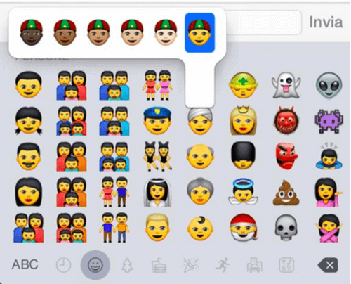
For Apple, graphics can mean even more. Last year, the company made sure its iPhone and Mac software included a slew of new, more diverse emoji—the small emoticons that sit among letters and numbers to express feelings within text.
Previously, its use of Unicode-based graphical characters offered yellow smileys, thumbs-up signs and other symbols. Now different skin tones and family types have joined the parade.
The company has another emoji tweak in the works for iOS 9, and this time, the move could alienate one of its most hotly desired markets: Apple plans to offer the Taiwanese flag in the next version of the software, despite Chinese leaders considering Taiwan a “renegade province.”
See also: Apple’s Emoji Characters Will Soon Look More Like The World
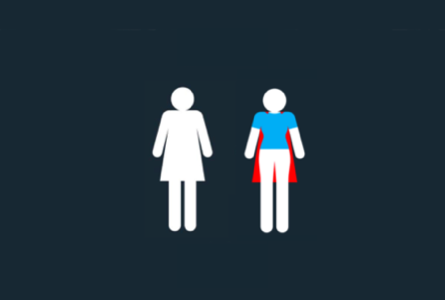
If icons are rife with meaning, then the simple act of revamping them can be a way to take a stand. Axosoft’s Tania Katan transformed the traditional bathroom lady graphic, seen the world over, to a superhero in her #ItWasNeverADress campaign.
The new version, released this spring at the Girls in Tech conference in Arizona, aimed to support women in technology, as well as women’s causes at large.
“[If the bathroom lady is] a symbol that represents women, then no wonder we’re feeling trapped, rigid and uncomfortable,” Katan told me a few months ago. “There’s something about that being a symbol that represents us, that doesn’t represent us at all. And we’ve just accepted it.”
Winner’s project opened her eyes to the importance of symbolism in everyday life. She now digs deeper into what icons mean, and whether they actually say what they intend to: “I try to question all icons, especially those that feel the most familiar,” she wrote. “For example, is the briefcase the best symbol for ‘work’? Which population carried briefcases and in which era?”
When it comes right down to it, those simple graphics sometimes convey more about their creators, and their attitudes, than the actual subjects they’re trying to portray.
Icons, logos, emoji and other images aren’t just minor grace notes, like a cherry slapped on top after the real work is complete. It’s part of the real work, perhaps the most important part. Visuals have a tendency to connect with the public, sometimes viscerally, which means smart tech makers should carefully consider the imagery they’re putting out into the world.
Facebook photos courtesy of Caitlin Winner/Facebook; Apple emoji photo courtesy of Apple; bathroom icons image courtesy of Tania Katan/Axosoft


