Infographics are still a thing with a lot of companies, if my inbox is any indication. Easel.ly, a service that recently debuted in beta, is making it easy to create infographics online. Whether it should is another question.

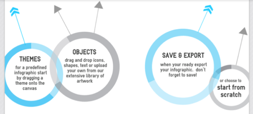
Easel.ly is a Web-based tool for creating infographics. It’s still in its early stages, so you’ll find some rough edges, but it does live up to the “easy to use” promise. Select a theme, your objects and shapes, plop in some text, and you can have a passable-looking infographic in a very short amount of time.
Right now it seems to be missing a way to actually develop charts inside the tool – there’s just a placeholder for charts that drops in one static chart image. The color palette is “coming soon,” and the SVG export contains errors – at least as far as Chrome and Firefox are concerned. But, this is a beta product. Assuming the Easel.ly folks get the kinks worked out and fill out its features, it should be able to generate decent-looking infographics pretty soon.
Easel.ly doesn’t seem to be the only game in town for quick-and-dirty infographics, either. There’s visual.ly, which seems to have a few stock infographics you can create. I haven’t tried that one, though, because it requires authorizing via Twitter or Facebook. (Sorry, kids, I am not willing to give you access to my social media accounts just to create a lame infographic.)
Does the World Need More Infographics?
Judging by the number of infographics that are pitched to ReadWriteWeb, there’s a lot of demand for creating infographics. Unfortunately, there’s a lot more pink slime in infographics than actual beef these days.
To put it another way, most infographics suck. It was true when we wrote that last November, and it hasn’t gotten any better; if anything, it’s gotten worse, as companies keep churning out infographics in the hopes of a “viral” campaign. When infographics started to become popular, many were just thinly disguised promotional vehicles with dodgy data and a lot of self-promotion. Lately, they’ve dropped the pretense and just gone whole-hog on the self-promotion.
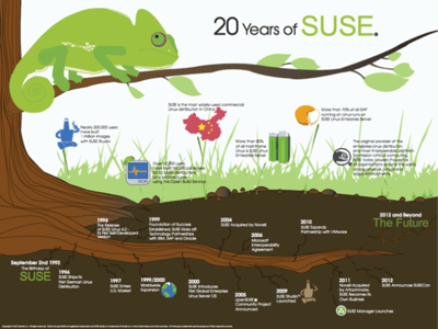
Want an example? I’ll pick on one of my former employers, who pitched me an infographic on 20 years of SUSE history (PDF). Now, there’s nothing wrong with SUSE promoting its 20th anniversary. There’s really nothing wrong with creating a nifty graphic that illustrates SUSE’s achievements over the years. But calling this an “infographic” is stretching the term to near breaking. At best, it’s a timeline with a few numbers thrown in. (Also, somebody needs to get the chameleon to the vet, pronto. It’s not looking very good.)

There’s this one from RewardLoop that is entirely self-promotional. Domo has one about “the incredible data explosion” that is as confusing as it is light on actual data. In the “Competitive Edge” section, it is entirely unclear whether individual companies are being compared, or industries as a whole.
The point isn’t to pick on these companies, though, but to illustrate a point: Infographics are apparently not that difficult to create. The Web is littered with them. But good infographics are difficult to create, because it means having worthwhile information and putting it in context – not just slapping some pixels together in a semi-pleasing manner to help with your branding.
When there’s a Web-based app that does that, I’ll be very interested.


