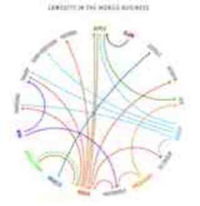
When you have data you wish to visualize there are many options. A recent graphic that made the news involved a depiction of the lawsuits in the tech world. The graphic was in response to prior depictions in an attempt to simplify and convey the meaningful trends of the data represented.

Let’s take a closer look at the software package behind that graphic and how you might use it in your next project.
Setting the Table
Circos is a Perl based software package that allows anyone to quickly visualize data. Where Circos departs from your typical scatter plot or canned style graph in a spreadsheeet is the unique circular layout. It is this circular layout that might appeal to you for considerations of relationships or proximity from a table you have compiled.
You can download, install, and run Circos tools but there is also an online version of Circos if you have a small data table to consider. For larger tables you’ll want to do your own installation on a dedicated server or desktop.
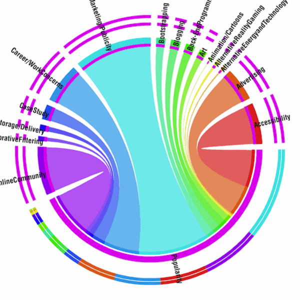
Here’s an example showing the relationships between Interactive panel submissions for SxSW 2011 from panelpicker.sxsw.com. As you can see in terms of Popularity, “Branding/Marketing/Publicity” is a popular topic for submission.

What do you plan to visualize with Circos? Let us know in the comments below!


