Today, the folks over at Microblink have launched a new application which allows you to visualize your FriendFeed data or the data belonging to your friends. Called FeedStats, the app displays charts and graphs which show what services are being used, what time you post, and who interacts with your content the most. In short, FeedStats is a lot like the Twitter service TweetStats, but designed just for FriendFeed users.
The FeedStats site is powered by the FriendFeed API to generate the data it displays. To get started using the service, all you have to do is enter in a FriendFeed username into the box provided then click the “Stat Me!” button. FeedStats will then quickly display eight detailed charts which include the following information: interface used (available as a bar chart or pie chart), posts by day, posts by hour, most likes by user, most comments by user, like compatibility index (who likes what you like), and the user’s “top 10.”
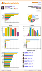
That top 10 comes directly from the like compatibility index – it shows you the top ten users from the compatibility bar graph. If you authenticate with FriendFeed within FeedStats, you’ll also be able to subscribe to the users in your top 10 right from the site itself.
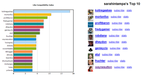
Besides the charts and graphs, there isn’t much more to FeedStats. Still, it’s definitely a great way to help you find more people to subscribe to on FriendFeed. Not only can you discover who you’re most compatible with, you can put in the names of some of your favorite FriendFeeders to see who they’re compatible with too. This is much better than any sort of “suggested users” feature since it’s just going to show you people who like the same things you do. We only wish that it would show you if you were already subscribed to the various folks it finds. Maybe in a future release?