It’s easy to remember, it’s everywhere, and it represents an advanced brand. This is why we tell you everything about the Samsung Logo: history and curiosity of one of the hi-tech giants that have achieved the most success in the world. An example that can also help you design your own.
Brand launch: the 3 key points of the successful Logo.
You already know that the Logo or video animation is essential to start any business online and offline; otherwise, you risk not existing in the market. It is not a simple matter of appearance, but the “face” that the company puts on when you do your business with customers.
The Logo conveys the values of the Brand, which in turn represents the Brand.
You certainly don’t want consumers to choose the competition, so you have to decide to design the entire corporate image to sell together with the product. Starting from the Logo.
There are millions of them, all different from each other, and if you find it difficult to build an original one, don’t be discouraged: it’s not complicated. Let’s give you the example of Samsung, Simple Logo, which has changed over the years without losing ground. As with all Logos, this too started from three basic elements, namely:
- The brand, most often made up of a literal part in typefaces that directly represent the company. It can be a name, an acronym, or a word with a meaning.
- The color, which causes an emotional impact on the customer. But it also blends in with your corporate image and website backgrounds when viewed online.
- The shape and size are effective if they distinguish the Logo printed on the packaging or shared on social networks.
These three elements require a lot of work from a marketing expert and a professional graphic designer. But if you choose professionals, the Logo will last you for many years. Without forgetting that, in view of a change of direction, a rebranding is necessary to refresh it.
A shape rectification, a color tone update is sometimes enough, as long as they are designed.
All this is perfectly reflected in the Samsung logo. This is why we will tell you below the history, curiosities, and secrets of one of the most popular hi-tech giants.
Discover the Samsung Logo — its history and — curiosities
Are you looking for examples to design your company logo? Nothing better than the history of the Samsung Logo to learn what it means to achieve success by keeping it constant over time.
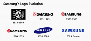
The company’s history began in 1938, when South Korean Lee Byung-Chul, fed up with being a wealthy landowner, moved to Taegu and founded Samsung Sanghoe.
In the beginning, it employs about forty employees, and the incredible thing is that the company deals with the distribution of spaghetti throughout the city. Fortunately, Lee has a mania for founding companies, which he spreads almost everywhere in South Korea.
This gives him the capital to set up, in 1948, a joint venture with Cho Hong-Jai, owner of the Hyosung group. Thus was born the Samsung Trading Corporation, today Samsung C & T Corporation.
Teased by Japan’s expansionism in the field of electronics, in the seventies, Lee set out to produce the first black and white television in South Korea. Thus began the escalation of the brand we know well.
In the 1980s, Samsung Electronics understands that it has to invest in research if it wants to compete with the other global hi-tech giants. With Gumi’s Hanguk Jeonja Tongsin, he started manufacturing dial phones; from there, he moves on to the decayed keyboard, then to the fax, and finally to mobile phones.
In 1982 it produced Samsung’s first personal computer, the SPC-1000, only for Koreans.
It expands to the USA, Europe, and Japan with its digital products between the eighties and nineties. The turning point came in June 2009: Samsung launched Galaxy, the world’s leading line of Android smartphones and tablets.
In the first quarter of 2012, it appears to be the world’s largest mobile phone manufacturer, surpassing Nokia. The company’s success continues today.
You have surely noticed that the name of the brand has always been the same, since the date of its foundation.
Only the graphics change. “Sam Sung,” in fact, initially are words in the Korean hanja font that mean “three stars.”
The letters hanja, in addition to having a shape, also express an idea. Sam means “great, numerous, and powerful” while Sung means “eternal.” The 1938 Logo is as pompous as a commemorative stamp and takes up the stylized graphics of those years. The basic elements are:
- Mark formed by the circle of the planet Earth; an ear, reference to wheat; three stars. Plus hanja
- White characters and figures on a black background because the Logo is printed on white paper
- Rectangular shape well defined by the edge, visible even from a distance.
Samsung logo, at every turn — a rebranding
The history of the Samsung logo follows the evolution of the company: every important turning point corresponds to a rebranding.
Since 1969, the year in which the company launches into electronics, the Logo comes out of its box and becomes a free written in bold black font on a white background. In contrasting red and white, there are still the three stars, drawn in bolts’ shape.
We have to wait until the nineties for the new Samsung logo that goes worldwide, even in digital. Here’s how it turns out.
The Samsung Logo and the digital challenge from 2000 to today.
By now, you understand that a Company Logo must be designed to last, but it also requires a revision every time a rebranding is needed. The Samsung Logo with its history is an example: in 1993, a new Logo appears, with graphics updated to the needs of the web, which however retains the original meaning:
- The branding is written with a custom typeface. A version of the Helvetica Black or DDT Cond SemiBold font where the letter A becomes iconic without the horizontal bar. The first letter, “S,” and the last letter, “G,” open on the edge, connect the inside with the outside to convey the brand’s desire for union with the community and consumers.
- The choice of the blue color wants to convey reliability and commitment in service.
- The ellipse that contains the inscription is inclined by 10 degrees because it reproduces the evolution of the earth in space around the sun. But it can also be a flying saucer looking for life forms. The concept refers to innovation and change in a small universe.
In 2005 the Samsung logo changed again.
This time it is used in two versions, with and without the blue closed contour ellipse. But the big news is that in addition to the visual logo, Samsung designs an audio logo, ushering in the trend of sound design.
The author is the Austrian composer Walter Werzowa who records it in Los Angeles with the production of Musikvergnuegen.
Conclusion
The history of the Samsung Logo teaches you that it is possible to maintain a successful Logo for a long time. Just design it right and strategically review it at the right time.
Image Credit: Shutterstock


