Editor’s Note: This was originally published by our partners at Kill Screen as part of Kill Screen’s Year In Ideas series.
Open a map in one of this year’s big video games and you’ll see mostly blank space. Sometimes it’s pitch dark outside the bubble of detail around your landing in the world. Sometimes the landscape is sketched out but not yet colored with icons, which spread wherever you set foot. We don’t ask how our character draws the map, or why, in a modern setting, she would ever need to.
For more stories about video games and culture, follow@killscreen on Twitter.
Though not common to all games, these conventions are instantly recognized. Beating the game means illuminating the map. Maybe it dates back to Wizardry-era dungeon crawls and the age of graph paper mapping, a tradition carried on in this year’s Persona Q and the re-released Elminage Gothic (which makes players buy consumable maps to spot-check their location.) But however they started, dark maps were everywhere in games this year.
The map of a game like Grand Theft Auto V or Far Cry 4 works more like a memory than a pocket reference. The real work of navigation is usually done by floating icons onscreen, distance counters, and GPS overlays; the skin of the map grows in as you chase symbols. The characters of GTA V should be able to see every corner of Los Santos just by glancing at their phones. Instead they do the legwork themselves, filling in the city like a giant scratch card.
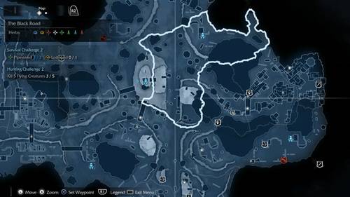
GTA V: A Clean Guide To A Complex World
The form of a map tells us about a game’s ambitions, or at least helps us guess. In the latest GTA our slowly expanding vision suggests the series’ new emphasis on progression, as does the return of San Andreas’ character stats. That wasn’t always Rockstar’s focus: in 2008, Niko could survey the whole layout of Liberty City as soon as he got off the boat. Franklin has to turn on the lights in his hometown block by block.
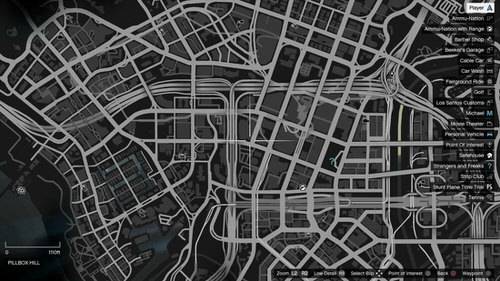
In a year of overcrowded maps, GTA V gave us a clean guide to a complex world. The skeleton of the city is laid out like a monochrome negative, but the black-bordered gray roadways have more pop than their predecessors in GTA IV or Watch Dogs, and the arterial lines twine together with elegance that puts real maps of Los Angeles to shame. Icons are kept small and sparingly colored, making them easy to match with the relevant protagonist (green for Franklin, light blue for Michael, orange for Trevor). The irrelevant symbols even shrink when you’re playing another character.
GTA’s real achievement is using multiple viewpoints to help players build a layered mental map of the area. At one point in Kevin Lynch’s seminal 1960 study, “The Image of the City,” he mentions that L.A. residents could vividly describe to him the areas surrounding their home, but got progressively more vague when envisioning a journey downtown. (Lynch contrasts “formless” L.A. with Boston, where residents could clearly describe the city center.)
If not for GTA V’s character-swapping, players might remember little except their safehouse and the city’s two poles, the Del Perro Pier and the Vinewood sign. But our leaps between different homes and perspectives literally give each district its own character: we learn the alleys around Franklin’s first place in Strawberry/Crenshaw, then the sloping roads behind Michael’s mansion in Rockford/Beverly Hills, then the shortest path to the ocean from Trevor’s place in Vespucci/Venice Beach.
Outside of GTA—which is, technically, a 2013 game that happened to get an essential remaster—recent “open worlds” have been dispiritingly similar. The maps of Assassin’s Creed Unity, Shadow of Mordor, Far Cry 4, and Dragon Age: Inquisition are all cut from the same cloth. Each is filled in progressively as the player claims structures that double as fast travel points: AC’s Viewpoints, Mordor’s Forge Towers,Far Cry’s Outposts and Radio Towers, and DA:I’s camps. It’s the template Ubisoft popularized.
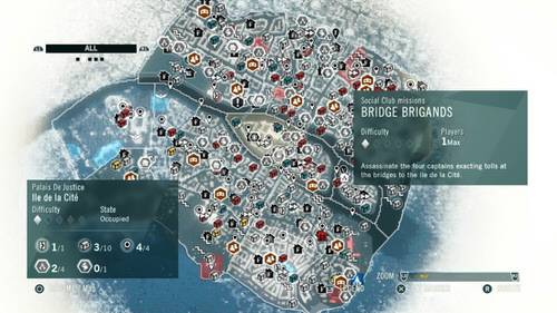
Assassin’s Creed: A War Between Mathematicians And Realtors
If GTA V was the best of this year’s maximalist maps, then Assassin’s Creed Unity was by far the worst—a clownish bleed of distractions over plots of ghostly buildings shipped in from Chengdu. Synchronizing a new map section reveals a mass of hexagons with magnifying glasses or scrolls or shields inside, GPS flags, medals inside transparent circles, staircases, orange hexagons containing various symbols, fast-forward icons, chests in four different colors, houses colored red or black, and hexagons with houses inside them.
It looks like the record of a war between mathematicians and realtors. And it barely even works. Overlapping icons obscure fast-travel points until you change filters or zoom in and tease out the edge of what you’re trying to click on. Once, my mission icons disappeared on every filter setting. But the flat map does have a tilt function, which I imagine is a comfort to the lunatic who created it.
Mordor steals AC’s ideas, but at least it improves them. Its markers get more space to breathe and can be sized up at a glance: red shields (orc events), yellow shields (story), white shields (challenges), and blue Forge Towers. It beats AC at the little things, like the sharper snap your cursor does when it rolls over an icon, the crisper borders around each district, and the fine outlines of walls provided in place ofUnity’s hazy tofu shapes. Apart from the scratchy Ithildin symbols, it doesn’t look very Tolkienesque; then again, neither do the zipline stealth kills. Mordor is a playground, and its map takes care to keep things simple.
See also: Call Of Duty Doesn’t Understand Grief—But Who Does?
Both games lack distinct areas and routes—in Kevin Lynch’s framework, they lack “imageability.” The lines of fast travel cut up the land and prevent you from holding continuous strips of scenery in your mind. The sensation of traveling isn’t accelerated but removed. After many hours with the game, I didn’t remember much of Unity except the player’s base at the Café Théâtre; Mordor is a blur outside of one stronghold (Tol Crossing?) that I kept finding target orcs in.
The intensity of a mental image, Lynch pointed out, comes from continuous use. He broke down our impressions of an area into paths, edges, nodes, districts, and landmarks, calling paths the “predominant” organizing feature in most cases. That may be why the worlds of Unity and Mordor are so forgettable: they’re all nodes and no paths. Even if you don’t abuse fast travel to turn swaths of the map into flyover country, you can hold down a couple of buttons to make Arno or Talion barrel past almost any enemy and launch themselves over any barrier, taking the shortest line from point A to B. There’s no starch in either game to stop players from walking all over it. (The one inconvenience I remember in Unity is the Seine, which sometimes made you look for a bridge.)
Compare that to the mindfulness of the Los Santos resident, who takes his life into his hands whenever he crosses the city. Steering a vehicle around poles and pedestrians, weaving between trucks and into oncoming traffic, glancing from the mini-map to the street: these are all complex tasks that challenge us to balance speed and caution and draw on our memory of the area as well as the map. We learn the city road by road, rather than having entire districts dropped on us at once. The result is a lasting after-image of the area that we can call to mind weeks or months later.
The maps of Far Cry 4 and Dragon Age: Inquisition amend AC’s template, but never go too far afield. FC4’s map may be the year’s most colorful, having seemingly absorbed every pigment absent from GTA’s negatives and Mordor’s blueprints. The splashy look suits the franchise’s celebration (ostensibly, interrogation) of tourism, also seen in the gold boxes that surround chapter titles like the National Geographic logo. Even the names of places have their own energy: Satish’s Sad Room, Great Drought Chorten, Kalinag Returned, and so on.
The main novelty of FC4’s map, outside of fiddling like the division of Viewpoints into Outposts (fast travel) and Radio Towers (map illumination), is the prominence of animal ranges. Giant rhinos and wolves are a larger-than-life presence on the landscape of Kyrat, and the knowledge that you’ve wandered into “badger country” tends to have more weight than being told that you’re in Faubourg. By suggesting each animal’s territory rather than marking it outright with a dotted line or glow, the map introduces welcome ambiguity to a game that is otherwise about driving between icons while listening to the worst radio station that has ever been created or imagined.
If you prefer the dotted line, Inquisition is there for you, drawing purplish search zones all over its map in an unmistakably Azerothian touch. If the ground wasn’t oversalted with lost shards, Dragon Age would be a capable mashup of the Ubisoft map and World of Warcraft. But the former doesn’t need another imitator, and the latter deserves to be copied more. In WoW, quest-givers move to new zones in pursuit of their own goals, the landscape is transfigured by story events, fast-travel points are generously spaced, and every wilderness sometimes holds rare mobs that give you a reason to visit. In Inquisition and in most of its open-world cohorts, the map is static.
See also: Four Things I Learned While Writing A Book About Super Mario Bros. 2
Inquisition’s maps are finely illustrated, though, and an area cleared of icons wouldn’t look out of place printed inside a fantasy hardcover. It’s one of the only navigation aids I saw this year that avoids a technical, schematic appearance—even the terrain of FC4 looks like a grainy satellite capture when you zoom in. DA:I doesn’t maintain the extravagant detail of its War Table map on its blown-up area maps, but I doubt anyone expected it to.
A few major games this year escaped the influence of the Ubimap. Grimrock II carries on the old practice of step-by-step, tile-by-tile exploration, and its directions and riddles require actual study of one’s surroundings. (Kentucky Route Zero and Grimrock II sometimes feel like the last two games in the world that still trust you to find an old oak or take the second left after the crossing without marking it with a beacon visible from space.) As mentioned above, Persona Q gets even closer to the days of manual mapping, though it saves everyone graph paper by providing a digital grid.
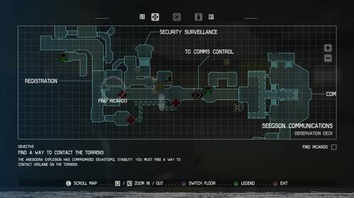
Alien: Isolation: One Of The Most Tactile Digital Maps Ever Made
The real map of the year wasn’t of a dungeon, though it came from another game where every step counted. It was even laid over a grid. Of course I mean the lovably antiquated, closely packed, curiously aqua-colored widescreen schematics of the Sevastopol in Alien: Isolation, which are always on the verge of being snowed in by the inches of static piling at the base of the screen.
See also: Hatsune Miku Is Here To Destroy Everything You Love (And Hate) About Pop Stardom
I have no doubt that it’s one of the most tactile digital maps ever made. Just listen to the snap and whirr of unseen reels as you zoom—not in one continuous motion, but shuddering between two fixed positions. Listen to the plonk of the new button used to switch floors. For once, the map isn’t just in your head. Ripley collects it personally, pulling new layouts from glowing terminals around the station.
And sometimes this analog masterpiece is wrong, apparently by design. One of the game’s peak suspense sequences later on, for instance, makes you explore an altered area of the ship where your map critically misleads you. But it’ll occasionally lead you astray even before that, sending you to the wrong floor or to a vent that’s not there. The magical thing is that I think sometimes the map wasn’t even at fault. I was just livid that it left me room to make my own mistakes.
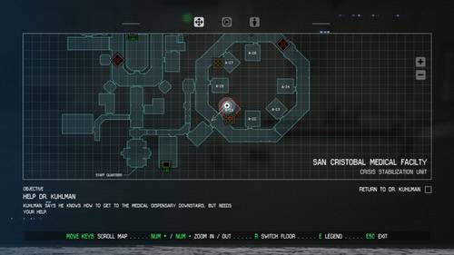
The mission of many game mapmakers is to destroy ambiguity. Isolation infuriated people by restoring it. In Isolation, you are only human and your map is only a map. You look at the map and make a plan, and sometimes your plan is only a guess. No onscreen marker stops you from taking the second right instead of the third, even when the second right means death. The gap between our memory of the map and the reality of it becomes a space for fear to grow.
Since no actually qualified individuals seem to be rating the year’s maps, it falls to me. Alien: Isolation receives every award. Best Map Design. Best Map Font. Best Adapted Map. Rookie of the Year. Thanks, Creative Assembly. Carry these accolades in your head, like an image of Michael’s driveway.
More From Kill Screen
- Kill Screen’s Year In Ideas
- We Played Lindsay Lohan’s Videogame So You Wouldn’t Have To
- We Are Slaves To Destiny
For more stories about video games and culture, follow@killscreen on Twitter.