Every year, the Web changes a little bit more. As the years tick by, we may not notice how everything on the Internet is becoming a little bit more beautiful, a little easier to use. But, if you remember what the Web looked like in 1995 and now look around at what we have now in 2013, it is the difference between antiquity and modernity.
The Webby Awards have been celebrating the best on the Web since 1997. Like the Web, the Webby Awards have grown in size and stature in the last 16 years and are now considered the highest honor that a website can garner these days. The 17th annual Webby Awards will be given next week on April 9th. To commemorate another year, the Webby Awards teamed up with Internet Explorer to produce a graphic timeline of the Web, as told through Webby winners since 1997. If you have some time to burn, hop on over to the site and see how the Web has evolved since the days before the Dot Com Bubble to the Mobile Revolution.
Below, we took some of the best examples of how the Web has evolved since 1997. From SonicNet to TED Talks, the transformation of the Web from function to design has been remarkable.
1997
SonicNet
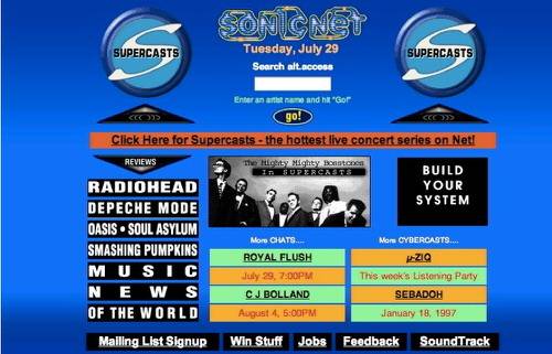
In 1997, the music industry was still healthy and churning out mega profits. Boy bands were the rage, Radiohead was coming into its own and Smashing Pumpkins was still together (they broke up and since have reformed). SonicNet won the Webby for Music that year and, well, it was 1997. The website itself was not much to look at but was considered a fairly high standard for the day.
Family Planet
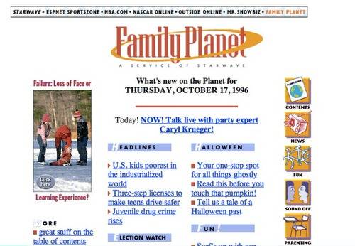
Family Planet won the Home category for the Webby’s in 1997 and it is perhaps the quintessential late 1990s website. Actually, it is quite a bit better than most late 1990s websites. You can start seeing some of the early design trends that would pervade the Web for years to come in Family Planet, with the three column layout and banner headline on the top.
2000
Thrive Online

By the time the new century rolled around, the Web started to look a little bit better than it had in the 1990s. Browsers were better and quality designers were buckling down on a more aesthetic Web. Then the Dot Com Bubble burst and many of those designers soon found themselves out of work. Thrive Online won the Health category in 2000 with a bold design, big fonts and front and center pictures.
Epicurious
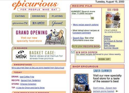
Not everything was slick and trim in the year 2000. Epicurious won the Living category that year and was a jumbled mess. 2000 was still in the era of the Web when more was still thought of as, well… more.
2003
PayPal

Following the aftermath of the Dot Com Bubble, the Web picked up its pieces and forged ahead. By the early-to-mid 2000s design and functionality started to meet in interesting and creative ways. PayPal, the payments service that not only survived the Dot Com era but came out so far ahead that its alumni are now considered a technorati mafia, was one of the websites on the forefront of function and design. PayPal won the Webby in 2003 for Financial Services.
Orisinal
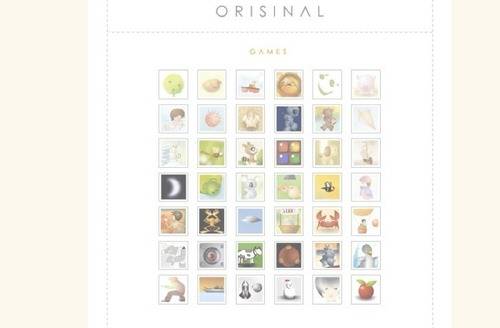
Gaming and computers have always mixed. Who was a kid int he 1980s and did not play Oregon Trail or Carmen San Diego? By 2003, games on the Web were becoming big business and Orisinal was an original player providing cute animal-based games that proved to be the biggest time-suck ever. “Apple Season” was a favorite, where players tried to catch as many apples as possible.
NASA
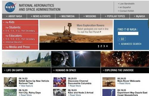
I am a proponent of giving NASA a lifetime achievement Webby just for being awesome. At a time when most government-run websites were husks of hyperlinks and text, NASA was pushing forward with visuals, videos and science.
2006
Google Earth
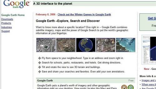
If we were to break the first 20 years or so of the Internet into two epochs, the boundary line between the two would be Google’s initial public offering in 2004. Since Google went public, the Internet has become faster, information has become easier to obtain and design has drastically increased. Google has had a large part to say in this. Google Earth won the Webby in 2006 for Best Design – Function. Google Earth made satellite imagery, once a curiosity for students and researchers, in the hands of anyone at had access to an Internet browser.
Flickr
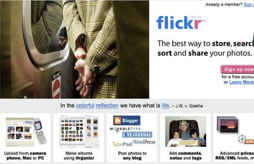
Flickr won multiple Webby awards in 2006, including Best Practices and Best Navigation/Structure. If you can believe it, Yahoo was actually good at bringing quality websites to the masses once upon a time (Yahoo acquired Flickr from Ludicorp in 2005). Flickr was the photo sharing site in the mid-2000s and its mix of design and functionality was second to none.
2009
The Turbo Gene Test
Turbo Gene Test was a website created for car company Saab. It was a bit of a marketing gimmick, but it was beautiful and portended a trend that we have seen a lot of since 2009: brands creating interesting websites to promote their business. It is no longer flashing banner ads and keyword search results. Turbo Gene Test won the Webby for Best Design – Aesthetic in 2009.
NikeID
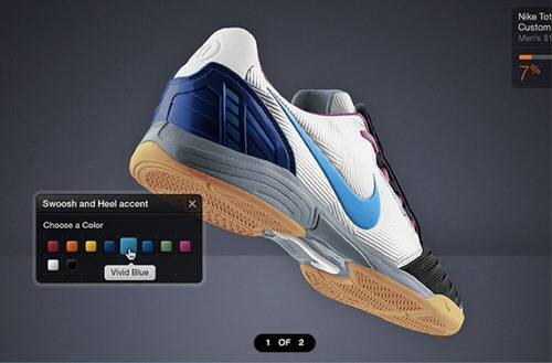
Towards the latter half of the 2000s, the Web became more interactive. NikeID, the website for Nike’s sensor-laden running show, was a great example of how brands and websites could show off their product in interesting visual and interactive fashions. NikeID won the Webby in 2009 for Best Design – Function.
2010
Nike – A History Of Flight

Nike won another Webby in 2010 with Jumpman: A History of Flight. It was basically a way to show of Nike shoes through the years, especially those of basketball star Michael Jordan. The timeline-style website was informative, interactive and visually appealing. Nike might seem like an odd company to have such influence over the design of the Web, but it has proved multiple times that it can bring on the right people to implement creative new ideas to push boundaries. History of Flight won the Webby for Best Design – Aesthetics in 2010.
2011
TED Talks
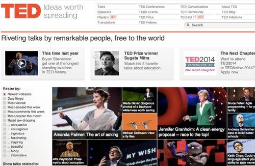
TED Talks have become must-see Internet over the past couple of years. In 2011, the TED website won the Webby for Best Design – Function. TED has shown us new ways to think about live and how video communities live on the Internet.
2012
Kinetic Fanzine No. 1
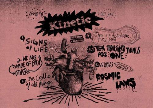
The Internet is now a place where anybody with a little imagination, a friend with design chops and maybe some rudimentary knowledge of coding can create a great website that is lightyears ahead of what was being produced in 1997. Kinetic Fanzine, which won for Best Design – Visual in 2012 is a great example of that.
Top image: National Film Board of Canada won for Best Photography in 2012