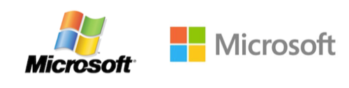
For the first time in 25 years, Microsoft has changed its logo, the company announced Thursday. The new logo draws heavily from the look and feel of the typeface formerly referred to as “Metro” used in the company’s upcoming Windows 8 operating system.
“It’s been 25 years since we’ve updated the Microsoft logo and now is the perfect time for a change,” Jeffrey Meisner, the general manager in charge of brand strategy for Microsoft, wrote in a blog post. “This is an incredibly exciting year for Microsoft as we prepare to release new versions of nearly all of our products. From Windows 8 to Windows Phone 8 to Xbox services to the next version of Office, you will see a common look and feel across these products providing a familiar and seamless experience on PCs, phones, tablets and TVs.”
The new corporate logo adorns the Microsoft Web page, and will be used to sign off all Microsoft TV advertising as well as other forms of marketing. The logo also currently appears on three Microsoft retail stores today in Boston, Seattle’s University Village and Bellevue, Washington. It wil be added to all Microsoft stores in the next few months, Microsoft said, although the company may need some time to replace it across all of its digital properties and pages.
Microsoft, which halted use of the term “Metro” after a copyright claim from a German company, is now simply highlighting the use of the “Segoe” font that had been used elsewhere in its product line. The new logo reworks both the company’s logotype, or the Segoe font, as well as the Microsoft symbol itself. Now, the logo combines four pastel colors – orange, green, blue and yellow – arranged into a square.
In an accompanying video (see below), Microsoft explained that the four colors are associated with its main product lines: blue for Windows, orange for Office, and green for Xbox. Yellow, presumably, will be associated with Microsoft’s enterprise products, some of its most profitable.
Microsoft maintained the same colors and placement as the conventional logo the company offered for several years. But gone is the sweeping “flag” motif, where Microsoft’s image appeared to be swept up by some unknown force. (Update: A microsoft spokeswoman said the “flag” was never officially part of the Microsoft logo, and that this is the first time Microsoft has added a symbol – the four squares – to its company logo.)
The changes are most likely a deliberate choice: in February, Sam Moreau, principal director of user experience for Windows, reported that the company had brought in design agency Pentagram to rework the Windows logo – the first sign that big changes wre coming to the Microsoft iconography.
“Paula [Scher, a Pentagram designer] asked us a simple question, ‘your name is Windows. Why are you a flag?’ Moreau wrote. Now, the new logo actually provides a different slant on the Windows motif, which was offset to represent a “slight tilt in perspective.” The new Microsoft logo is front-facing, square and solid. The symbol is important in a world of digital motion, Meisner said. “This wave of new releases is not only a reimagining of our most popular products, but also represents a new era for Microsoft, so our logo should evolve to visually accentuate this new beginning,” Meisner wrote. Early reactions have just begun to trickle out: “The new Microsoft logo reminds me of placeholder logos I drop in wireframes until I design a real one,” tweeted Andrew Heaton, a user experience designer.