On the one year anniversary of the Haiti earthquake, journalist Peter Aldhous created a data visualization that shows how the Carribean country’s relatively low seismic earthquake had as many fatalities as all but one earthquake over a time span of almost 40 years.
The data visualization is striking but also a study in how journalists are increasingly telling stories that leverage datasets that are freely available to the public.
Peter Aldhous, San Francisco Bureau Chief for New Scientist magazine, created the interactive graphics. We asked him to explain how he created the visualizations which compare seismic activity to fatalities caused by earthquakes over the span of four decades.
Aldhous posted the data visualizations on his Web site with the following explanation:
The earthquake that struck near the Haitian capital, Port-au-Prince, on 12 January 2010, was unremarkable in seismic terms — barely making the year’s top 20 most powerful quakes. But it was one of the most deadly seismic events in the past four decades, serving as a reminder that the scope of these disasters is defined not by the scale of the Earth’s unleashed fury, but by overcrowding in poor urban areas and lax or poorly enforced building codes.
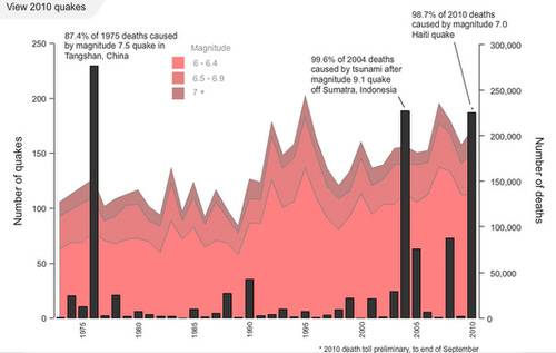
The deadliest earthquake occurred in 1975 when a 7.5 earthquake killed more than 250,000 people. Only the tsunami in 2004 off the coast of Sumatra had more fatalities. That 9.1 earthquake killed more than 225,000 people.
The bar graph marks fatalities. Notice how some of the largest earthquakes had minimal casualties.
How Aldhous Created the Data Visualization
In an e-mail interview, Aldhous explained how he created the data visualizations. He said it started with downloading freely available data about earthquakes and fatalities:
“The raw data was downloaded from searches at the U.S. Geological Survey for quake magnitudes and locations and The International Disaster Database for earthquake fatality data. I manipulated the downloaded data in Excel and Access to get it in the format I needed to make the graphics – e.g. running some SQL queries in Access to get the numbers of quakes of different magnitude classes in each year for the stacked area chart drawn from the historical data.”
He then created the individual frames:
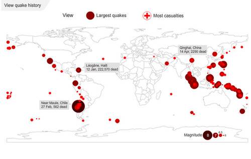
To make the individual frames for the animation of all quakes greater than magnitude 6 in 2010 I needed a world shapefile for the basemap, and shapefiles defining the locations for the earthquakes on each day, which I generated using the CSV to Shapefile Converter plugin in MapWindow GIS from the downloaded USGS data.
He then imported the files into R, a free software program for statistical computing and graphics. He used the rgadal package, and generated an image in a postscript file for each day of the year.
Here’s the R code Aldhous used:#import the basemap
basemap = readOGR("world.shp", "world")
#set the color palette for the points (the darker color for the Chile quake, in a class of its own, was added later, in Adobe Illustrator)
palette = c("red4","red3","red1")
#then iterations of the following:
#import the data for each day
Jan1shape=readOGR("1Jan.shp", "1Jan")
Jan1data=read.csv("1Jan.csv", header=T)
#create a vector graphic for each day
postscript (file="1.ps")
plot (basemap, border="gray")
plot (Jan1shape, pch=19, cex=(Jan1data$IconScale), col=palette[Jan1data$Class], add=T)
dev.off()
In the above code, Class is an ordinal variable that matches quakes to the categories given in the legend. IconScale is a transformation of earthquake magnitude used to size the bubbles for each quake, chosen merely to make it clear that magnitude is not a linear scale, and to give the graphic a pleasing aesthetic – it doesn’t reflect any physical reality such as the energy of each quake. If you scaled according to energy, the magnitude 8.8 Chile quake would dominate the entire map.
Aldhous then polished up the work using Adobe Illustrator and imported the work into Adobe Flash where he made the animations.
The Results
The results are a clear and telling story about how data visualizations are created. Aldhous used freely available data to make his point. The use of the R programming language provide the spatial characteristics to display the size of the earthquakes in the data visualization. It’s a combination that shows the way journalists with some programming skills can tell stories in a visual narrative.