There’s a big opportunity for someone to make a killer Facebook app for the iPad. Facebook doesn’t have a native iPad app yet, and the mobile Safari version of it is decent at best. The much-hyped app Flipboard is still clogged up and doesn’t display your full Facebook experience.

Enter 3-year-old Swiss app developer Sobees. The company creates some of the most technically innovative social web clients you’ll find anywhere. Unfortunately, the Facebook iPad app Sobees released today, called My Friends, is not one of those. It’s not very good, in fact. I’ll explain just why it’s not good below.
Sobees does a lot of things that are very interesting with its other clients. The desktop Twitter client, for example, uses a service called Factery Labs to automatically extract a key sentence from the text of any link shared by a friend on Twitter and displays that below the link. That’s very cool. But the company likes to build on Silverlight, and its work is generally Windows-ugly. (Sorry, but after seeing these apps for years, someone had to say it.) Putting Windows-ugly on an iPad is an aesthetic crime.
Here’s a look at the company’s new iPad app. Developers, don’t make these same mistakes with your software. There is potential here, but My Friends just doesn’t end up delivering a good experience.
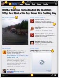
- Your profile picture in the top left is where you’ll see new Facebook notifications for your account. The red exclamation point looks like something’s broken, though. Why not use numbers like Facebook itself does? Better to use basic, familiar signage if possible. When you get a notification and click on that alert, you’re given three options: show notifications, open facebook.com or open the Sobees fan page. Tell the app to view your notifications and you’re not even able to read their entire text, or click to view them in any other way. Extra clicks are required to get to an unsatisfactory destination.
- Check out the fonts on the title bar and elsewhere. Not good. I think I see at least five different fonts on this page, and none of them are particularly attractive.
- Breaking news? One of my friends ate very few calories total today, yet got to eat some pudding. Well, stop the presses! There has to be a hundred different ways this prioritized placement in the display could be better determined to truly show me what’s most important. That’s what makes apps like this interesting.
- Likewise on hot images: That’s a fuzzy picture of the back of a truck.
- These latest status updates are cool, and the scrollable window here is nice. It would be nice if I could choose between groups to view. It would also be nice if the comment and like count was responsive in real-time. Even when I post a comment on one of these items myself, its display in Sobees says there are no comments.
- Latest video ought not display a broken YouTube player. Sometimes it does and sometimes it doesn’t. Inline playback is nice, but sometimes it crashes the whole app, too.
- Down at the bottom you’ll see two dots, indicating that there is a second page you can scroll to. That brings up the Sobees display of your news feed. This can take a long time to load, and there’s no switching back to the front page while it loads. It ought to be preloaded for a faster interface. There’s nothing that stands out about the newsfeed display, either.
- The best part of this app? The people tab. It’s a big scrollable set of profile photos with names overlayed. Click one and you go to a profile page. It’s really nice. Let me put those faces into groups, and I’d almost use the app just for that: to check in on particular friends the way Facebook was used before the Newsfeed was invented.
Final judgement: this app isn’t good enough to use for much. It would be great to see it improved, simplified or extended upon. The mistakes made here are probably not uncommon, though, and are things to watch out for in developing other social apps.