Some LinkedIn users will have noticed a change to the navigation and user interface of the LinkedIn.com website, announces a company blog post. The business-focused social network is in the process of rolling out an updated design that aims to improve and simplify site navigation while also offering a cleaner, less-cluttered look. Does the fresh coat of paint hit the mark?

What’s New: Navigation Improvements, Lots of Whitespace
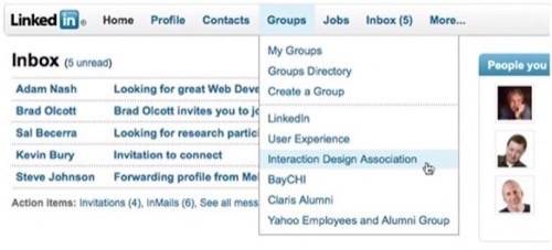
One of the main new features of the revamped LinkedIn is the global navigation bar at the top of the page which links to all the site’s features including profile, contacts, groups, jobs, your inbox, and more. Click on any of these items and a drop-down menu will appear providing you with further options. This gives the most important navigational aspect to the site a more modern look than it had before when each section was displayed in clickable tabs of different shades of blue.
The company also touts how the new look and feel also makes room for more page content with less scrolling needed in order to see everything on the page. This is also true to some extent. However, on your homepage where network updates and group updates are featured, the amount of scrolling depends on the size of your network and how active the network members are. For example, under the “group updates” section, updates for the past seven days were posted followed by a section that included updates from the prior week. That actually led to quite a bit of scrolling to see them all. It’s not necessarily a bad feature, though. After all, LinkedIn isn’t the sort of site we’re logging into on a daily basis so it’s nice to be able to catch up when we’re there… even if that means the homepage screen extends downward forever.
Also new on the homepage are moveable, collapsible sidebar modules which can display things like who’s been viewing your profile, events, job listings, applications you’ve added, and more.
Cleaner Look Highlights Ads
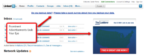
One downside of the site’s “cleaner” look is how much more noticeable the ads are now. Of course, to LinkedIn this may be an upside. Although the ad placements are no different than before, the new look makes them really stand out. Since everything is now black or blue text on a white background, the full-colored ad at the top of the screen is the first thing to draw your eye upon login. There’s also a text link ad directly below the global navigation that demands your attention. It’s in the exact place where a company message would normally appear and the font used is a darker, bolder blue than anything else on the site. Both of these elements are somewhat distracting, but we suppose there’s nothing that you can really do about ads. Still, we wish that the network had taken a page from Facebook’s book when it came to ad placement – when you log into Facebook, the first thing you notice is the content and the updates, not the ads.
LinkedIn says the updated design was based on years of data from usability research but what you’re seeing now isn’t necessarily the final product. They’re still iterating and, based on user feedback about the new look, they may make some additional changes in this and other areas.
Still Needs Improvement: the LinkedIn Inbox
One thing that still hasn’t improved, sadly, is the LinkedIn inbox. Although the homepage view of the inbox provides a handy “take action” button which lets you quickly accept, reject, or archive requests, the full inbox view still forces you to click each message to accept or reject requests – there are no bulk actions you can take from the inbox screen besides archiving or marking messages as read or unread. Even worse, after accepting or rejecting a request, the message remains in your inbox until you manually archive it, necessitating quite a bit of additional work if you’ve let those invites pile up.
What Do You Think?
Are you impressed with the new look for LinkedIn? Or did you prefer the old tabbed interface better? LinkedIn obviously hopes that by simplifying the navigation and site elements which help to better engage users that they will spend more time exploring and interacting with the various site elements. Do you think that will be the case? Or do the underlying features of LinkedIn need improvement as well?