The U.S. presidential elections are right around the corner and it seems that just about everyone is looking for news, poll results, and other political coverage both online and off. For those of you who are still eagerly devouring anything related to the elections, you’ll want to check out these five tools for visualizing election data. From earmarks to electoral votes, there’s a lot you can learn from the apps listed here.
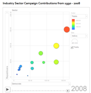
1) Visualize Political Contributions By Industry
The non-profit organization called Sunlight Foundation, whose mission is to use the Internet to make information about the U.S. government more accessible, just released a visualization of campaign contributions from 1990-2008, broken down by industry sectors and party lines. From this app, profiled on Programmable Web, you can see how the finance, insurance, and real estate industries spend more than others. The visualization is interactive – just push the play button after configuring the settings. It was built using Google Motion Chart and data from OpenSecrets.
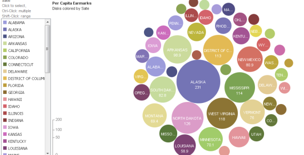
2) Visualizing Earmarks
Earmarks are a hot topic in the current U.S. Presidential election. You can visit the web site earmarkwatch.org to investigate those spending measures inserted by members of Congress into bills that direct taxpayer dollars to their pet projects. But an even easier way to track which states are the worst for using earmarks, this visualization over on ManyEyes is useful. Wow, look at Alaska!
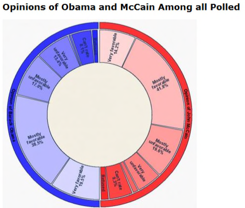
3) Visualizing Election Polls
University of Utah computer scientists have written software they hope will eventually allow anyone to interactively and visually analyze election results, political opinion polls or other surveys. The software displays data in the form of “radial” charts that are doughnut-shaped and include features of traditional pie charts and bar graphs. The charts are interactive and animated, too. You can watch a video demonstration over here, but unfortunately, the poll-analysis software isn’t quite ready for prime time. What a tease!
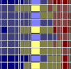
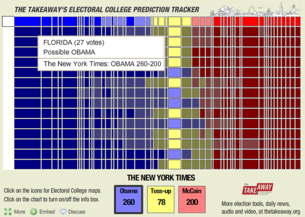
4) Electoral College Prediction Tracker
This interactive visualization widget provides an overview of the predicted outcome of the U.S. presidential election. The rows depict the results from different news agencies (The Washington Post, The New York Times, CNN, etc.) and the columns represent the different U.S. states. The states width is based on the number of electoral votes they have available. Political bloggers will really like this one, too – it’s embeddable!
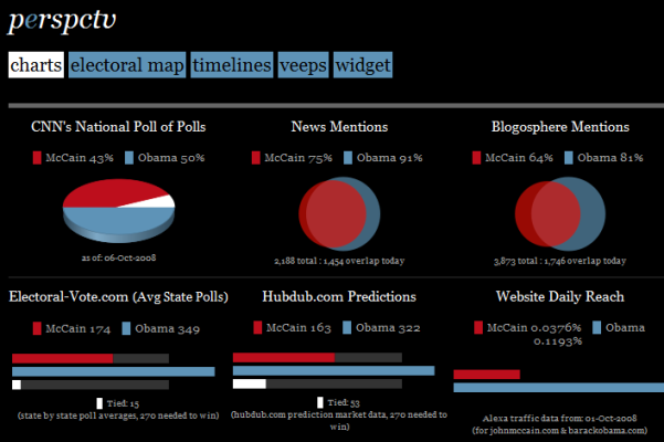
5) The 2008 Presidential Election In The Blogosphere
This next visualization, perspctv.com, is an informational dashboard that summarizes and graphs the Internet activity relating to the 2008 presidential elections. The charts compare the similarities as well as the differences between the mainstream media and user-generated content, such as that found on political blogs. Currently, the graphs include CNN polls, new mentions, blogosphere mentions, Twitter mentions, a U.S. electoral map, and Google Trends-based timelines. (via information aesthetics)